19 Best restaurant websites to get inspired
Having a restaurant website lets visitors access your contact information, check menus, book tables, and even order food online anytime. It’s also a powerful marketing tool to reach more clients and engage with the community.
This article will showcase the best restaurant websites for your inspiration. We have chosen them based on various factors, including user-friendliness, design aesthetics, and mobile compatibility. This ensures that all restaurant websites featured on the list are functional and visually appealing.
In addition, we will share some tips on how to create your restaurant website.
Download website launch checklist
Top 19 Restaurant Websites
Let’s explore our top 19 mobile-friendly restaurant sites. Once you get inspired, we will share some tips and tricks on how to make your own website.
1. Romero Verde
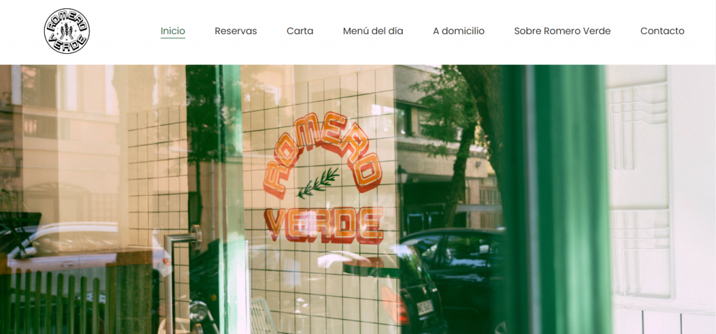
If you want to create a vegan restaurant website, get inspired by Romero Verde. The site’s vibrant and fresh web design elements reflect Romero Verde’s focus on eco-conscious practices.
Romero Verde’s homepage is a hero photograph of its logo on the restaurant’s ceramic wall tile seen from the outside. The aesthetically captured image lets visitors have a quick look at the restaurant’s ambiance.
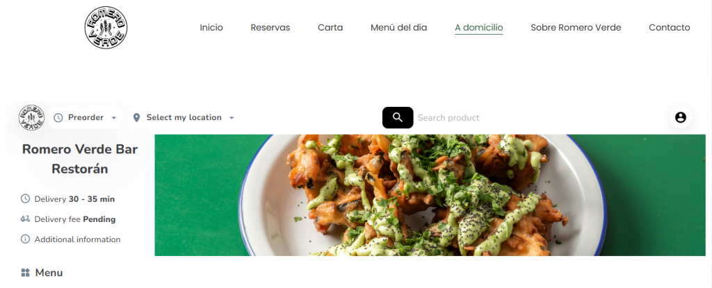
Scroll down the homepage, and you’ll find some of Romero Verde’s food menu photos in a slideshow. It also has a dedicated section for its daily special meals, coupled with online ordering and booking functions.
The website, catering to a diverse clientele, is available in English and Spanish. Additionally, its integration with Instagram allows for a dynamic display of its products and community engagement.
Created with Hostinger Website Builder, this restaurant website offers easy navigation and all the functionality for a successful business.
2. Dim T
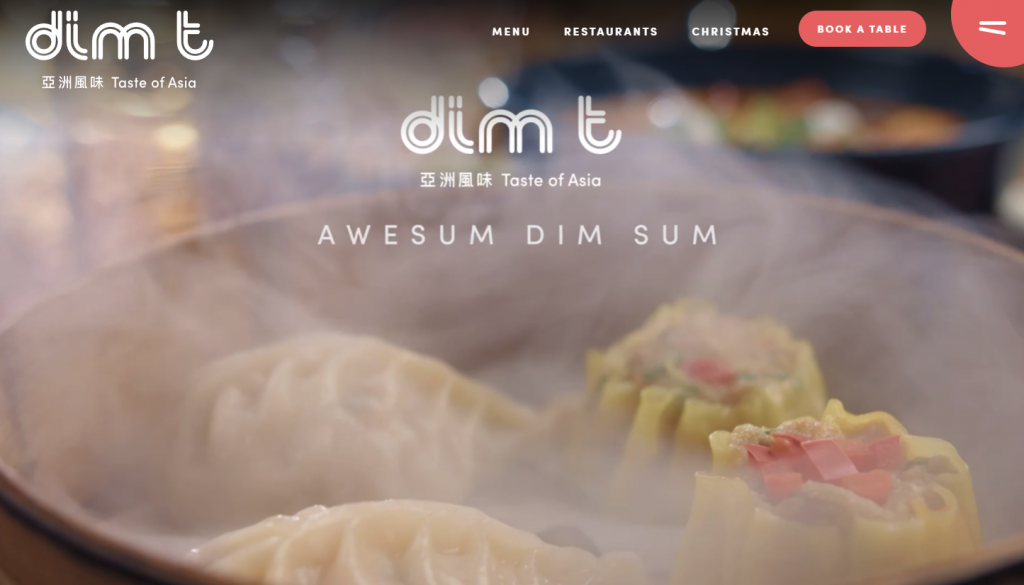
Dim T’s website greets visitors with a high-quality video hero, capturing its dim sum expertise. A key feature in the site’s navigation structure is the prominently highlighted Book A Table button in a striking red hue.
Online visitors looking for a Dim T experience nearby can utilize the Find Nearest Location feature. The site also thoughtfully includes a dietary filter, making finding vegan, vegetarian, and gluten-free options easier.
This restaurant website stays up-to-date by regularly updating its design based on its promotional activities. For example, it’s currently embracing the festive spirit with a Winter/Christmas campaign.
3. La Cage
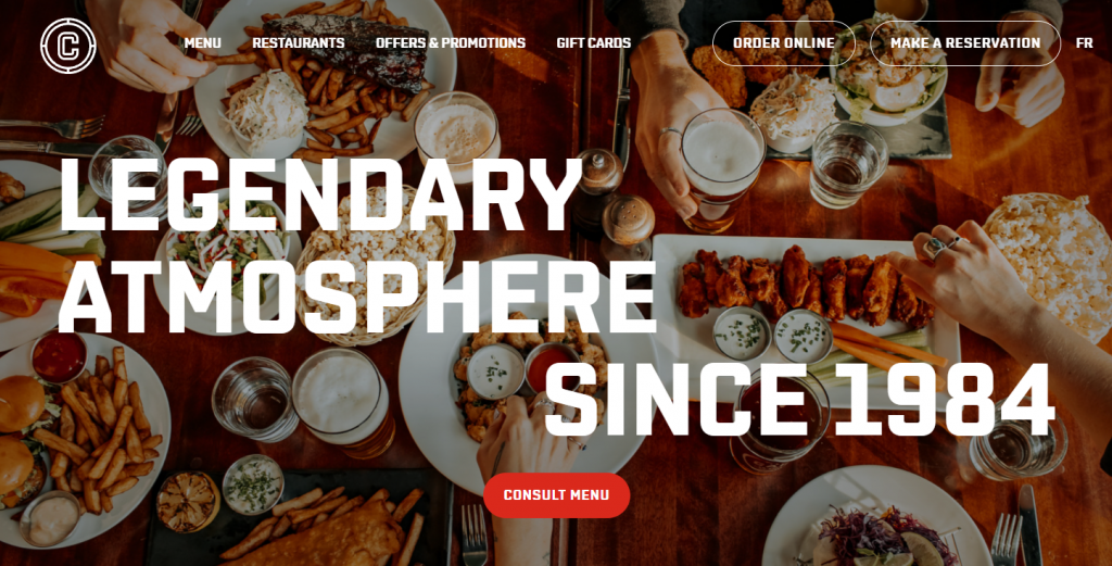
The La Cage sports bar presents a sleek restaurant web design combining a high-quality hero image and strong typography.
Emphasizing community building, La Cage offers a variety of loyalty programs. Scroll down the homepage and find La Cage members’ everyday deals. You can also visit the Offers and Promotions page for more detailed information about the club’s loyalty program.
Discover what is available in each restaurant’s branch by clicking Consult Menu. The pop-up sidebar with search functionality helps visitors select a restaurant. For each location, you can check the available dining options – dine-in, takeout, and delivery.
Other prominent call-to-action buttons are Order Online and Make a Reservation. The strategic CTA placement at the homepage’s top right corner helps ease the customer journey.
4. Little Ruby’s Cafe
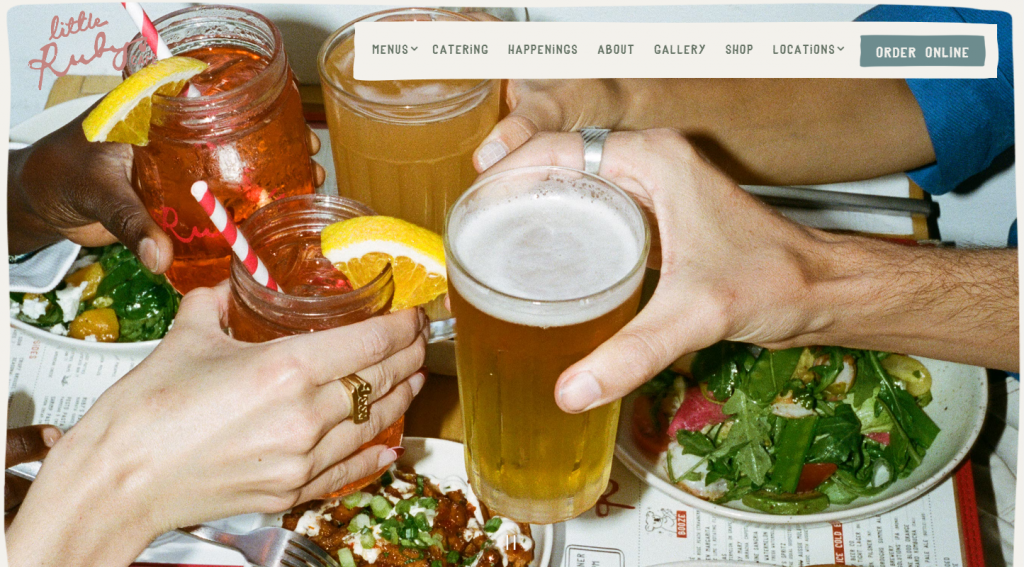
Little Ruby’s Cafe’s website exhibits a home-like feel through the first-person point-of-view shots and hand-drawn web design elements.
The hero image slideshow and photo gallery showcase the cafe’s warm atmosphere. Also, the Happenings page helps attract more guests. It’s where Little Ruby’s Cafe shares its event information.
Another distinctive feature is the delivery services. With Uber Eats online ordering for restaurants, Little Ruby’s Cafe aims to attract customers in Soho, Murray Hill, and East Village. This strategic collaboration prompts visitors to place online orders.
Suggested Reading
Check out our article on how to take product photos to improve your restaurant website photography.
5. Mr.Pops
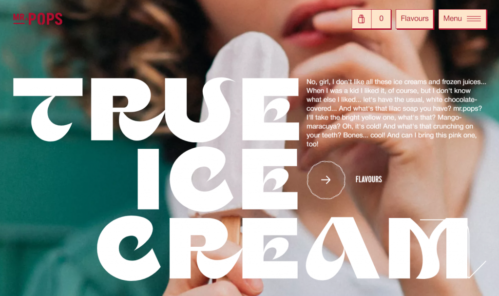
Mr.Pops is a Ukraine-based ice cream parlor. It’s one of the best restaurant websites due to its use of fun storytelling and a creative web design approach.
The website uses a red and beige color palette combined with high-quality, colorful photographs. It incorporates doodle animations to improve user engagement.
Mr.Pops’ website also offers an exceptional user experience thanks to its easy navigation. It simplifies the menu bar into three sections – the shopping cart, the Flavours tab, and a drop-down menu. Moreover, it provides information on favorite flavor selections to help potential customers make decisions.
The website is available in English to cater to international visitors.
6. Luks
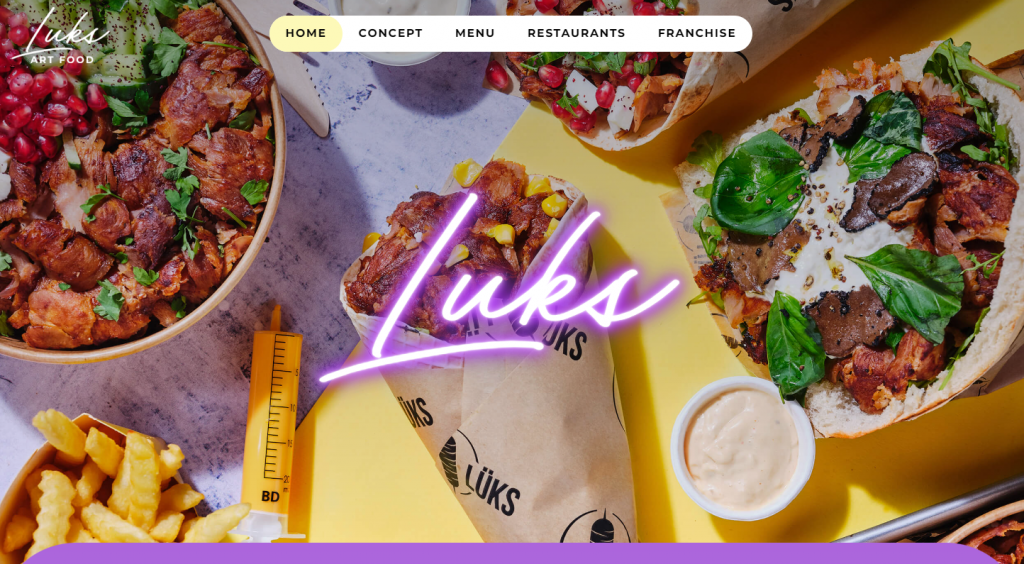
Luks, renowned as France’s first gourmet kebab chain, presents a vibrant restaurant website design.
The website employs high-quality images of Luks’ signature dishes, complemented by a gradient pastel color palette. Simple animations add dynamic to the browsing experience, enhancing the visual appeal and keeping the user engaged.
Luks’ menu presentation is well-organized, thanks to the clear categorization. Social media integrations to Luks’ Instagram and TikTok accounts allow the restaurant to showcase its social media presence and connect with the audience.
Visitors can discover Luks’ history and milestones on the restaurant’s Concept page. The website’s Become a Franchise section signifies the brand’s success while inviting entrepreneurs to be part of its story.
7. Miss Lily’s
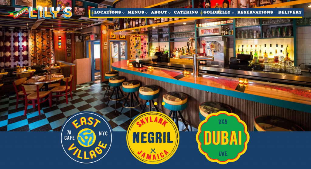
On Miss Lily’s restaurant website, expect a colorful and lively design. It uses a navy and yellow palette, echoing the restaurant’s Caribbean vibe.
Miss Lily’s homepage features well-designed location buttons overlapping the hero image and the following section. This approach ensures that information about each location is just a click away.
This restaurant website highlights Miss Lily’s involvement in community and social causes. The About page has a section dedicated to fundraising efforts supporting The Rockhouse Foundation’s programs and projects.
Information on the online ordering system and catering services is also easy to find, demonstrating Miss Lily’s commitment to accessibility and customer service.
8. Chi Chi
Chi Chi is a Sydney-based Pan Asian restaurant. Its website design utilizes a bold color scheme of red, orange, white, and black, creating a striking online presence.
Chi Chi’s restaurant website incorporates a horizontal scrolling effect. This design choice differs from the traditional vertical-scrolling approach many restaurants utilize, adding an element of innovation.
Discover Chi Chi’s categorized menus for breakfast, lunch, dinner, drinks, and snacks. This menu organization makes it easy to find what you want.
Suggested Reading
Learn how to create your own exceptional restaurant menu.
High-quality images are also the site’s central feature. In addition to the beautifully captured food pictures, online visitors can explore a photo gallery of Chi Chi’s space. This feature helps entice them with the restaurant’s interior.
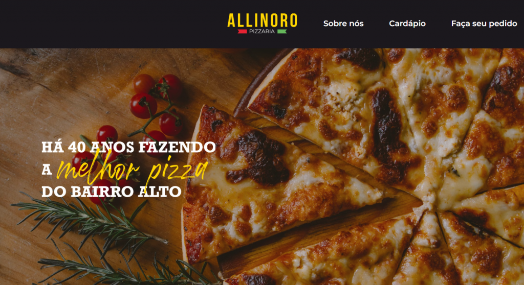
9. Pizzaria Allinoro
Pizzaria Allinoro offers a great example of a simple restaurant website. On top of the hero image of the restaurant’s artisanal pizza, explore its navigation bar, which consists of three tabs – About us, Menu, and Make your wish.
The pizzeria’s menu presentation online includes four categories, with the dish names and descriptions attached. This approach lets customers get a quick overview of Pizzaria Allinoro’s offerings.
Location details include the restaurant’s address and Google Maps integration. Opening hours and contact info are also clearly listed, providing all the necessary information for planning a visit or getting in touch.
Powered by Hostinger Website Builder, Pizzaria Allinoro provides a direct online ordering system through phone and mobile devices. Find more information on the restaurant’s social media accounts – Facebook and Instagram.
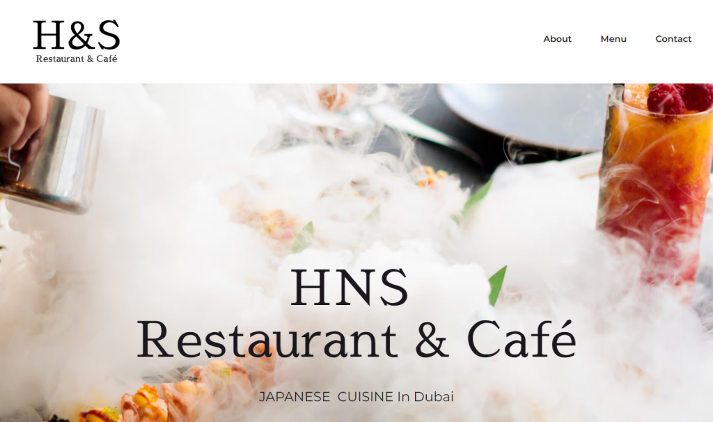
10. HNS Restaurant and Café
Another website created with Hostinger Website Builder, HNS Restaurant and Café offers a simple website design to take inspiration from. It exemplifies how a minimalist approach can also be elegant.
The site’s homepage showcases a high-quality hero image, setting the site’s welcoming tone and inviting visitors to explore further.
HNS Restaurant and Café’s website features a simple menu bar. It has three items – About, Menu, and Contact. Scrolling down the homepage, visitors will encounter short descriptions of these pages, similar to those on a one-page website.
Opening hours and social buttons are accessible on the site’s footer.
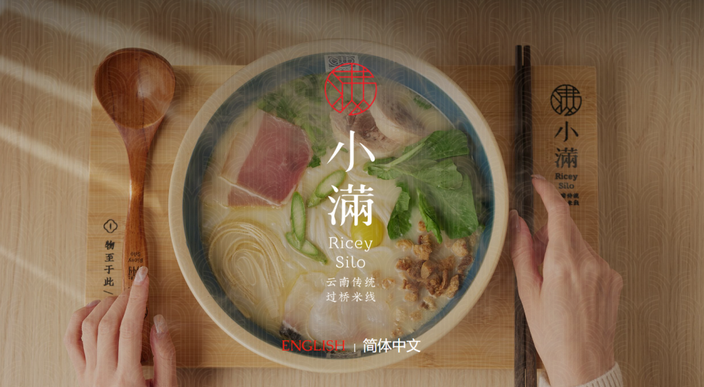
11. Ricey Silo
Ricey Silo’s restaurant website has an elegant design that emphasizes its specialty in rice-based noodle dishes.
Visitors must first choose their preferred language – English or Japanese – to access the site. Then, a full-screen video of Ricey Silo’s steamy rice noodles will greet you upon opening the homepage.
The About page contains the restaurant’s history, values, and statement of authenticity. It also has a beginner’s guide on how to eat Ricey Silo’s rice noodles, from separating the quail egg yolk and battering the protein to adding the ingredients into the broth and slurping the noodles.
Clicking Menu will open a new tab for the restaurant’s menu PDF file. The comprehensive description makes it easier for potential customers to find what they fancy.
Should you have any inquiries, Ricey Silo’s address and contact details are available on the site’s footer.
12. Bavet
Bavet, specializing in Bavarian cuisine, offers a great restaurant website design example for interactivity.
This website incorporates various animation styles, including scrolling, hover, and click-triggered effects, without overwhelming visitors. Color-wise, it mainly consists of beige and red.
In addition to food and drink menu items, Bavet’s restaurant website contains information on its multiple locations and community forums.
On the Locations page, explore its 15 locations, each offering a distinct atmosphere and experience. Find information about Bavet’s club, kiosk, food truck, merch shop, and social media channels on the Community page.
One unique feature is the sticky bottom navigation bar, with Our Menu, Book A Table, and Order Food call-to-action (CTA) buttons. This strategy is excellent for optimizing user experience on mobile devices.
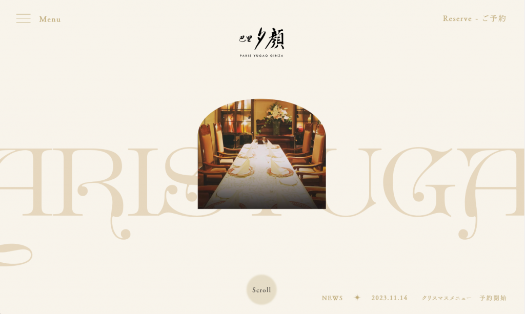
13. Paris Yugao Ginza
Paris Yugao Ginza is a museum-themed, modern restaurant. Its website combines French and Japanese design inspiration by blending minimalism with a sophisticated beige, gold, and black palette.
Paris Yugao Ginza’s website showcases meticulous attention to detail, capturing visitor’s attention.
The eight-pointed star icon used throughout the site serves as a decorative element as well as demonstrates the restaurant’s commitment to elegance. The rotating circular text animation adds a dynamic touch to the browsing experience.
Paris Yugao Ginza’s restaurant website has a detailed Information & Access section. It provides essential details, including the restaurant’s address, contact details, and business hours.
14. Canlis
Canlis is known for its breathtaking views and exquisite dining experience, and its restaurant website mirrors this elegance.
The website’s lavish design complements the restaurant’s upscale dining experience offerings, ensuring the user experience online is as refined as in person. A standout feature on the website’s desktop version is the video hero showcasing the restaurant’s scenic setting.
Canlis’ website incorporates a vertical navigation structure where visitors can make reservations or purchase gift cards.
Its homepage emphasizes visual storytelling of the restaurant’s history and features an introduction to Canlis’ executive chef. This personal touch adds depth to the story, inviting visitors to connect with the culinary mastermind behind its renowned dishes.
On the Reservations page, explore the restaurants’ policies, including attire and cancellations.
15. Diner
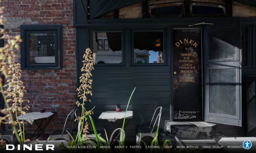
Diner offers another simple restaurant website design inspiration. Its homepage employs a bottom navigation bar, setting it apart from other dining establishment websites.
In addition to dinner menus, it offers brunch dishes, wine, and spirit drinks. Utilize the contact info if you need assistance in accessing the menu.
As Marlow & Sons’ local hit for Brooklyn, Diner’s Catering and Shop are integrated into third-party sites of the group. Clicking the button will redirect you to Marlow Events or The Marlow Collective, respectively.
On top of all, Diner is an amazing restaurant focusing on local, seasonal, and sustainable foods. The dedicated Know Your Farmers page demonstrates the commitment to support local communities.
16. Paperboy
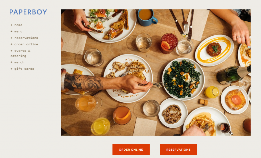
Paperboy’s restaurant web design is very minimalistic, emphasizing functionality and convenience for visitors. Its homepage has four elements – a vertical navigation bar, a hero image, CTA buttons, and the restaurant’s info.
Access the restaurant’s menu PDF file by clicking the menu tab. On the events and catering page, get a glimpse of the restaurant’s atmosphere through inviting images.
As a side business, Paperboy offers a variety of merchandise. Browse and purchase the brand’s mugs, hoodies, sweatshirts, t-shirts, and tote bags from the merch page.
Paperboy’s restaurant reservation and online ordering system are through a third-party site. For social media engagement, Paperboy embeds its Instagram account’s link on the site footer.
17. Fifty Nine Republic
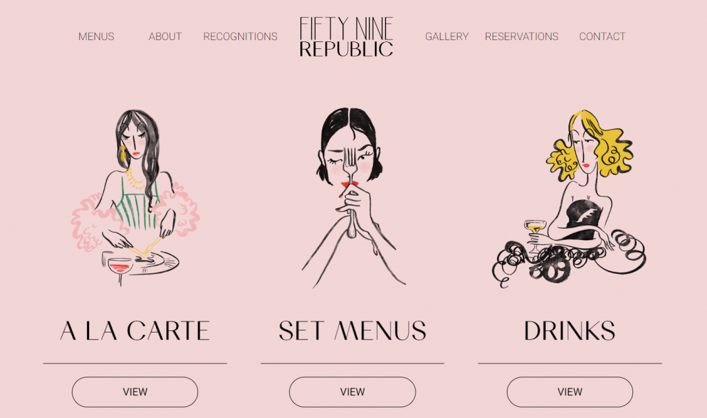
Anticipate one of the most unique restaurant website designs on the list. Fifty Nine Republic’s website stands out with a pink background and hand-drawn icons. This aesthetic choice enhances the site’s visual appeal, helping attract customers.
Fifty Nine Republic’s restaurant website effectively showcases a food gallery, highlighting its menu options. It also includes awards and recognitions to demonstrate its commitment to excellence.
Essential information, like opening hours, locations, and menus, is easily accessible on the site footer. In addition to Facebook and Instagram social links, Fifty Nine Republic embeds its Trip Advisor account link to give access to organic customer reviews on restaurant websites.
18. Little Shucker
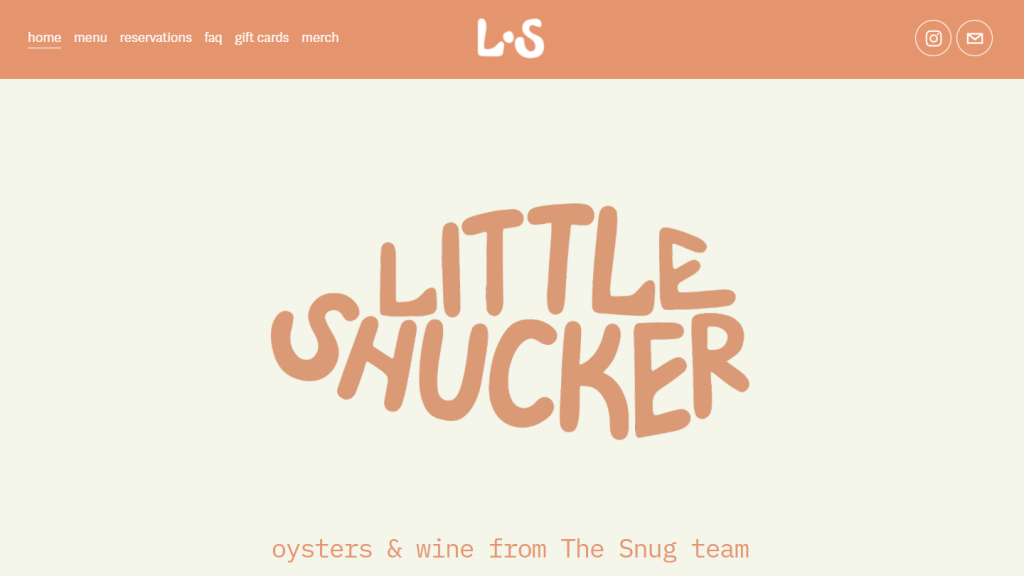
Little Shucker’s restaurant website features a fish-shaped typography hero image. This web design approach minimizes page weight and ensures excellent site speed, a good practice for SEO for restaurant websites.
The site’s color scheme combines orange and beige, contributing to its minimalist aesthetic. Navigation is user-friendly, with a sticky bar where visitors can access the restaurant’s reservations, FAQs, and shop pages.
While Little Shucker doesn’t have phone support, an email address and other relevant details are available on the site footer should you have any questions.
19. Tiki Chick
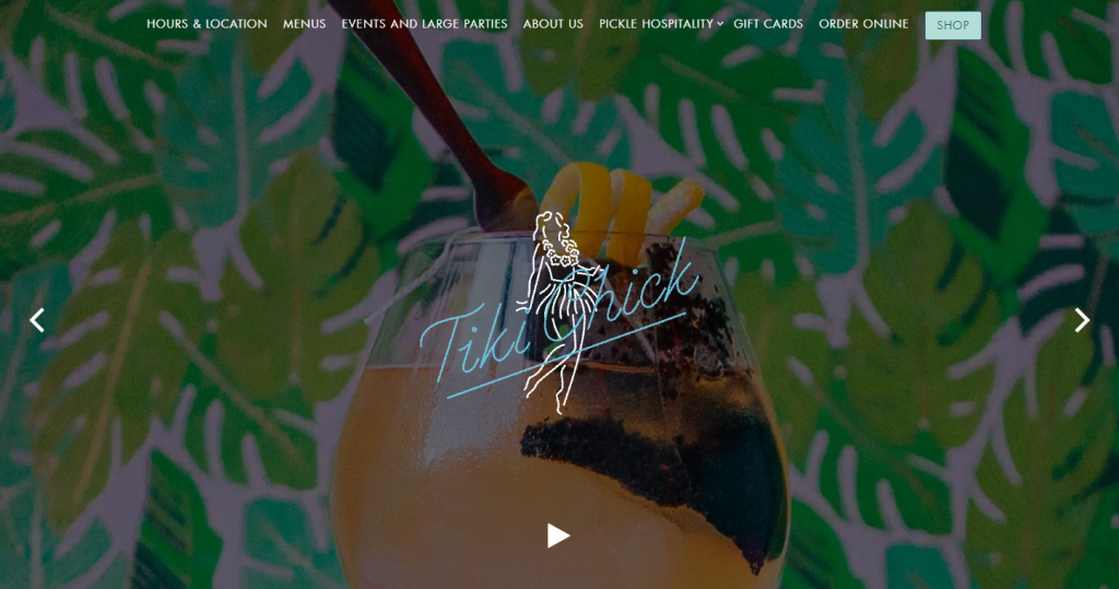
Tiki Chick’s restaurant website immerses visitors in a tropical theme. The design, featuring vibrant images and the neon light effect, successfully highlights the tiki bar’s retro aesthetic.
Despite the colorful design style, straightforward navigation eases site visitors to find essential information.
For organizing special events in a lively setting, find the information in Tiki Chick’s dedicated homepage section for private dining or party event reservations. You can also easily explore the bar’s menu items, including dine-in, takeout, and seasonal choices on the Menu page.
In addition to an integrated eCommerce store for Tiki Chick’s merchandise, the website facilitates convenience by accepting online orders.
Elements of a Great Restaurant Website
Building an exceptional restaurant website can set you apart from competitors. Let’s explore some web design best practices to improve your user experience.
Ready to Build Your Own Stunning Website
Check out our step-by-step guide on How to Build a Restaurant Website.
Eye-Catching Homepage
The homepage serves as the digital front door of your restaurant. Having an aesthetic homepage helps set the tone for your restaurant website and capture online visitors’ attention.
Hostinger’s restaurant website builder offers intuitive AI-powered tools to create an inviting homepage that reflects your brand’s ethos. These tools include:
- AI Image Generator. Click on any pre-set image → Generate image to use this feature.
- AI Writer. Assist in crafting short copies. Click on any text from the restaurant website template → AI Writer to adjust them based on your needs.
- AI Logo Maker. Change the pre-made logo and quickly generate a new one by accessing AI Tools → AI Logo Maker.
Clear Menu
When designing your website, pay attention to its menus. A well-organized menu offers numerous benefits, one of which is ensuring visitors can easily navigate your restaurant’s offers.
Keeping it up-to-date is equally crucial, especially if you also sell food online. Outdated or incomplete information can lead to customer dissatisfaction, potentially resulting in missed business opportunities.
Hostinger Website Builder lets you easily create a clear menu. Here’s how:
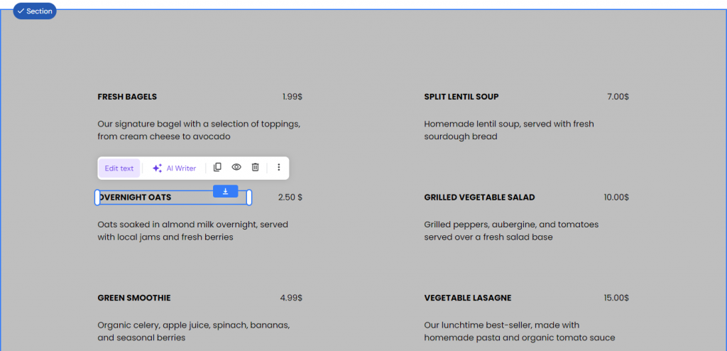
- On the editor, click Menu to access and edit the web page.
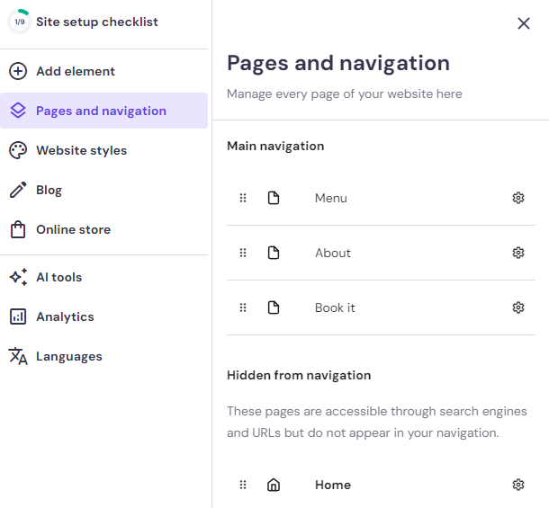
Alternatively, you can go to Pages and navigation → Menu.
- Click on any text, whether the food name, description, or price. Then, choose Edit text to start editing.
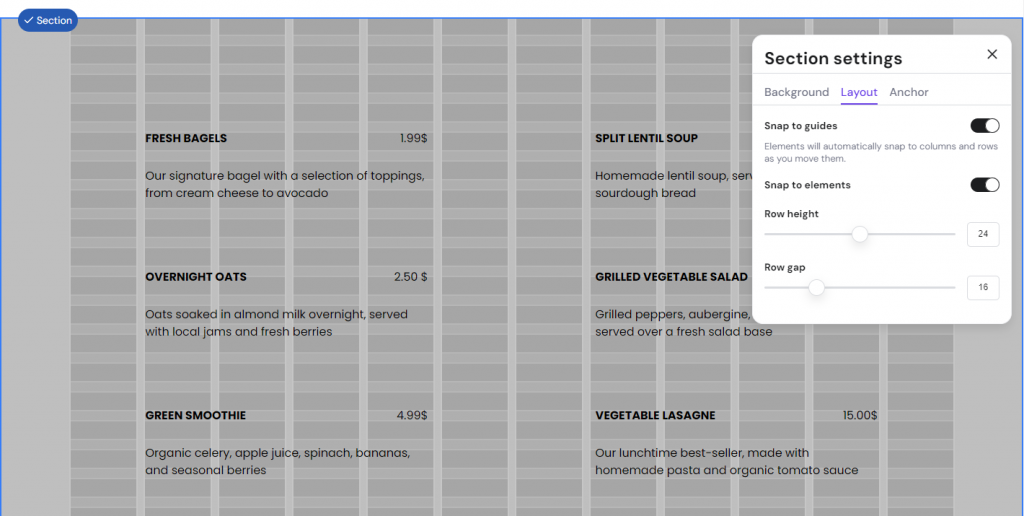
- To customize the web page layout, go to Edit section → Layout. Repeat this process for each of your Menu page’s sections.
High-Quality Food Photos
High-resolution food, space, or merch photos help improve your website’s engagement. They also reflect positively on the restaurant’s professionalism.
Fortunately, the best restaurant website builders optimize your photos as you upload them. This automation ensures excellent restaurant website performance, resulting in a good user experience.
Online Reservations
Integrated online booking offers convenience. It lets customers make reservations without physical visits to the restaurant, accommodating their busy schedules.
Hostinger Website Builder enables seamless integration of reservation features. By purchasing the Business and Cloud plans, you can activate the eCommerce functionality and choose Appointment as your product type.
Customer Reviews and Testimonials
Displaying feedback builds trust and credibility. It’s also a form of social proof, demonstrating that your restaurant is confident in its offerings and transparent about customer experiences.
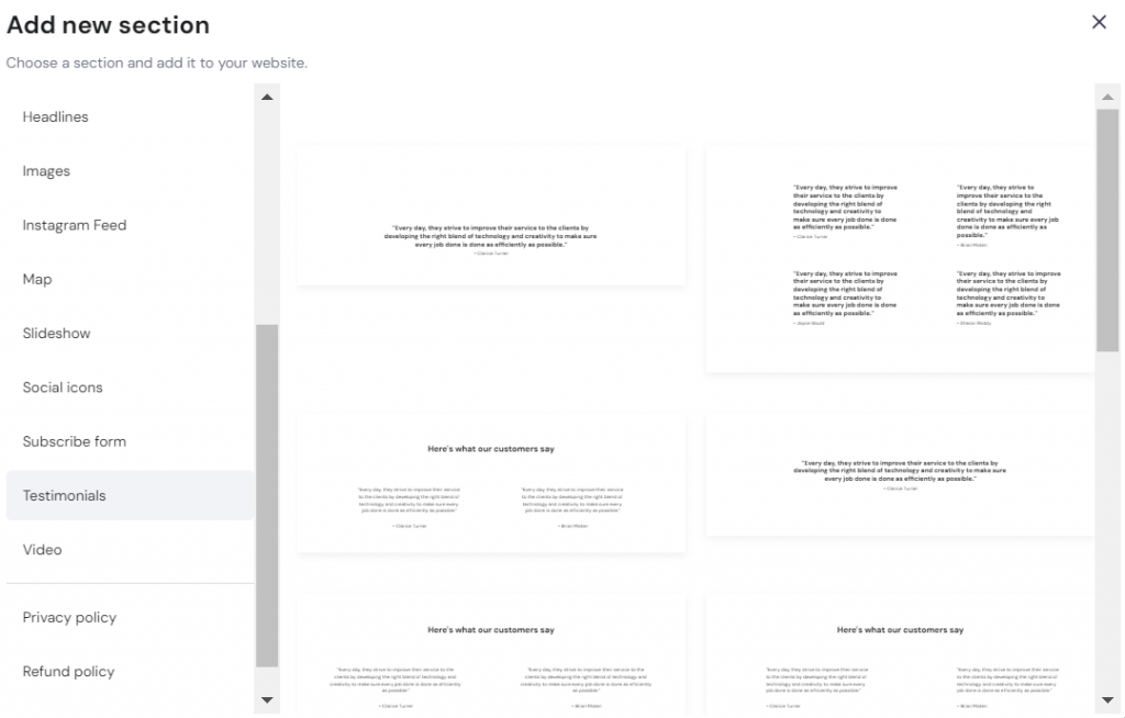
Hostinger Website Builder has the features to showcase customer reviews. On the editor, click Add Section → Testimonials.
To pull and display reviews from third-party sites like Tripadvisor and Yelp, go to Website Settings → Integration.
About Us Page
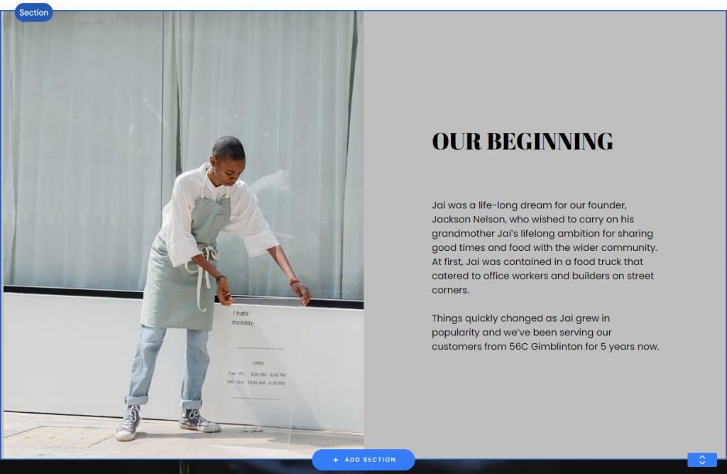
Your story matters, and an engaging About Us page lets patrons connect with you on a personal level.
Use the restaurant’s About Us page to introduce the people behind the scenes, from the chef and staff to the owners and founders. You can also include your location, address, and contact information. On restaurant websites, these details are necessary.
Attach practical information such as the restaurant’s philosophy, sustainability efforts, and community involvement. They demonstrate what your restaurant stands for and how it contributes to a greater cause.
Create an engaging About Us page with Hostinger. On its interface, click on the auto-generated About Us content to start editing and align it with your brand’s story.
Social Media Buttons
Keeping an active presence on relevant social media platforms helps restaurants reach a vast and diverse audience.
Social media integration for restaurants is also a powerful tool for engagement. It facilitates direct, two-way communication between the restaurant and its patrons.
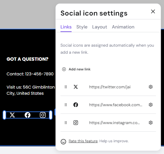
All Hostinger Website Builder‘s templates integrate the social media section by default. Go to the site footer and click the social buttons to edit the links.
Blog and Updates
Showcase your expertise in culinary by sharing valuable restaurant blog content, such as cooking tips, unique food and drink pairings, and behind-the-scenes stories.
A business can use a blog to foster a sense of community. Build meaningful connections by participating and writing about events, partnerships, or initiatives that support local causes.
With Hostinger Website Builder, you can easily integrate a blog into your restaurant website. Navigate to Blog → START A BLOG to set one up.
Conclusion
The above restaurant websites demonstrate web design creativity in the culinary industry. Some interesting trends include strategic placement for call-to-action buttons, hero image or video use, interactive web design elements, and the visual storytelling approach.
While each website offers a unique experience for visitors, here are our five top picks and why they stand out:
- Romero Verde. Distributes the restaurant’s interior photographs throughout the website to invite visitors to pay a visit.
- Dim T. Prompts visitors to take the desired action by highlighting the Book a Table button in red.
- La Cage. Offers a loyalty program and special deals to emphasize the bar’s goal for community building.
- Little Ruby’s Cafe. Entices visitors with high-quality photographs in first-person POV, showcasing the cafe’s warm atmosphere.
- Mr.Pops. Incorporates fun storytelling to reinforce brand identity.
Several restaurant websites’ best practices to improve user experience include crafting an enticing homepage.
Writing an engaging About Us page and incorporating a restaurant blog are crucial, too. These strategies help showcase your culinary expertise and foster a sense of community.
Regarding user experience, ensure clear and up-to-date menus to help visitors navigate your restaurant’s offerings. You might also want to consider offering online reservations.
Build trust and offer social proof by displaying customer reviews. Link to your social media accounts and get opportunities to engage directly with a diverse audience.
Good luck with your restaurant website!
All of the tutorial content on this website is subject to Hostinger's rigorous editorial standards and values.
