15+ best photography website examples for 2025 built with Hostinger Website Builder

A photography website is essential for photographers who want to showcase their work online and attract potential clients. However, creating a photography website can be challenging without the right tools and direction. The good news is that there are tutorials and guides on how to create a stunning photography website that can assist you in kick-starting the process.
In this article, we’ve compiled a selection of successful photography websites to serve as a wellspring of inspiration. We will explore the best photography website examples built with Hostinger Website Builder.
Download website launch checklist
Top 15+ photography website examples
From minimalist layouts to visually dynamic galleries, this compilation of the best photography websites will help inspire you to create your own photography website.
1. Hilario Photography
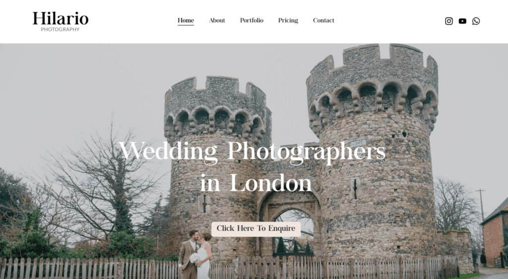
Hilario Photography is a wedding photography website that stands out for its clean, inviting design. Created by the husband-and-wife duo, Tim and Sisi, the website reflects their passion for capturing authentic, heartfelt moments.
The homepage features a stunning wedding photo that harmonizes beautifully with the site’s cohesive color palette, typography, and buttons. Visitors are naturally guided to a single call-to-action, leading them to the Contact page for inquiries.
The Portfolio page highlights Tim and Sisi’s storytelling approach. Each project features a brief description of the couple and their special day, adding a personal touch to the images. This humanizes the work, making it relatable and engaging.
The Pricing page is equally straightforward, offering two clear options with concise descriptions of what each package includes. This simplicity ensures visitors can quickly understand the value of each service.
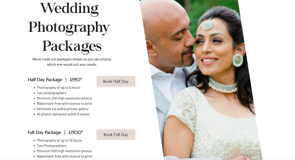
Unique features – Balanced use of color and typography, personal storytelling on the Portfolio page, and a simple call-to-action for easy navigation
2. New Lens
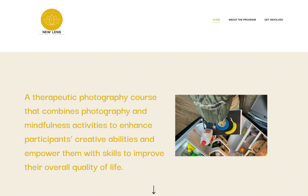
New Lens Therapeutic Photography shows how photography websites can be more than just an online portfolio. Combining photography with mindfulness, the New Lens Photography Program offers classes for those looking to join the creative cause.
The New Lens website has user-friendly navigation. The homepage’s content clearly explains the program and showcases photo galleries. Every page of the website leads to the Get Involved page, encouraging visitors to join the program.
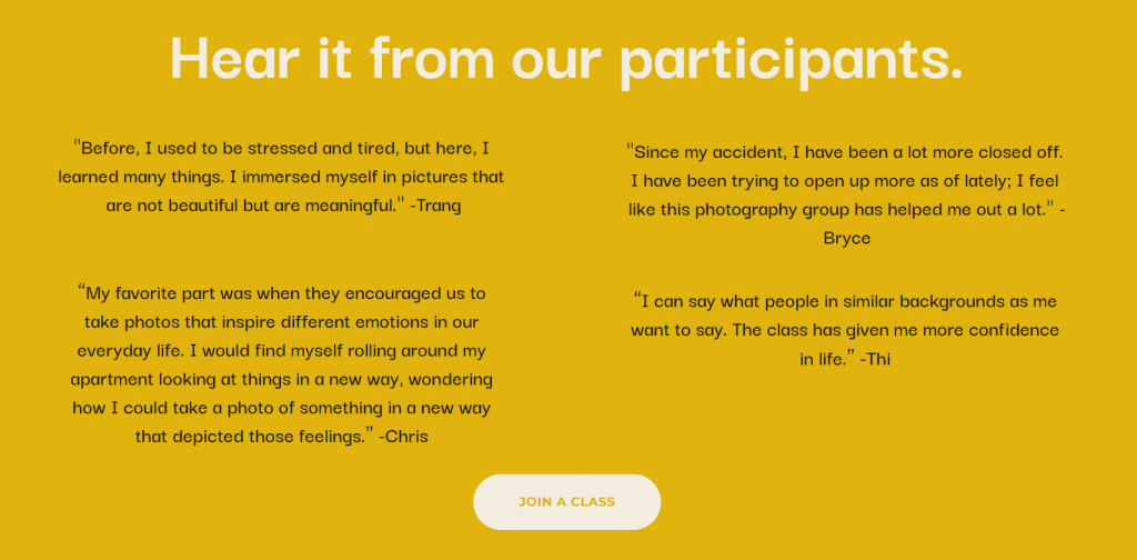
The website also features social proofs. Client testimonials for photographers are valuable social proof, boosting website credibility and encouraging potential clients to contact you.
Unique features – a client testimonials page and soft colors to strengthen branding
3. Tilly Rose Creative
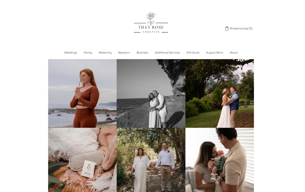
Tilly Rose is a wedding photographer based in Australia. Rose’s photography site shows how photographers can effectively organize their services.
All the photos are organized in a grid gallery contrasting a white background. With a contact form and call-to-action copy underneath each page, potential clients are encouraged to get in touch with the photographer.
Since wedding photography is her main project, the Wedding category is first in the navigation menu. Visitors can explore other categories in the navigation menu, which signifies Rose’s versatility. Aside from photography, she offers freelance services, such as social media management, graphic design, and web development.
Rose, as an Australia-based wedding photographer, chose the .com.au domain extension for her website. The domain extension helps the website gain more visibility on searches in Australia.
Domain Name Checker
Instantly check domain name availability.
The wedding photography website also has a simple eCommerce functionality for selling Gift Cards, a great example for photographers looking to sell products.
Unique features – online booking integration and contact details at the bottom of every page
4. Reflections In Focus
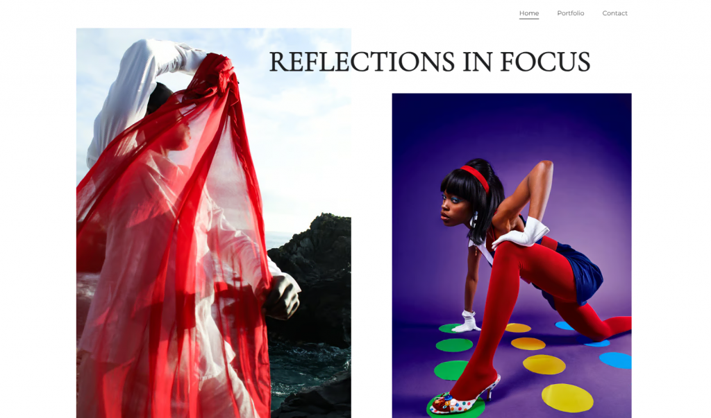
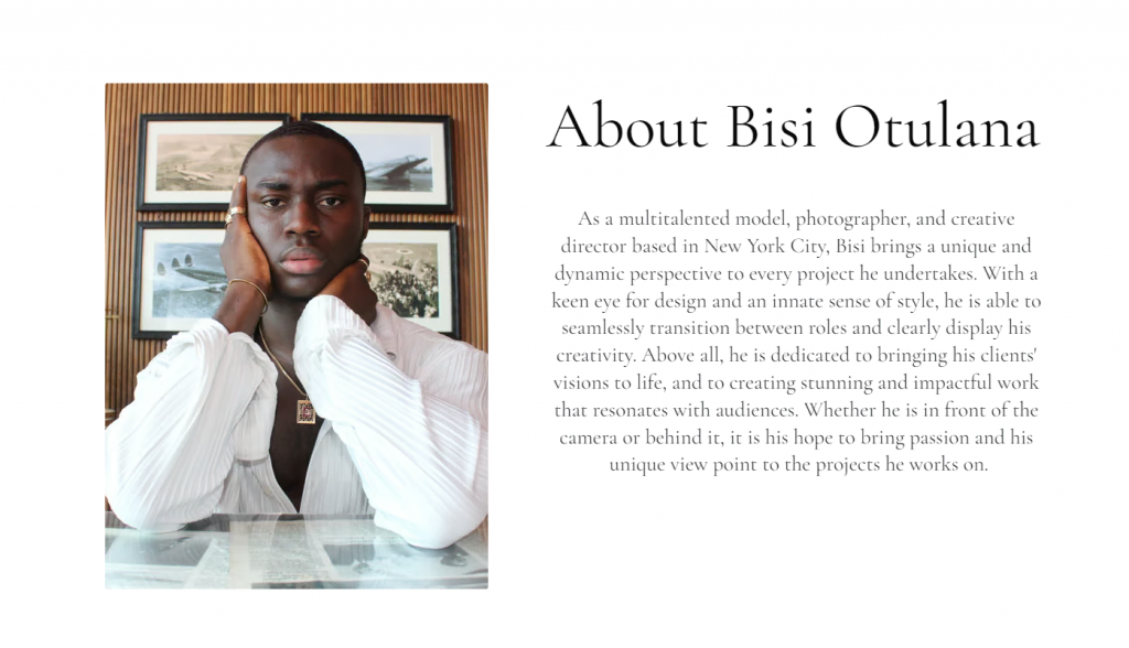
Reflections In Focus is one of the best photography websites due to its design. A showcase for fashion photographer and creative director Bisi Otulana, the website’s design is clean yet elegant.
Otulana’s website has a straightforward design with three pages – Home, Portfolio, and Contact. The two-page Portfolio section has brief project details, allowing visitors to focus on the photos.
The homepage showcases four editorial photography samples with distinct styles, giving visitors a quick summary of Otulana’s work. Interestingly, the website combines the homepage and the About section. Readers can learn more about Otulana without having to navigate to a separate page.
The About section is summarized in one paragraph and a photo of Otulana. First-time visitors will get a strong sense of the photographer’s style and personal branding.
Unlike many photography websites with lengthy contact forms, Otulana only attached his Instagram account and email address on the Contact page. It’s a great option if you want to keep your own website copy concise.
Unique features – minimal text and the use of white space
5. Desmond Photos
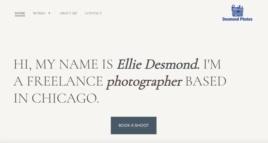
Desmond Photos is a photography portfolio website showcasing the unique perspectives of theater and street photographer Ellie Desmond. As a freelance photographer, Ellie’s work focuses on capturing raw, candid moments both on and off the stage.
The website features a straightforward, minimalist design with four pages: Home, Works, About Me, and Contact. This simple structure allows visitors to explore Ellie’s portfolio without distractions, making it easy to navigate.
The Works page offers an organized gallery of her projects, highlighting both theater performances and street photography with concise descriptions that provide context for each collection.
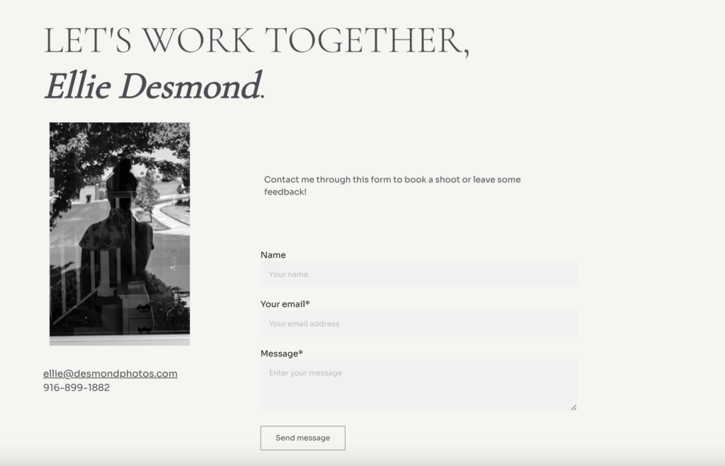
Unique features – A minimalist design with clean navigation and personal touches that highlight her passion for theater and street photography
6. GX Photos
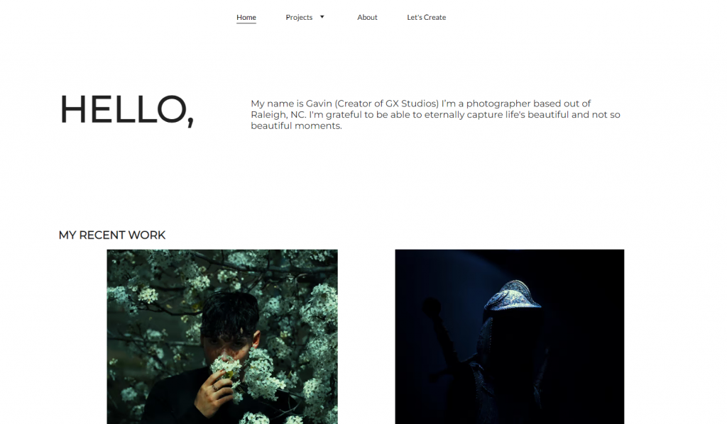
The photography website GX Photos can be your inspiration if you’re looking to combine both personal and professional projects.
The website journey begins on the homepage with an introduction to the photographer, Gavin Sibley. It also lists the photography genres Sibley specializes in.
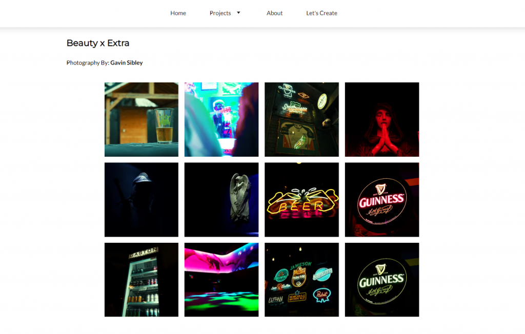
Visitors can explore GX Photos projects through the homepage, drop-down menu, or the project page itself. Clicking on Previous or Next at the bottom of each page will take users to a different project.
GX Photos uses different gallery layouts depending on the project. For architecture and personal photography, the photos have different sizes. For event photography and collaborations, the photos are arranged in a grid.
Specific gallery layouts can accentuate photos from a particular genre. It also helps add more variety to your photography website.
Unique features – creative CTA copy for the Contact page and a simple drop-down menu
7. FJ Studio
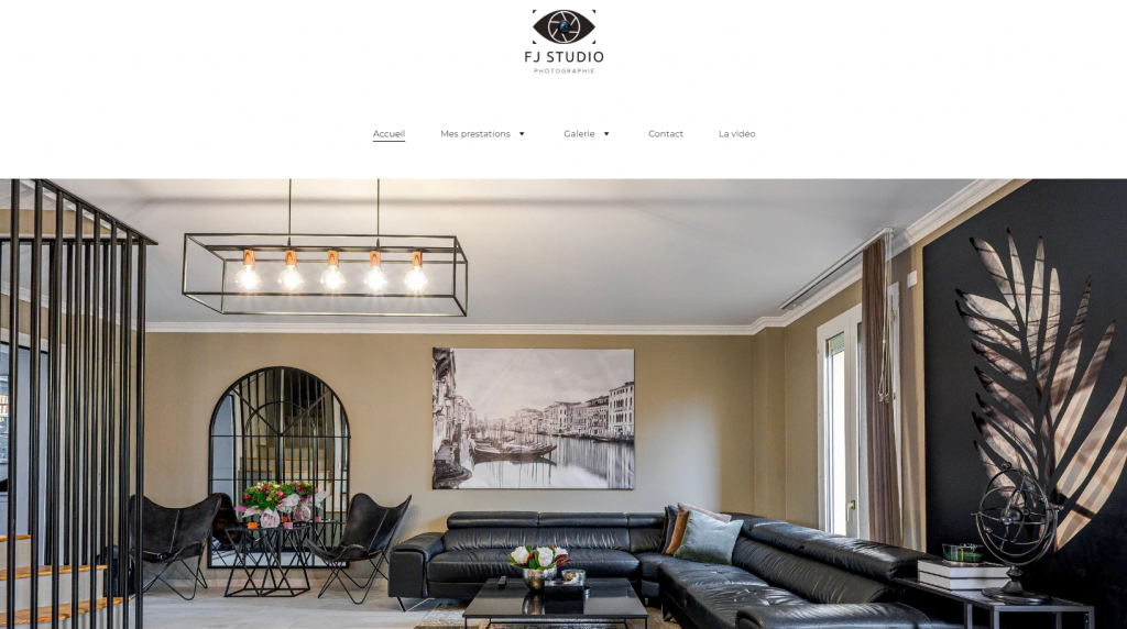
FJ Studio is Julien Ferre, a real estate, business, and portrait photographer based in France. Ferre also does events and wedding photography. If you want to build your photography business in a similar niche, FJ Studio is a great website to take inspiration from.
The photography website design is simple, with color schemes reflecting the brand.
The website also has all the necessary information for potential clients, from service coverage to price details, leaving no questions unanswered. This helps filter out curious visitors so only potential clients will make contact.
Ferre opted for a .fr domain extension for better visibility in France. Unlike the previous example from Tilly Rose Creative, Ferre used a country-code top-level domain (ccTLD) instead of an SLD. A ccTLD adds uniqueness and offers good SEO for photography websites.
The About Me page includes background information, an essential practice for a photography portfolio website. Ferre also added a portrait session booking form in addition to other contact details.
Unique features – WhatsApp chat integration and a booking form
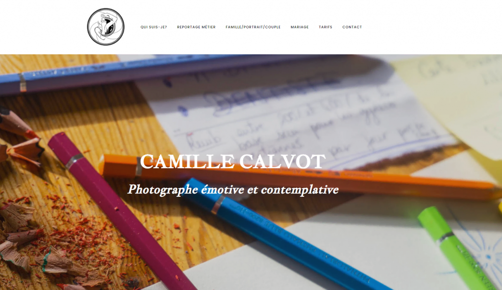
8. Camille Calvot Photographie
Camille Calvot specializes in family, business, and wedding photography. The background image of Calvot’s homepage successfully portrays her specialty and sets the tone for the website.
The About Me page has a short bio, self-portrait, and short paragraphs explaining Calvot’s style and approach.
The featured projects are organized by client types, like Business, Family, and Wedding. This client grouping is a great idea if you’re targeting the same audience.
Instead of a grid layout, the images are presented in large sizes, immersing viewers in Calvot’s work. Each project category page also has a short description by the photographer.
This photography website also has a pricing page complete with what’s included in the fees.
Unique features – using copy along with images to convey the photographer’s vision and a featured image representing each photography project
9. Pinzoo
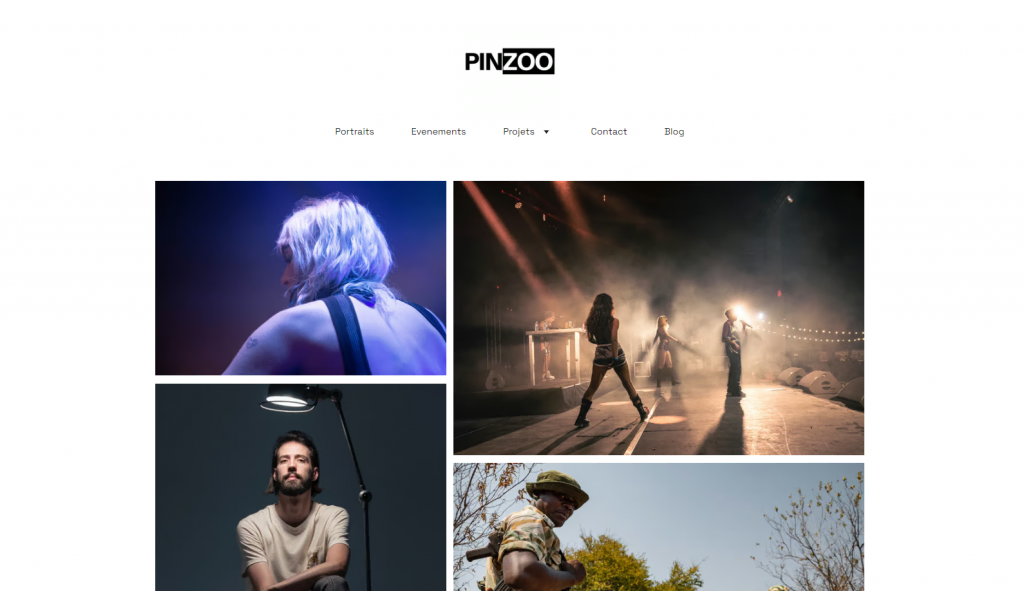
Pinzoo by Theo Lalliot is one of the best photography websites on this list. Lalliot, who specializes in event and portrait photography, uses the website as an online photography portfolio and a blog.
Fellow photographers can take inspiration from how the website organizes each project’s photos. The photography website design uses plenty of white space to highlight the images. They are organized neatly in a drop-down menu with short text descriptions.
The website footer contains Lalliot’s social media profiles, contact information, and legal notices. This is a good way to add more information without disrupting the user experience.
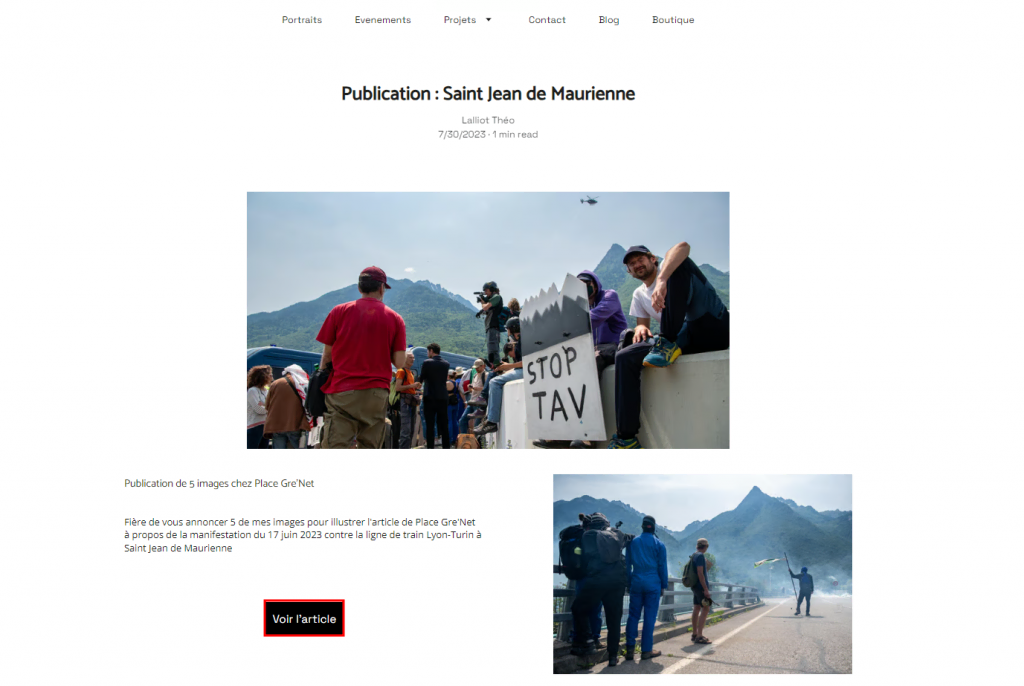
The blog displays Lalliot’s work as an editorial photographer. For each post, he adds a summary of the event, featured photos, and a link to the article’s original source. This is a clever self-promotion strategy for any aspiring photographer.
Lalliot also keeps the website’s name short and memorable. You can follow the same approach when looking for the best name for your photography website.
The photography website also features a shop page titled Boutique. Selling prints is a great way to make extra income as a photographer.
Unique features – photography blog integration, simple navigation, and a clean layout
10. TJ Photography
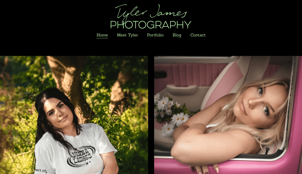
TJ Photography is a website for various photography categories, including family, nature, pets, and portrait photography. The photographer behind the website, Tyler James, unified these categories with strong branding colors – black and light green.
The homepage features a gallery with some of Tyler’s best photographs, which immediately grabs visitors’ attention.
One unique feature of TJ Photography is its About Me page. Here, Tyler introduces himself in a personal and engaging way, showcasing his passion for photography and his journey as a photographer.
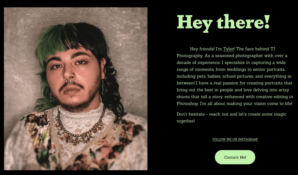
The photo is enhanced with an SVG grainy filter, giving it a subtle vintage vibe and making it more vibrant.
Unique features: Strong branding colors and a blog page with a Customer Spotlight segment
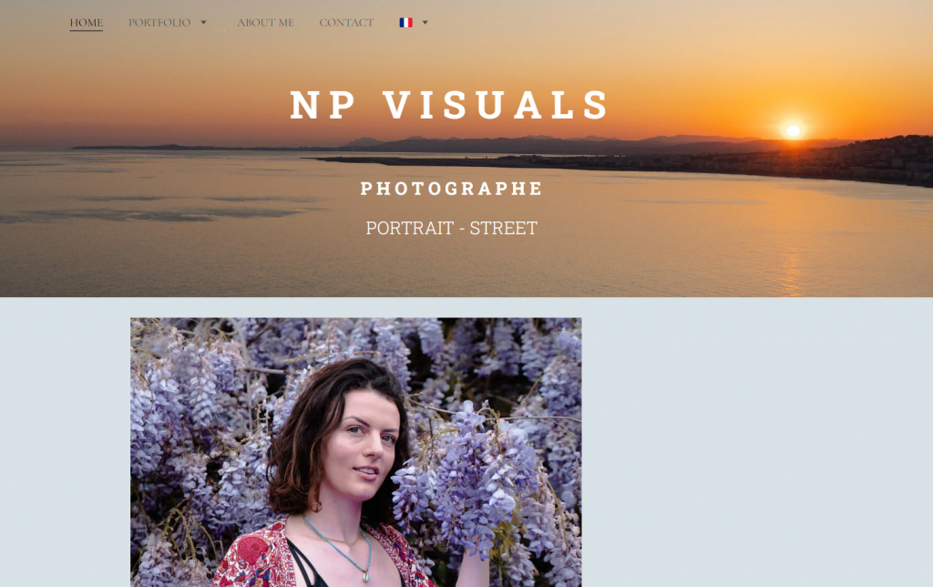
11. NP Visuals
NP Visuals showcases Nathan Piet’s portrait, events, street, and landscape photography work. The photography website has a consistent design with the same layout for different categories.
Visitors can navigate Piet’s projects directly from the homepage or the Portfolio drop-down menu. For extra information, Piet notes the camera and lens used for each project.
The website is available in three languages –English, French, and Japanese. This feature can help photographers who want to expand their business internationally. The multilanguage feature is available for all websites built with Hostinger Website Builder.
Piet also links his Facebook and Instagram pages on the website. Since social media is a visibility tool, this strategy helps Piet interact with visitors beyond their website visits.
Unique features – a multilingual feature and a project drop-down menu
12. Eleonore Photographe
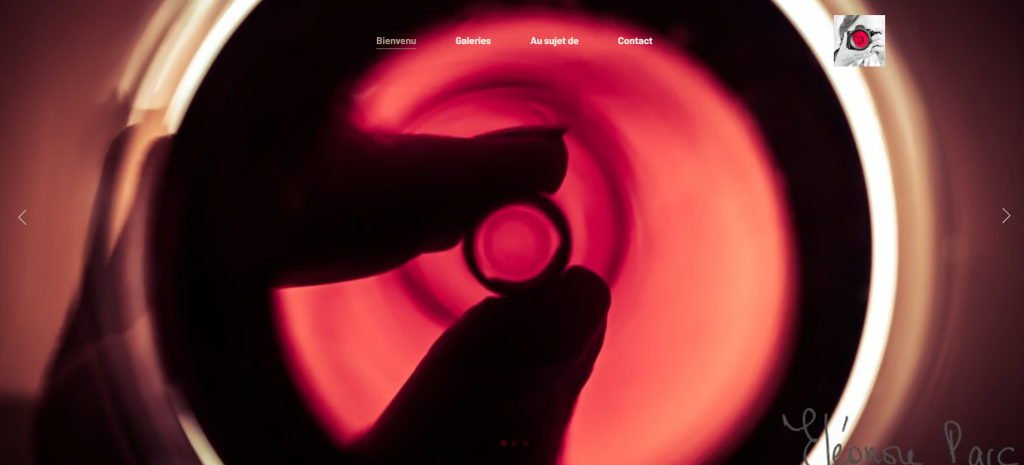
Eleonore Parc is a professional photographer and wine enthusiast. The website combines these two interests in a straightforward web design. Like several other photography websites in this list, Parc uses the .fr domain extension to target France-based clients.
The homepage of Eleonore Photographe is an image slideshow of the photographer’s latest work followed by a button that leads to the gallery. The page also has a News section highlighting Parc’s latest work and upcoming events.
If you have another business outside of photography, you can use this website to promote it. For example, Parc links her other website on the About Me page.
The Eleonore Photographe website is a great example of strong personal branding for photographers. The colors and fonts are consistent throughout the pages, and some photo galleries include a story and poetry written by Parc.
Unique features – a photography site linking to a coaching business site
13. Rosa Walloise Photographie Mariage
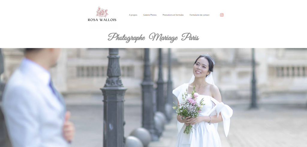
Rosa Wallois is a wedding photographer based in Paris. The homepage introduces visitors to the photographer and showcases a sample photo representing Wallois’ niche and style.
The website design is simple, with a total of four pages. Meanwhile, the visuals are dominated by white and elegant fonts, staying true to the wedding photography niche. Like the other best photography websites in this list, visitors have two options to navigate through pages: from the homepage or the menu bar.
Each page of Wallois’ wedding photography website has a heading copy reflecting her personal branding style. For the photo gallery, she explains her approach to wedding photography and shows a contact form button and her latest works.
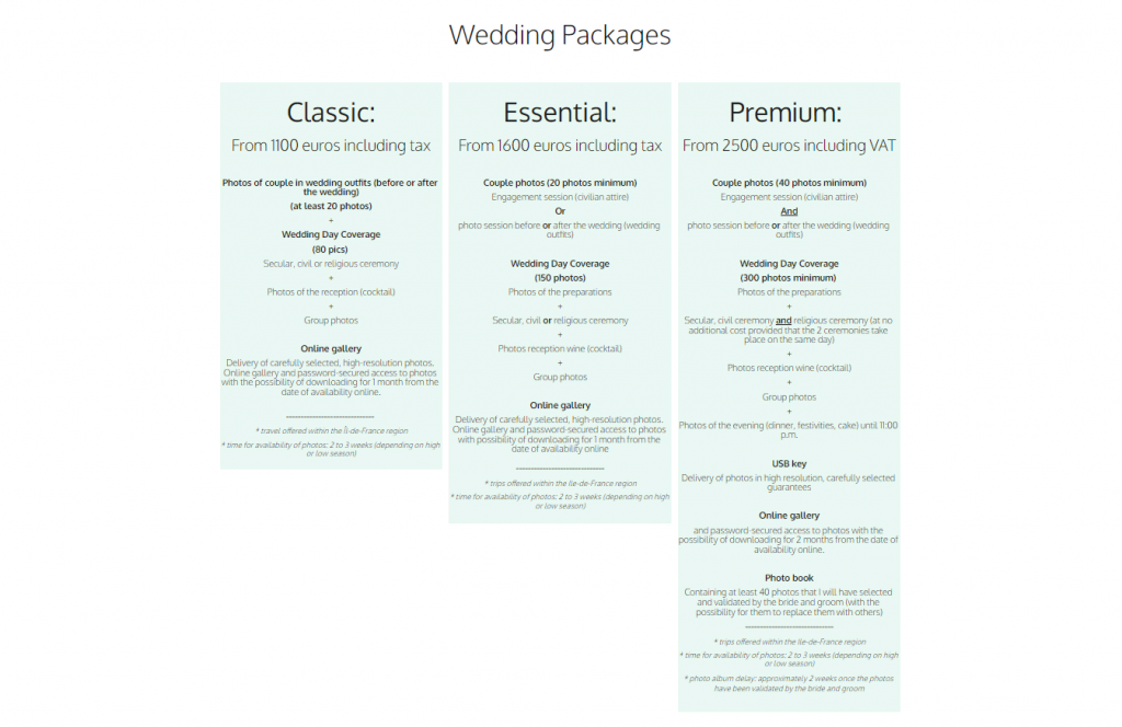
Fellow wedding photographers can learn from how Wallois arranges the service packages. The packages are put side-by-side, allowing visitors to easily compare and pick the best one.
Unique features – scrolling animation and parallax effect
14. Joel Photography
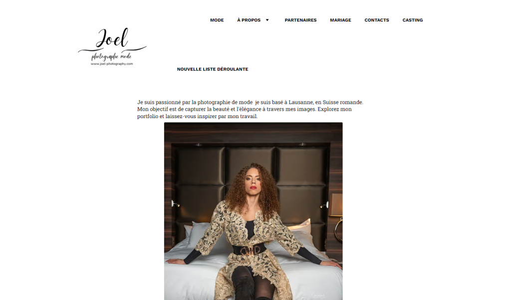
Based in Switzerland, Joel Photography specializes in fashion, pet, event, and wedding photography.
The website homepage has a short photographer bio. It also has a narrow photo gallery that looks best on smaller screens. This can be an inspiration if you’re targeting an audience mainly using mobile devices.
The web design is simple and clean, with plenty of white space and a brief copy to add context to the projects. If you’re also a fashion and beauty photographer, this design language will be able to attract attention to your photos.
If you work with a partner, take note of how this website includes partner details. With only the partner’s logo, a brief copy, a link to their website, and their address, it’s efficient yet effective.
Unique features – inspiring yet simple web design inspiration for mobile devices
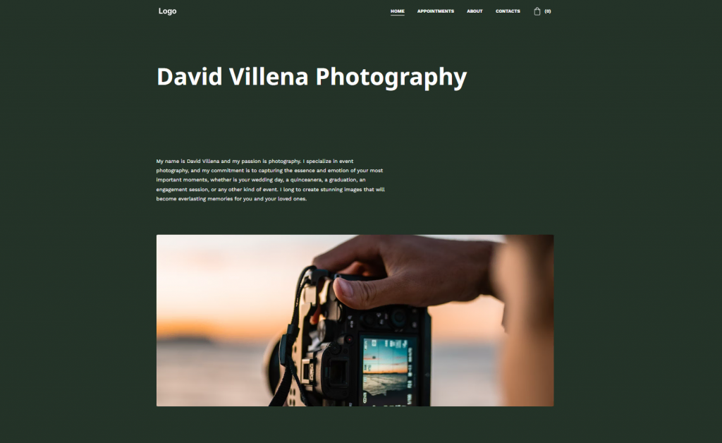
15. David Villena Photography
Photographer David Villena specializes in wedding, graduation, and family portrait photographs.
The homepage introduces visitors to the photographer and the work Villena does. He displays the portfolio on the homepage instead of a separate page. You may consider this alternative when designing your website.
The website’s domain extension is .photography. As a .com alternative, it is a suitable choice for a photography business.
Compared to several other photography websites in this list, Villena’s website doesn’t use a plain white background. He uses color palettes that complement photos shown on the homepage, which may help increase the interest of potential clients.
The photography website has four menus: Home, Appointments, About, and Contacts. The Contacts page has multiple means of communication for potential clients, including email, social media, and a contact form.
Unique features – scrolling animation and a simple About Me page design
16. Romain Daniel InFrame Photographie
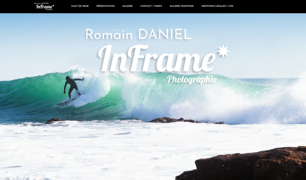
The Romain Daniel InFrame Photographie website showcases the photographer’s work in lifestyle, sports, events, and portrait photography.
The website layout has consistent colors throughout, which are black and white. Visitors can learn essential information about Daniel, his work, and his contact information from the homepage, keeping navigation simple.
For the gallery, Daniel arranges the page based on the clients. Interestingly, each portfolio is password-protected, so only authorized individuals can access it. This layer of security ensures confidentiality for the clients.
For the legal page, the photographer displays intellectual property notices and terms of sales.
Unique features – parallax effect and a Google Business page
17. San Pixs Photographie
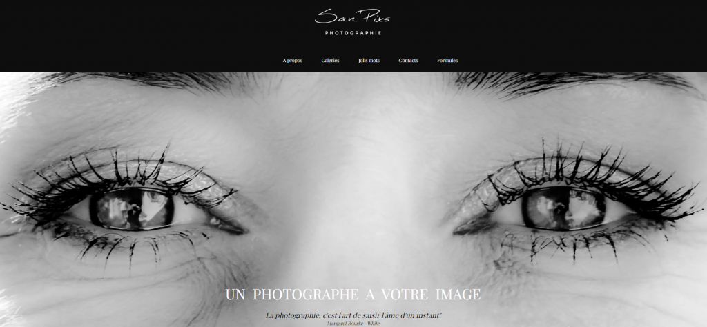
San Pixs Photographie, or Nicolas Sanchez, is one of the wedding photographers on the list. For visitors, the website journey starts with a striking homepage image with a short text and a quote. It also uses a .fr domain, representing the photographer’s location.
The monochromatic homepage design is simple, with links to other pages and social media at the bottom. Another way to navigate the website is from the top menu.
The website gallery mainly shows wedding and birthday photography. There is also street, nature, architecture, and film photography.
Sanchez also displays a detailed list of wedding photography packages and their pricing. This will give potential clients an idea of how much they’ll be paying and what they’ll get in return.
Unique features – a client testimonial page
18. Simon Vallet Photographe
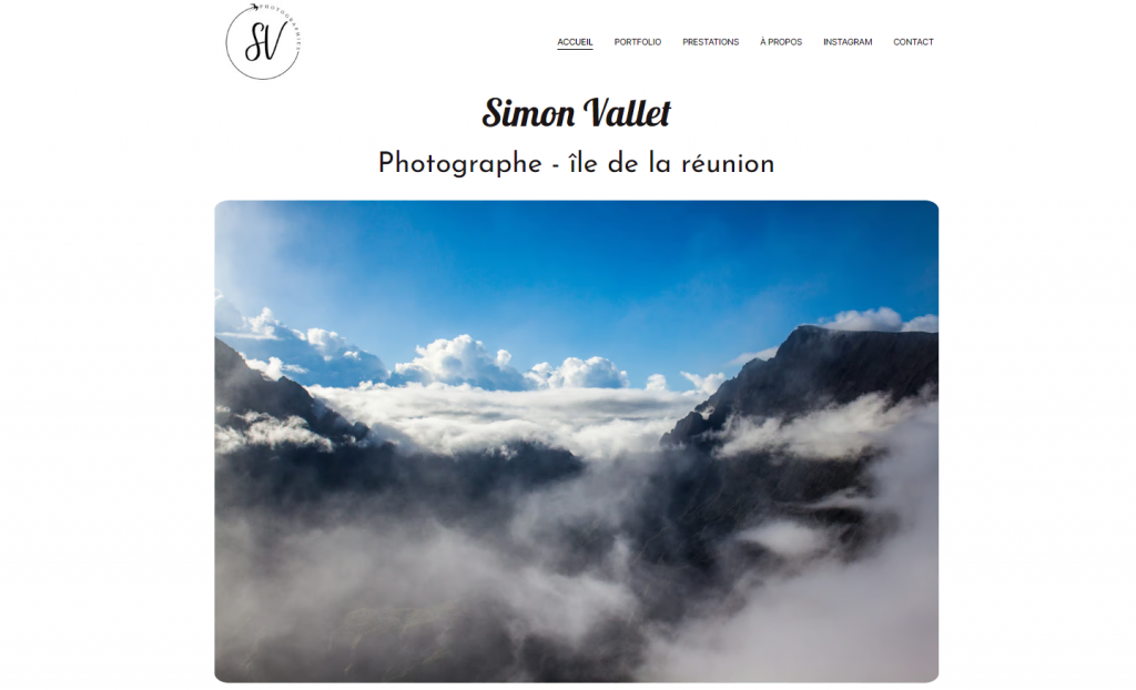
Simon Vallet is a photographer based in Réunion Island. Vallet’s photography website displays a selection of featured images on the homepage. It also has a short About section with a portrait of the photographer, his phone number, and his Instagram account.
The portfolio page showcases photos of people, animals, and nature. The page has a white background with no text descriptions, allowing the photos to speak for themselves.
Vallet also has photos from his Instagram account in a grid layout. Adding social media posts to a website can strengthen your branding as a photographer.
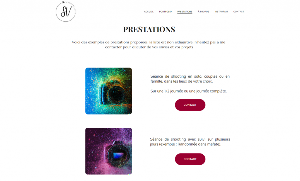
The services page offers more details on Vallet’s photography and training services. If you offer various service types, you can use this layout as an inspiration for your own website.
Unique features – use of white space and a clean portfolio layout
19. Pixel Style
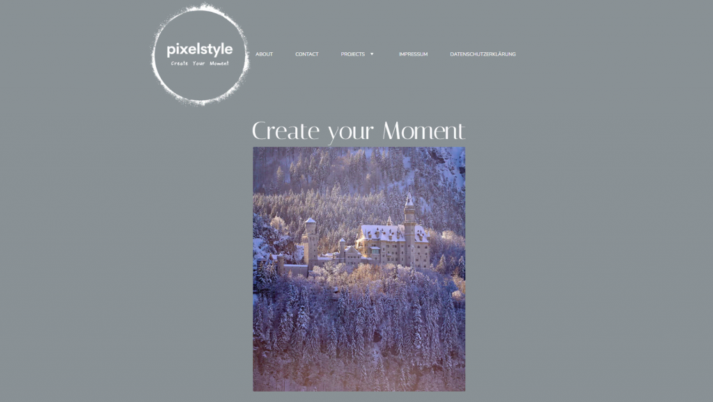
Nikolas Kraupp, a professional travel, business, and action photographer, showcases his work on his website, Pixel Style.
Pixel Style is one of the photography websites with a ccTLD domain, which is .de. The homepage displays a main image, a short About Me section, and more featured images.
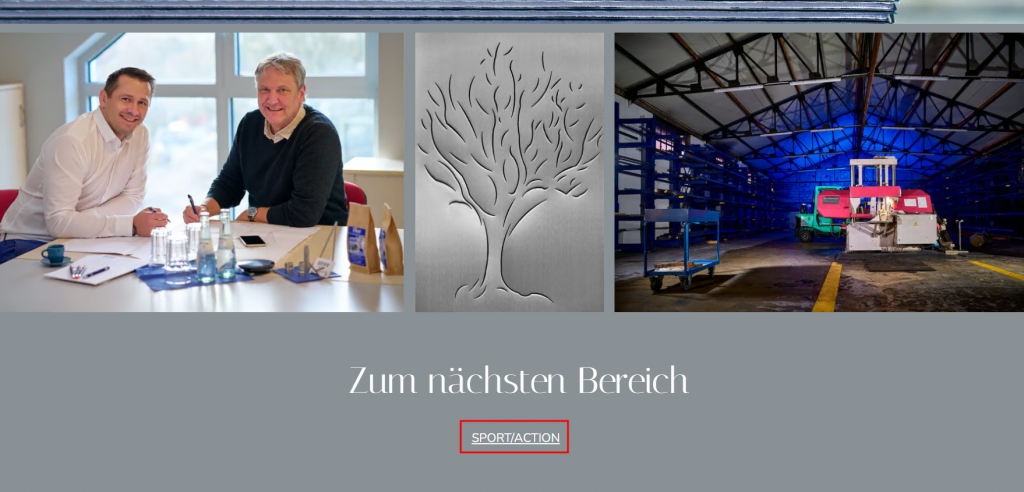
Kraupp organizes his projects using a drop-down menu. Each project page has the same layout. Visitors can navigate to another project at the end of every page by clicking a link.
The photography website also has a data protection page. On this page, he mentioned how Pixel Style securely handles the personal information of clients and site visitors. Adding this page to your photography website can help gain the trust of new and existing clients.
Unique features – a drop-down menu of the project list and a dedicated data protection page
20. Damien Callens Photographie
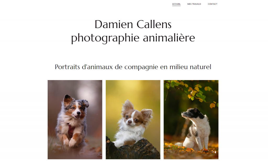
Damien Callens is a wildlife and nature photographer. For his website, Callens uses a .fr domain extension to target audiences in France. The photography website design is simple, with only three pages: a homepage, a portfolio page, and a contact page.
Like the other best photography websites built with Hostinger Website Builder, the contact page has a featured image and a short contact form.
Callens focuses more on the main project – pet portrait sessions. On the portfolio page, he provides a concise description, including session duration, location, and photo delivery details. This allows potential clients to gain some insights before booking his service.
Unique features – simple web design and use of white space
How to make a photography website with Hostinger Website Builder
After reviewing the best photography websites built using Hostinger Website Builder, you might feel inspired to learn how to create your own website.
Follow these simple steps to build a photography portfolio website using Hostinger Website Builder:
- Sign up. Go to our Photography Website Builder and create your account.
- Choose your template design. Browse our photography website templates to find one perfectly aligned with your photography branding. Choose a modern, minimal layout that captures your creative vision.
- Customize your photography website. Customize your photography website with ease using the drag-and-drop editor. Start with the template and then edit the web design according to your preferences. Follow this photography website design best practices to guide you.
- Add your photography portfolio. Feature your finest projects, along with client details and project descriptions. Take inspiration from the photography websites we’ve compiled to showcase your work in the best light.
- Preview mobile layout. Pay attention to how your website looks on smaller screens. Mobile-friendly photography websites are great for increasing user experience and overall accessibility.
- Optimize for search engines. Add relevant keywords, write compelling meta titles, and provide descriptive alt text for images. Mastering photography website optimization is crucial for increasing site traffic.
- Publish the website. Once satisfied with your portfolio website design, content, and optimization, take the final step to publish it. Your photography website is now live and ready to be showcased to the world.
Conclusion
Photography websites can benefit beginners and professional photographers. A website acts as a visual storytelling for photographers and a platform to showcase their work online.
We’ve explored the best photography websites built using Hostinger Website Builder to inspire you. From wedding to fashion photography, you can learn from these website examples to discover the best design for your own site.
We also walked you through the step-by-step process of building a website using Hostinger Website Builder. With our guide and the portfolio website examples as inspiration, you’re all set to create the best photography website to attract more clients and advance your business. Good luck!
Photography website examples FAQ
Read answers to the most common questions about photography websites.
What should a photographer’s website include?
A photographer’s website should include a portfolio of curated past projects, an About Me section highlighting their photography background, and contact information.
How many photos should a photographer’s website contain?
When choosing your photos, prioritize quality over quantity. Around 20-30 of your best work should be enough to leave a positive impression without overwhelming visitors.
Can I customize the templates to match my photography style and brand?
Absolutely! With Hostinger Website Builder, you can adjust the website’s elements, colors, fonts, and layout to create a unique and personalized photography site. This way, your website becomes an extension of your brand.
