20 Fitness Website Examples for Your Inspiration
The best fitness websites have a couple of things in common: clear navigation, informative content, and visually appealing layouts. Whether you are a personal trainer, a gym owner, or any other fitness professional, understanding what constitutes a good fitness website will help you stand out from the crowd.
In this article, we’ll look at 20 fitness website examples made with Hostinger Website Builder and learn how to structure a website for optimal user experience, effectively showcase our services, and ultimately convert those website visitors into loyal clients.
Download guide to using Hostinger
Top 20 Fitness Website Examples
These fitness websites, all made with Hostinger Fitness Website Builder, do a great job of combining intuitive navigation with great content and web design.
1. Advantage Fitness Training

Advantage Fitness Training’s website is a great example of a user-friendly fitness website. The navigation is made easy through a well-categorized menu bar, enhancing the user experience and building trust with prospective clients.
The blog and detailed service descriptions help the website to stand out as a resource for fitness enthusiasts. Consider creating and sharing valuable content similarly to position your brand as an authority in the fitness industry and establish your fitness business as an industry leader, attracting more visitors and boosting search engine visibility.

Interactive features like the integrated online store and a newsletter subscription box keep the site dynamic, encouraging ongoing engagement. Highlighting the benefits of subscribing to your newsletter, like Advantage Fitness Training does, effectively builds trust and maintains visitor interest.
Creating a newsletter subscription block with a drag-and-drop website builder like Hostinger Website Builder is easy. Simply select the contact form element, place it in the right place on the page, and customize the form to include a field for the user’s name and email address.
2. Elliott Fitness
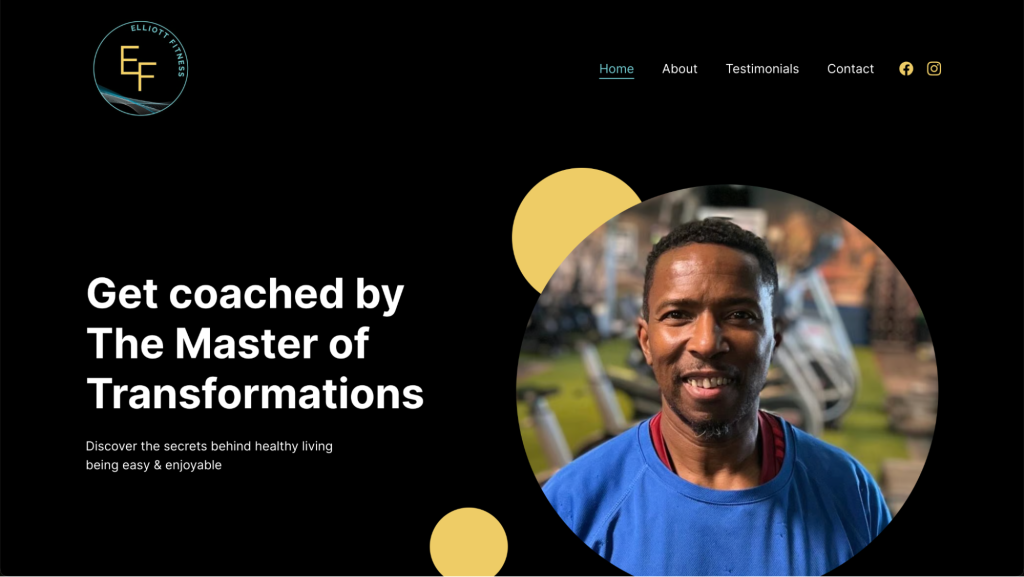
Elliott Fitness is another excellent example of an effective fitness website.
The website’s design is straightforward, facilitating easy homepage navigation through dedicated sections for testimonials and contact information. This approach ensures that all necessary information is readily accessible in a couple of scrolls, enhancing the user’s journey and encouraging deeper engagement.
With a responsive design, this fitness website ensures a seamless experience across mobile devices. Additionally, mobile optimization improves the site’s search engine optimization (SEO).
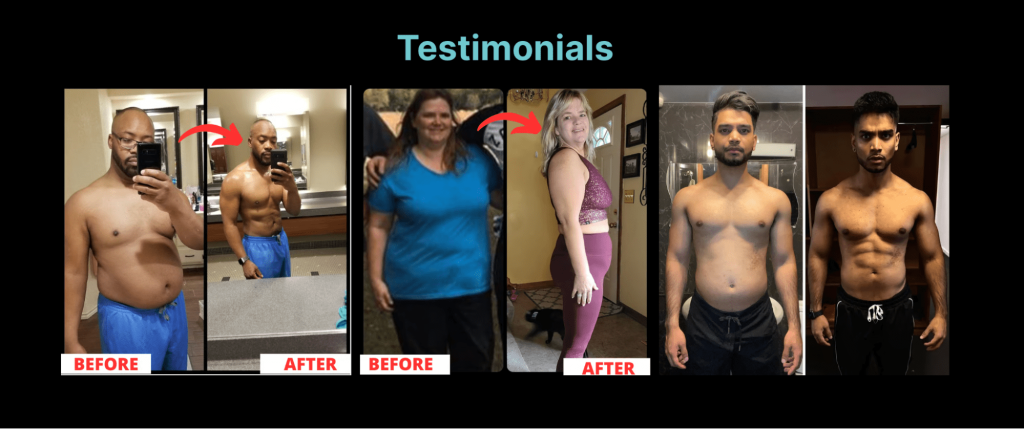
Testimonials on the site serve as powerful social proof. Sharing success stories that underline the effectiveness of your training and coaching helps build trust and credibility among visitors.
3. Formula Fitness India
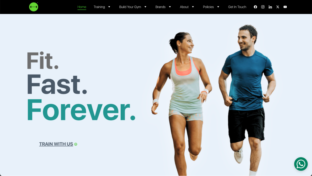
Formula Fitness India is a great source of inspiration if you want to combine comprehensive service offerings and user-friendly design.
The website is designed for ease of navigation, featuring a clear, intuitive layout that allows visitors to find information about services, memberships, and products quickly. Direct links and call-to-action (CTA) buttons for purchases and memberships are prominently placed, simplifying the user journey.
The site also actively engages its audience with group fitness sessions and social events, fostering a strong community spirit among members. This engagement is crucial for building customer loyalty and enhancing user satisfaction.
4. Heal U Fitness
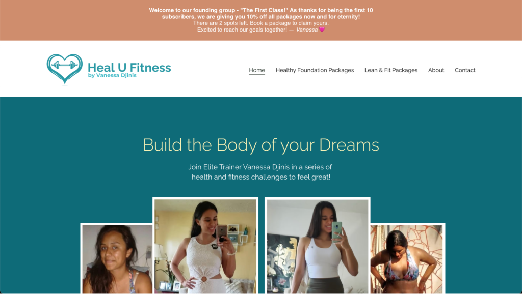
Heal U Fitness is a comprehensive online platform focused on holistic fitness and wellness, guided by Vanessa Djinis, a personal trainer.
This fitness website offers several unique fitness packages that cater to different needs. For example, Heal U Fitness provides Healthy Foundation plans for those looking for more in-depth assistance with their fitness journey.
These packages are comprehensive and include personalized nutrition plans, habit tracking, and hands-on training sessions aimed at extensive health improvements.
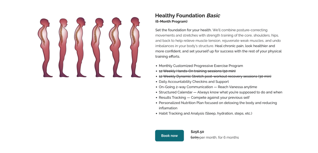
Such tailored packages cater to diverse client needs, enhancing satisfaction and retention by addressing specific health and fitness goals.
To implement similar strategies, begin by identifying common client issues. Then, develop targeted programs with clear objectives and ensure continuous progress through apps or virtual check-ins.
Offering these types of comprehensive health plans can help differentiate your services from traditional fitness websites, helping you stand out from the competition.
5. Fitnesstown Store

Fitnesstown Store is a specialized fitness site selling sports nutrition supplements. They offer a wide array of products ranging from whey protein to creatine, catering to various fitness goals like muscle gain and weight loss.
To mimic their approach on your fitness website, focus on categorizing your products effectively. This lets customers easily find what they are looking for, helping them make informed choices aligned with their health objectives.

For businesses looking to expand their reach, consider a hybrid model of both in-store and online sales, as Fitnesstown Store does. This strategy accommodates a broader customer base and meets the convenience needs of local shoppers.
6. Skeie Fitness
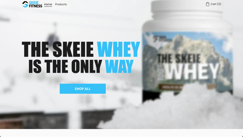
Skeie Fitness is an online fitness brand selling high-quality sports supplements.
They offer a diverse range of products, emphasizing the high-quality, non-GMO, grass-fed sources of their whey protein. This dedication to quality not only appeals to health-conscious consumers but also differentiates their products in the competitive fitness market.
To adopt a similar approach for your fitness website, focus on the specificity of your product offerings. Clearly categorize your products by their benefits – by muscle building, energy, and recovery, for instance – making it easier for customers to navigate and choose products that align with their fitness goals.
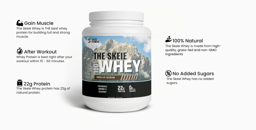
Like Skeie Fitness, make a clear point of the superior quality of your products. Detail the source of your ingredients and their benefits, reassuring customers of the premium nature of your offerings.
7. DHOPK Fitness
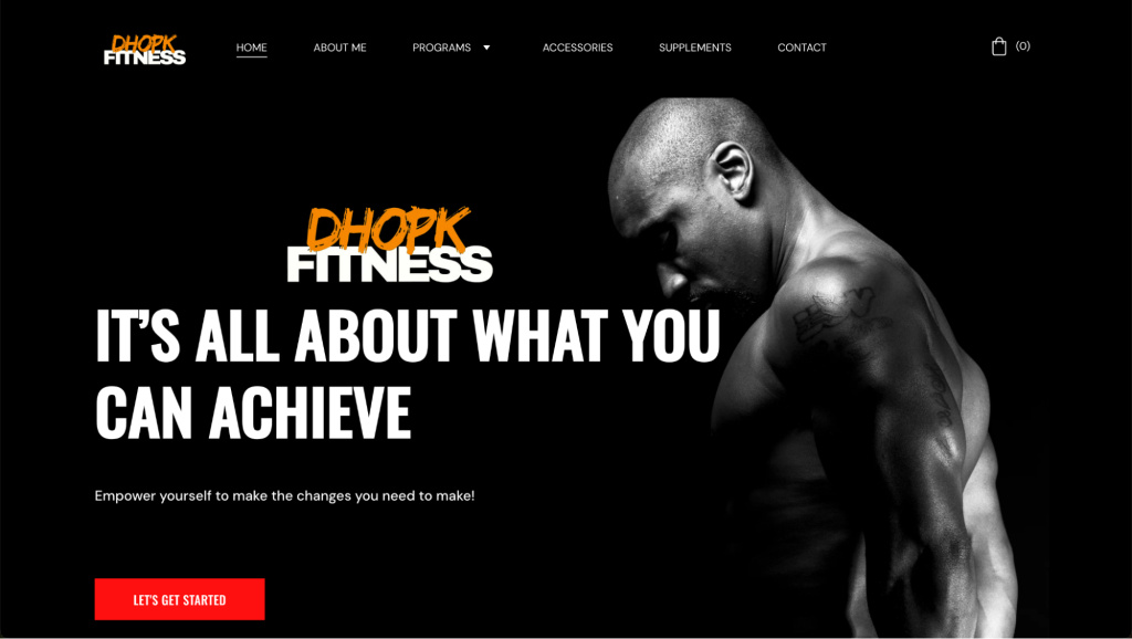
DHOPK Fitness, led by Damian Hopkins, is a specialized online fitness and personal trainer website. The site focuses on selling workout programs, such as The DHOPK Method and The Hypertrophy Blueprint for Men.
To implement a similar strategy on your fitness website, start by defining clear, targeted fitness programs that address specific outcomes, whether for muscle building, weight loss, or athletic performance.
This segmentation allows potential clients to easily identify which programs can best meet their fitness goals, ensuring a personalized experience.
Complementing fitness programs with related products, like DHOPK Fitness’s line of supplements, offers a holistic approach to health and fitness. Promoting these products alongside training programs can drive additional revenue streams while reinforcing your brand’s commitment to comprehensive fitness solutions.
8. Fitness Boss
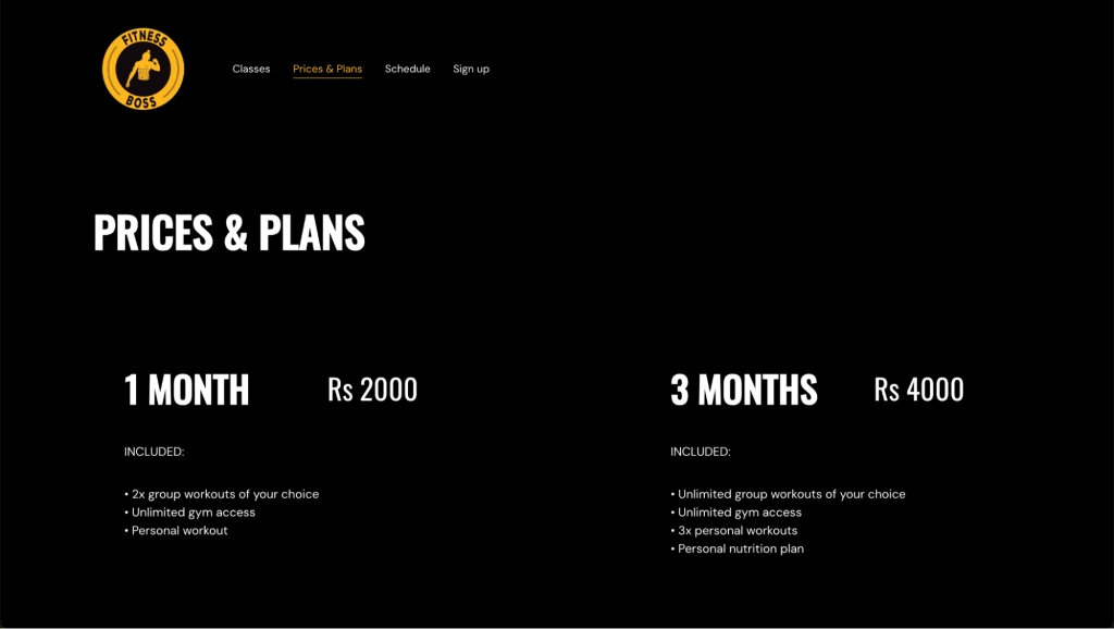
Fitness Boss in Delhi is a well-equipped gym offering a variety of workout options to cater to different fitness needs and goals. Their gym website design focuses on showcasing the different membership and class options available, accepting online bookings through the site.
Consider implementing similar tiered membership options that cater to different commitment levels and budgets on your site.

For example, offer short-term, mid-term, and long-term membership options. Each tier could have varying benefits, such as a certain number of personal training sessions, access to specialized classes, or discounts on additional services.
If possible, offer classes at various times throughout the day to accommodate different lifestyles, such as early morning sessions for early risers, midday sessions for home workers, and evening classes for those who work traditional hours.
Regularly review and adjust the class schedule based on member feedback and attendance trends to ensure it meets the needs of your clientele.
9. FitnessDange
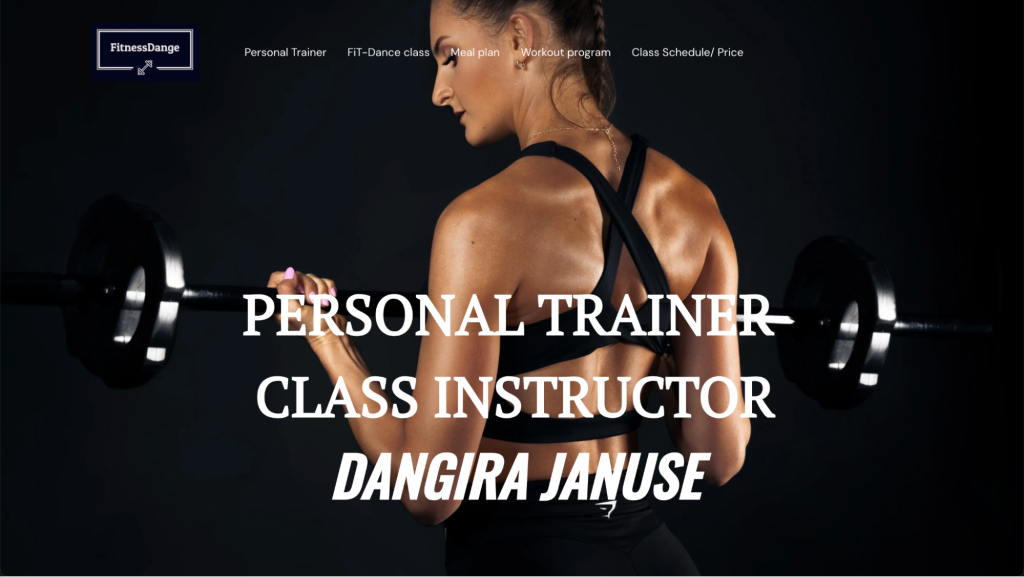
The personal trainer website FitnessDange effectively showcases how to design a fitness website that emphasizes personalization and engagement.
By including comprehensive details for each program, such as the types of exercises, expected benefits, and available personal trainer support, the website ensures that clients clearly understand what they are signing up for. This level of detail helps clients make informed decisions, enhancing their on-page engagement and overall satisfaction.
To further mimic FitnessDange’s successful approach, consider offering a variety of workout options tailored to different fitness levels and preferences.
This could include both gym-based and home-based programs to ensure accessibility for all clients. By diversifying your offerings and ensuring that each program is well-documented and easy to understand, you create a user-friendly experience that caters to a wide audience, much like FitnessDange.
This strategy not only meets diverse client needs but also broadens your potential client base, increasing the likelihood of higher customer engagement and retention rates.
10. King’s Barbell Fitness

The hero section of the Kings Barbell Fitness website effectively encapsulates the gym’s inclusive and motivational atmosphere.
It invites visitors of all fitness levels to join, reinforcing the message that fitness is an integral part of this community, regardless of skill level or age. This approach is particularly impactful for a fitness website because it immediately engages visitors by aligning with their aspirations – whether they’re beginners or experienced lifters – and encourages them to start their fitness journey.
To create a similarly impactful hero section on your fitness website, consider crafting a welcoming message that speaks to all levels of fitness enthusiasts, from beginners to advanced. Use language that encourages visitors to feel part of a community committed to fitness.
Include high-quality images or videos that showcase diverse people engaging in various workouts. This visual representation can inspire visitors and give them a sense of the environment and energy your gym offers.
Position a prominent call to action, such as Let’s Get Started or Join Us Today, that leads directly to a sign-up form or contact page. Make it easy for visitors to take the next step towards joining your gym.
11. Spartan Martial Arts and Fitness
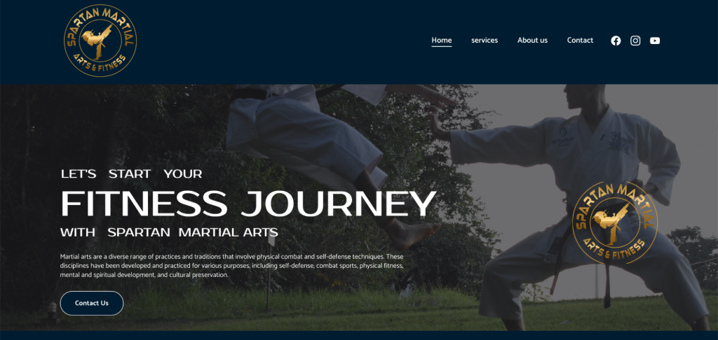
Spartan Martial Arts and Fitness’s website effectively combines detailed information about martial arts training with modern web design principles.
On the Services page, the image gallery depicts various martial arts and fitness disciplines available at the academy, such as Taekwondo, Boxing, and Yoga, each with a concise label for easy navigation. This layout is impactful for a service overview page because it offers both visual appeal and immediate, informative insights into the services provided.

Prospective clients can quickly grasp the range of classes on offer, enhancing user experience and guiding them towards making a booking.
To recreate this layout on your website, prioritize the visual appeal of your page design. High-quality images can capture attention faster than text, making the services offered immediately clear and appealing.
Include labels or brief descriptions accompanying each image to provide essential information at a glance, saving users’ time. Attractive visuals combined with concise text can encourage users to explore your offerings more deeply, increasing the likelihood of booking a class.
12. Paragon Fitness

Paragon Fitness is a great personal trainer website example for anyone looking to include a blog on their fitness site.
Creating long-form content serves as a resource for clients and visitors, offering valuable information and insights into health and fitness. It helps establish your brand or gym as an authority in the fitness domain.
Focus on writing informative articles that offer value to your readers, such as workout tips, nutrition advice, or wellness strategies. This content should help readers solve common problems or achieve their fitness goals.
For best results, post new content regularly to keep your website dynamic and give visitors a reason to come back. This also signals to search engines that your site is active, which can help improve your search engine rankings.
Remember to promote your blog posts on your social media channels to reach a wider audience and drive traffic to your website. Encourage readers to sign up for classes, personal training, or your newsletter within your blog posts to convert visitors into clients.
Did You Know?
The main difference between a blog and a website is that websites tend to be static in nature, while blogs constantly publish new content.
13. Apex Golf
The homepage design of Apex Golf Fitness has a clean and modern aesthetic.
The main focus of the page is on a friendly greeting from Dave, the owner and trainer. The picture of Dave is complemented by text outlining his expertise and the available services, creating an immediate connection with the visitor.
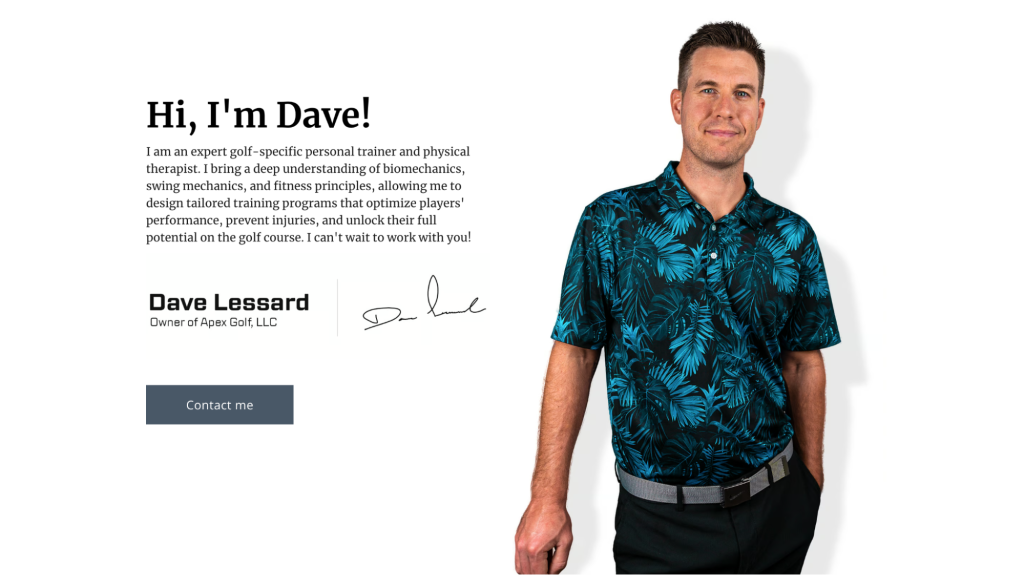
This design is effective for a fitness website because it combines personal branding with clear, informative content and user-friendly navigation that guides visitors toward booking sessions or getting in touch.
Create a similar effect on your fitness website by including a welcoming message from yourself or your lead trainer, along with a professional photo, to establish a connection with visitors.
Ensure there are prominent, easy-to-find CTA buttons on the homepage to guide visitors toward the right pages for better engagement.
14. Barcelona Dracs Lacrosse
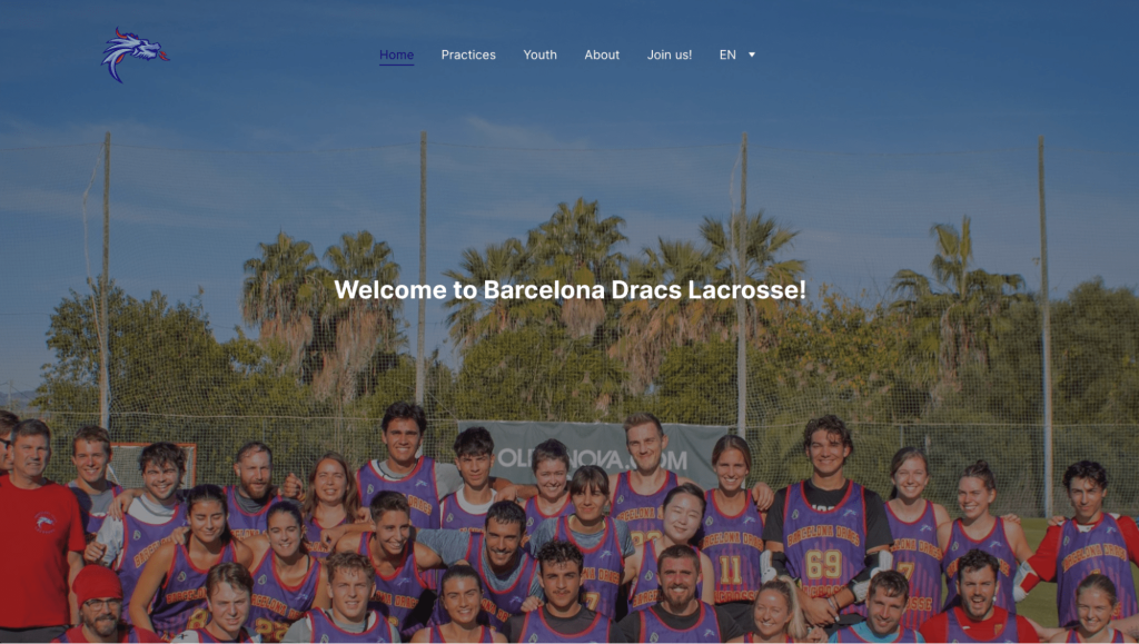
The Barcelona Dracs Lacrosse club’s website focuses on getting more people interested in lacrosse and finding new players for their club. This fosters a sense of community and shared enthusiasm for the sport.
On your own website, consider highlighting your clients’ or members’ stories and achievements. Encourage site visitors to attend events or participate in programs, showcasing your fitness space as more than just a gym but a supportive community.
The club’s site also provides clear schedules for the men’s and women’s teams, as well as the youth teams, making it easy for interested players to know when and where to attend practice. Good communication like this is critical for a good and smooth user experience.
Consider integrating a calendar into your site or creating an easy-to-find schedule page for different classes or training sessions for a similar effect.
15. Fitness for the Occasion
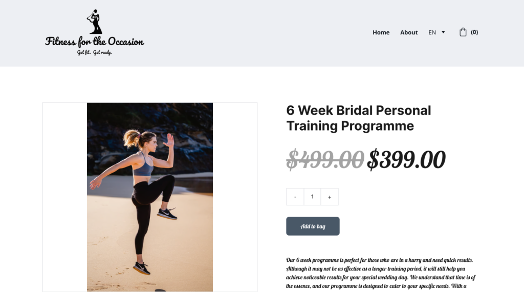
Fitness for the Occasion is a fitness site providing personalized training for brides-to-be. Having a niche focus allows the site to tailor its content, programs, and marketing to a specific audience, making its services highly relevant and attractive to those with wedding fitness goals.
By specializing, much like Fitness for the Occasion, you can cater to a specific segment more effectively, providing targeted solutions that more general fitness providers might overlook.
This could lead to stronger customer relationships and improved business outcomes because of the specialized service and the deep understanding of the clients’ specific goals and needs.
Create compelling content for your website that outlines the benefits and features of your fitness program. Use before-and-after photos, testimonials, and detailed descriptions to showcase the program’s effectiveness.
16. Home Gym Fix

The Home Gym Fix is a good example of an affiliate fitness website with a clear focus. By having a well-defined niche – home gym accessories – it’s clear to visitors what they can expect to find when they land on the site.
As an affiliate website, Home Gym Fix offers detailed reviews on different products, helping consumers make informed purchasing decisions. The clean, organized layout with product images and concise summaries makes navigation easy, enhancing the user experience.

To create a similar affiliate review section on your fitness website, focus on a specific area of the fitness market, such as home gym equipment, wearables, or recovery tools.
Write in-depth reviews and guides for each product. Include high-quality images, pros and cons, personal testing insights, and any scientific data, if applicable. Ensure your content educates your readers on why each product is beneficial, how to use it, and who it’s best suited for.
17. Matthew Reid Fitness

Matthew Reid’s fitness website makes it easy to find what you’re looking for. Right on the homepage, visitors see clear links to his main services: personalized training, online coaching, and nutritional guidance.
Having dedicated landing pages is an effective way to communicate the value proposition of the different services offered by a gym or a personal trainer. It can also help to establish credibility and showcase your expertise in your niche.

By providing clear and concise information on a dedicated service, visitors are more likely to take action, whether it’s signing up for a program or making an inquiry. A dedicated landing page allows for a strong, service-specific call-to-action, which can lead to increased client engagement.
For best results, write informative and engaging content that is specific to each service or product. Include details about your approach, what clients can expect, success stories, and any unique selling points. Research and use relevant keywords throughout the page to help your page rank higher on search engines.
18. O2 Gym
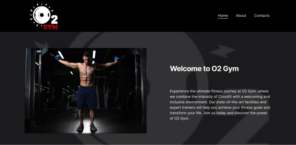
The O2 Gym’s website design emphasizes user engagement and accessibility, providing visitors with all the information they need to make an informed decision about joining the gym. This approach helps potential members feel welcomed and informed, increasing the likelihood of them taking the next step.
The site prominently features its logo in the menu and has a consistent theme that communicates its brand identity. A strong brand identity helps build recognition and trust, which are crucial for converting visitors into members.
The use of images throughout the site gives visitors a glimpse into the gym experience and the community atmosphere. Vibrant and authentic visuals can inspire visitors and help them envision themselves as part of your gym community.
The website also clearly outlines the gym’s unique approach, facilities, and the comprehensive nature of the available services. Providing detailed information about your products and services allows potential members to understand the value you offer and how it fits their fitness journey.
19. The Grind Fitness Center
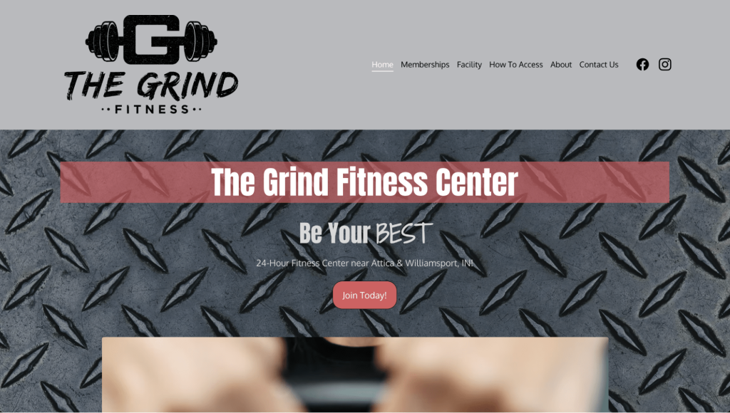
A well-crafted facility page, like that of The Grind Fitness Center, showcases how effective web design can drive user engagement and highlight a gym’s unique selling points. The page serves as an informational resource that mirrors the physical gym experience.
The high-resolution images of the gym’s equipment and amenities allow visitors to virtually step into the gym, offering a preview of the workout environment and community. This visual introduction can be motivating, helping prospective clients see themselves as part of the gym’s culture.
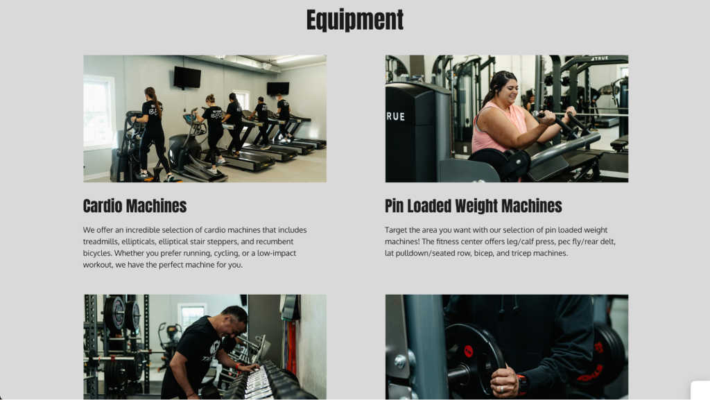
By detailing the range of equipment, from cardio machines to free weights, and highlighting additional amenities like full-service locker rooms and a lounge area with wifi, the website conveys a clear message of inclusivity and commitment to members’ comfort and convenience.
To create a similar section on your gym website, list all the equipment and features of your gym. If your gym has specialized equipment or unique amenities, make sure these are prominently featured. Describe how these offerings help your clients achieve their fitness goals.
20. AB Fitness Universal

The AB Fitness Universal has a couple of useful features that set it apart from other fitness websites.
The brand applies some great web design best practices on its pricing page. The tiered plan structure presents information clearly and hierarchically, allowing users to compare different options easily.
The use of color, especially the red for the Standard plan, draws attention, indicating it as the recommended or most popular choice. Also, listing the prices upfront helps set clear expectations about the cost, which is crucial for building trust with potential clients.
The site also features a dedicated FAQ page in the main menu. This way, it’s easy for visitors to quickly find answers to some of the common questions about the gym and its plans.
An FAQ section also builds trust and confidence in your services. It also improves the overall user experience by helping potential and existing members navigate through their queries without frustration. By addressing potential objections, an FAQ page can remove barriers to membership sign-up or class bookings.
Conclusion
From personal trainers to niche product suppliers, each of our 20 shortlisted fitness websites showcases features necessary for a successful fitness website.
Remember these key takeaways:
- Clarity is king. Make essential information readily available. This includes service descriptions, pricing plans, and contact details.
- Engage your audience. Visually appealing layouts, high-quality images, and engaging content captivate visitors and keep them coming back for more.
- Use CTAs. Prompt website visitors to take the next step, whether it’s booking a consultation, signing up for a plan, or subscribing to a newsletter.
- Social proof matters. Testimonials and success stories build trust and credibility, encouraging potential clients to choose your services.
By incorporating these elements, you can transform your fitness website from a static page into a powerful tool for attracting, engaging, and converting clients. With an easy website builder like Hostinger, it’s simple to get your own fitness website up and running in no time.
Fitness Website Examples FAQ
Find answers to the most common questions about what sets the best fitness websites apart from the rest below.
How Do I Find My Fitness Niche?
Many successful fitness websites cater to a specific audience. To find your niche, consider your own expertise, interests, and gaps in the market. Research popular fitness trends and identify areas where you can offer unique value or cater to particular audiences.
Do I Need a Website for My Fitness Business?
A website can be a valuable tool to reach clients, showcase your services, and establish credibility. It allows you to provide information about your programs, qualifications, and booking options. Whether you offer personal training, online courses, or sell fitness products, a website can centralize your offerings and make them accessible to a wider audience.
How Do I Monetize My Fitness Website?
There are several ways to generate income through your fitness website. You can offer paid online courses, create a membership section with exclusive content, or partner with fitness brands for affiliate marketing. Selling workout plans, eBooks, or merchandise are also options. The best approach depends on your niche and target audience. For a more detailed guide on this topic, learn how to make money as a fitness influencer.
How Do I Optimize My Fitness Website for Search Engines?
Search engine optimization (SEO) strategies help your website rank higher in search engine results for relevant keywords. This increases organic traffic – or free website visitors – from people searching for fitness information or services. Use relevant keywords throughout your website content, optimize page titles and descriptions, and build backlinks from other reputable websites to improve your SEO.


