23 best web-safe HTML fonts for your website
Jun 12, 2026
/
Irfan F.
/
9 min Read

The best HTML fonts are web-safe fonts that stay readable, consistent, and visually aligned with your website design across browsers, devices, and operating systems.
Common options include Arial, Helvetica, Verdana, Georgia, Times New Roman, Courier New, Trebuchet MS, and Garamond because they are widely supported and easy to use with CSS font-family declarations.
When choosing an HTML font, prioritize readability, brand fit, font category, fallback support, and how the typeface performs in headings, body text, buttons, and small-screen layouts. Sans-serif fonts usually work well for modern interfaces, serif fonts fit long-form or editorial content, and monospace fonts suit code-related websites.
Best HTML fonts at a glance
| Font | Category | Best for | Suggested CSS fallback |
|---|---|---|---|
| Arial | Sans-serif | General website text | Arial, Helvetica, sans-serif |
| Helvetica | Sans-serif | Modern brand websites | Helvetica, Arial, sans-serif |
| Verdana | Sans-serif | Small on-screen text | Verdana, Geneva, sans-serif |
| Georgia | Serif | Blogs and editorial content | Georgia, "Times New Roman", serif |
| Times New Roman | Serif | Formal or academic websites | "Times New Roman", Times, serif |
| Courier New | Monospace | Code and technical content | "Courier New", Courier, monospace |
| Trebuchet MS | Sans-serif | Friendly web interfaces | "Trebuchet MS", Arial, sans-serif |
| Garamond | Serif | Elegant long-form pages | Garamond, Georgia, serif |
1. Arial

Arial is a versatile sans-serif font with a contemporary feel. Each letter is thick and sturdy, achieving a clean and minimal look.
Arial has been a staple screen font due to its readability when scaled to any size. In fact, it is the default font for Google Docs.
Other than that, this typeface is also popular in printed media such as newspapers and advertisements.
Overall, if you’re looking for a classical font that will be suitable for most websites, Arial is a great choice.
2. Arial Narrow

Arial Narrow is one out of 38 styles of the Arial font family. Compared to the original typeface, this style offers a much more sleek design.
Letters appear narrow and condensed, with little space between them. This makes Arial Narrow a great choice for minimalistic websites.
Great font-pairing options include bolder sans-serif typefaces such as Verdana and Geneva.
3. Georgia
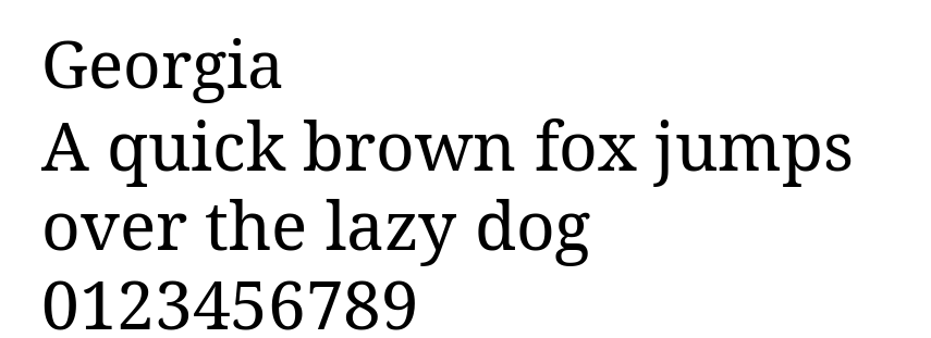
Georgia is a classic serif font designed for clear on-screen reading. Its letters have strong contrast, wide spacing, and distinctive serifs, making the text easy to read even at smaller sizes.
This font is commonly used for blogs, editorial websites, online magazines, and long-form content. It gives written content a polished and traditional look while keeping paragraphs readable on digital screens.
If you want an HTML font that feels elegant but still practical for body text, Georgia is a strong choice. It works especially well for websites that publish articles, guides, essays, or educational content.
4. Times

Times is a highly legible serif font due to its visible contrast and condensed style.
People tend to be familiar with this font as it’s found in a variety of media, from books and messaging apps to commercial publishing projects.
Originally, Times was primarily used in printed media such as newspapers, becoming associated with journalism and academic writing ever since.
Therefore, this font is the perfect choice to create a familiar and formal feeling on your website.
Additionally, this font is suitable for websites with long blocks of text, such as online newsrooms and blogs.
5. Times New Roman

Times New Roman is a variation of the Times font from the serif font type.
It is a popular text typeface widely used in printed media such as magazines and books but also a very popular font in HTML due to its versatility and legibility.
With its professional font style, Times New Roman has become the favorite choice for formal content found in news publications and educational websites.
6. Helvetica

Helvetica is a versatile HTML font as its clean design is suitable for any type of display.
It’s a popular sans serif typeface used by many renowned brands. For example, Jeep, Microsoft, Motorola, and BMW use this font for their logos.
Other than that, the U.S. government also uses Helvetica on its tax forms.
Furthermore, this font type is designed for small size uses such as text displayed on e-readers and mobile devices.
7. Courier

Courier is the most famous font in the slab serif classification – all operating systems come prepackaged with it.
This HTML font has been a standard for movie screenplays as well. Therefore, if your website is related to film, definitely consider adding Courier to your site design.
However, since this font is classified as decorative, it’s best to limit its use to headers and titles.
8. Courier New

This font is a thinner, more legible alternative to Courier. For that reason, electronic devices primarily feature Courier New.
In addition, this font is also classified as a typewriter face, looking great on websites with old-school designs.
Courier New is available in four styles – regular, italic, bold, and bold italic.
9. Verdana

Verdana is an excellent on-screen font due to its readability in small size and when displayed on low-resolution screens. This is primarily due to its generous width and spacing between characters.
However, this typeface is not limited to on-screen typography. For example, the famous furniture brand IKEA uses Verdana for both its website and its printed catalogs.
If you’re looking for an HTML font with great readability, this font is a great choice.
10. Tahoma
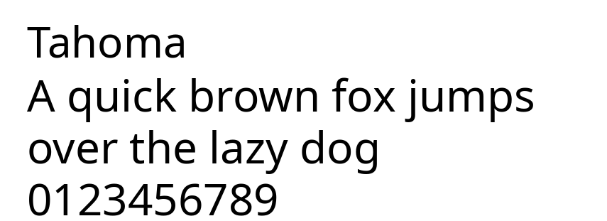
Tahoma is a compact sans-serif font with clean lines and tight letter spacing. Its simple structure makes it easy to read in smaller sizes, especially in menus, labels, buttons, and other interface elements.
This font is a great option for websites that need to display a lot of information in limited space. For example, Tahoma works well for navigation bars, dashboards, forms, sidebars, and mobile-friendly layouts.
Overall, Tahoma is best for websites that need a clear, functional, and space-efficient font. Use it when readability and compact design are more important than decorative style.
11. Trebuchet MS
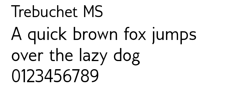
Trebuchet MS is a friendly sans-serif font with rounded shapes and a slightly informal appearance. Compared to more neutral fonts like Arial or Helvetica, it has more personality while still remaining readable.
This font works well for headings, buttons, call-to-action sections, and casual website designs. Its approachable style makes it a good fit for blogs, small business websites, portfolios, and creative landing pages.
If you’re looking for a web-safe HTML font that feels modern, warm, and easy to read, Trebuchet MS is a solid option. It can help make a website feel more inviting without reducing readability.
12. Candara

Candara was first brought to the mainstream by the Microsoft Vista OS to improve readability on LCD displays.
This typeface is highly readable due to the generous spacing between characters, making it a perfect display font.
Moreover, Candara achieves a contemporary look thanks to its curves and open forms. This font is suitable for informal typographic settings such as blog post titles and taglines on websites.
13. Geneva

Geneva offers a clean and modern look due to its consistent length, width, and spacing.
The font is versatile and widely used for both display and body text. The bold colors and slim strokes make this font legible in any size – it offers generous spacing with consistent length to ensure readability.
14. Calibri

Calibri is a widely used and popular typeface. It is a default font for various well-known software such as the Microsoft Office suite and Google Docs.
This font primarily comes off as modern and warm due to its rounded lines and clean style.
Additionally, Calibri works in a wide variety of text sizes. It is highly legible and suitable for both digital and screen displays.
Thanks to its clean design, this font fits all types of websites.
15. Optima

Optima finds its inspiration in classical Roman capital letters. It is used to convey elegance with its generous spacing and complementary strokes.
With Optima, you also have the option to define the spacing between each character.
While all the spacing variants are readable, setting the spacing wider will better complement this font.
Optima is best for display usages as found in logos for high-end brands like Estée Lauder and Marks and Spencer.
16. Cambria

With very even spacing and proportions, Cambria was designed for a great on-screen reading experience, even when displayed in small sizes.
This font is highly legible thanks to its horizontal serifs, which greatly emphasize the endings of each stroke.
Additionally, Cambria is very versatile. You can combine its different font styles and use the font for headers, titles, and body text.
This font comes in regular, bold, italic, and italic bold variations.
17. Garamond

Garamond is classified as an old-style serif.
It is a classical font type widely used in both print and digital displays, including Dr. Seuss’s range of books, Harry Potter volumes, and the Google logo.
This font is best for adding an antique yet timeless nuance to your website.
18. Perpetua

Perpetua is formal, classic, and elegant. The font was created by an English sculptor who was influenced by monuments and memorial lettering.
This font’s characteristics encouraged Penguin Classics and the University of Pennsylvania to feature Perpetua in their publications.
All in all, an educational or informational page can benefit greatly from this font.
19. Monaco

Monaco is the font found on macOS X’s Terminal and Xcode apps.
This font is a member of the monospace family group and features an emphasized, pixelated design.
Due to its distinctive style, Monaco is best used in the decorative text of websites about coding or gaming.
20. Didot

Didot is a neoclassical font – it carries a classic design with a modern twist to it.
The font’s unique design can be found on CBS News and The Late Show with Stephen Colbert.
This typeface is known for its high contrast and increased stress, making it stand out. If you’re looking for a display font for your website’s heading, tagline, or titles, consider Didot.
21. Brush Script

Brush Script is a modern-looking script font that’s informal and casual.
It features a calligraphy style based on handwriting techniques. Because of that, Brush Script MT translates into a beautiful yet readable display font for your site.
This font is great for landing pages and newsletter pop-ups on websites. Due to the nature of its elements, make sure to use this font sparingly and in large size.
22. Lucida Bright

Lucida Bright is classified as a slab serif type. It is one of the Lucida font versions with more contrast.
The narrow typeface allows for the effective use of space and can be great for business reports, documentations, or magazines.
A famous user of this typeface is the Scientific American magazine.
23. Copperplate

Copperplate belongs to the monotone group and features capital letters only. It is best used as a display font for business cards and letterheads.
On a website page, this font can be a great option for headers and titles.
This typeface became famous after Who Wants To Be A Millionaire used the font in its trademark.
Dishonorable Mention: Comic Sans

Comic Sans was based on lettering from comic magazines and was intended to be friendly and casual.
However, this typeface is considered unprofessional and child-like by many. There is even a community that supports banning Comic Sans as a font.
The reason this font is displeasing to the eye is because of its poor management of visual consistency. The letters lack uniformity in spacing, width, and height.
What Are the Categories of HTML Fonts
In typography, each font is a member of one of five font families, categorized according to their design similarities. They are:
Cursive

Cursive fonts imitate handwriting, usually having the letters joined together in a looped, flowing manner.
Many people associate this font type with individuality, expression, and calligraphy. It’s best to use this font type for headers, taglines, and blog post titles on your website, rather than the body text. When used as a default font, cursive can be hard to read.
Fantasy

The Fantasy font family generally features decorative attributes present on each letter. Popular among works of fiction, typefaces from this font set can help instantly communicate their genre and immerse the audience.
For example, this font category is widely used in fantasy and sci-fi movies such as Star Wars, Harry Potter, and Frozen.
Serif

The most prominent style attribute of serif fonts is the presence of small, additional strokes by the edges of the letters. While initially used for ink printing purposes, the font style is now associated with a sense of formality and elegance.
Websites mainly use Serif for body text, as it is highly legible and helps readers quickly skim written content.
Popular Serif fonts include Times New Roman, Cambria, and Garamond.
Sans-serif

As a counterpart to the serif font category, Sans-serif fonts do not display additional strokes attached to their letters.
Most fonts from this family feature similar widths, appearing both modern and minimalistic.
Sans-serif fonts are legible in any size, making the typefaces a great choice for both print content and digital use.
Monospace

Each letter and symbol found in Monospace fonts are of the same width.
Since the fonts are consistent and easy to distinguish, they are often the default font for typewriters and computer terminals.
How to use HTML fonts in WordPress
WordPress users can apply HTML fonts through the theme’s typography settings, the Site Editor, or custom CSS. If you use a web-safe font like Arial, Georgia, Verdana, Tahoma, or Trebuchet MS, you usually don’t need to upload a font file because these fonts are already available on most operating systems.
To apply a web-safe HTML font with CSS, add a font-family declaration to the relevant element. For example:
body {
  font-family: Georgia, "Times New Roman", serif;
}

h1, h2, h3 {
  font-family: Tahoma, Geneva, sans-serif;
}
Use a font stack with fallback fonts so the browser can display a similar typeface if the first option is unavailable. For example, Georgia, "Times New Roman", serif tells the browser to use Georgia first, Times New Roman second, and any available serif font as the final fallback.
If you want to use a font that is not web-safe, such as a downloaded brand font or a font from an external provider, you’ll need to upload the font files or use a plugin. For the full process, follow our guide on adding custom fonts to WordPress.
Which HTML font should you choose?
Choose an HTML font based on the main purpose of the page. Use Arial, Helvetica, or Verdana for clean and readable body text. Use Georgia, Garamond, or Times New Roman for editorial, educational, or long-form content. Use Courier New or Monaco for code examples, developer portfolios, or technical pages.
For most websites, start with a readable sans-serif font for body text and add a stronger serif or display font for headings. Then, define a CSS font stack with fallback fonts so the design remains consistent when the preferred font is unavailable.
If you are building a new website, choose the font together with the layout, color palette, and brand style. This keeps typography connected to the full website design instead of treating it as a separate visual detail.
All of the tutorial content on this website is subject to Hostinger's rigorous editorial standards and values.

Irfan believes that technology and the internet can help improve our lives significantly. That's why he shares his experience as a WordPress blogger to educate others. In his free time, Irfan enjoys good films and books.