6 Hot Changes Coming to WordPress 6.6
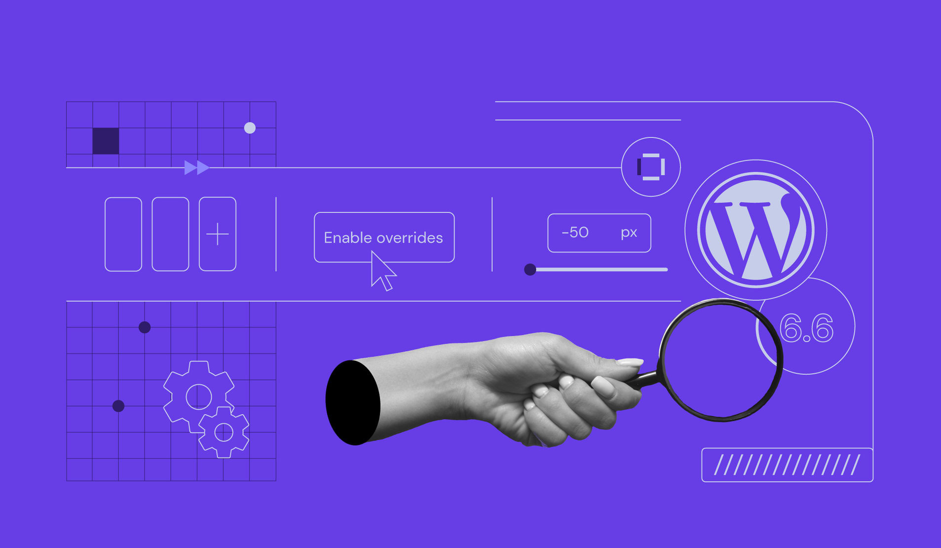
With WordPress 6.6 scheduled for release on July 16, now’s a good time to have a sneak peek at what we can expect. While the new version of WordPress is now in beta, you are very likely to see all of these changes to make your experience working with WordPress easier and more enjoyable.
This is not a complete review of all the changes coming but a highlight of some of the new features you’ll soon be able to mesh into your workflow.
When referring to a block theme, this is a type of modern WordPress theme in which all aspects of a website can be made with blocks. This is done partly in the Site Editor. Classic themes, an older type of theme, use blocks only for creating page or post content.
Pattern Overrides
WordPress 6.6 will give you the ability to partially override a synced pattern. That sounds complicated, but it’s not.
Up until now (before WordPress 6.6) suppose you created a synced pattern consisting of a group block. Within that block, you inserted a heading, several paragraphs, and perhaps an image block. Wherever you use that pattern for your website, you will see exactly what you created.
However, this being a synced pattern, you can change any aspect of it (the blocks and the styles used) wherever the pattern is being used. If you make any changes to the pattern, all uses of that pattern will automatically change everywhere it is used. That is a synced pattern.
An “unsynced pattern” (for lack of a better term) is, as you might be thinking, the opposite of a synced pattern. Whatever changes are made to this type of pattern affect only that single pattern.
The new Pattern Overrides feature can be thought of as a partially synced pattern in that some of the blocks – namely a Heading, Paragraph, Button or Image block – can be changed within a pattern without affecting the rest of the pattern.
Pattern Overrides can be made with any type of theme.
How to Use Pattern Overrides
Let’s create an Artist group block. As you use this block through the site, you will be able to change the Artist’s image and name without changing any other content inside the group block (in this case, a paragraph).
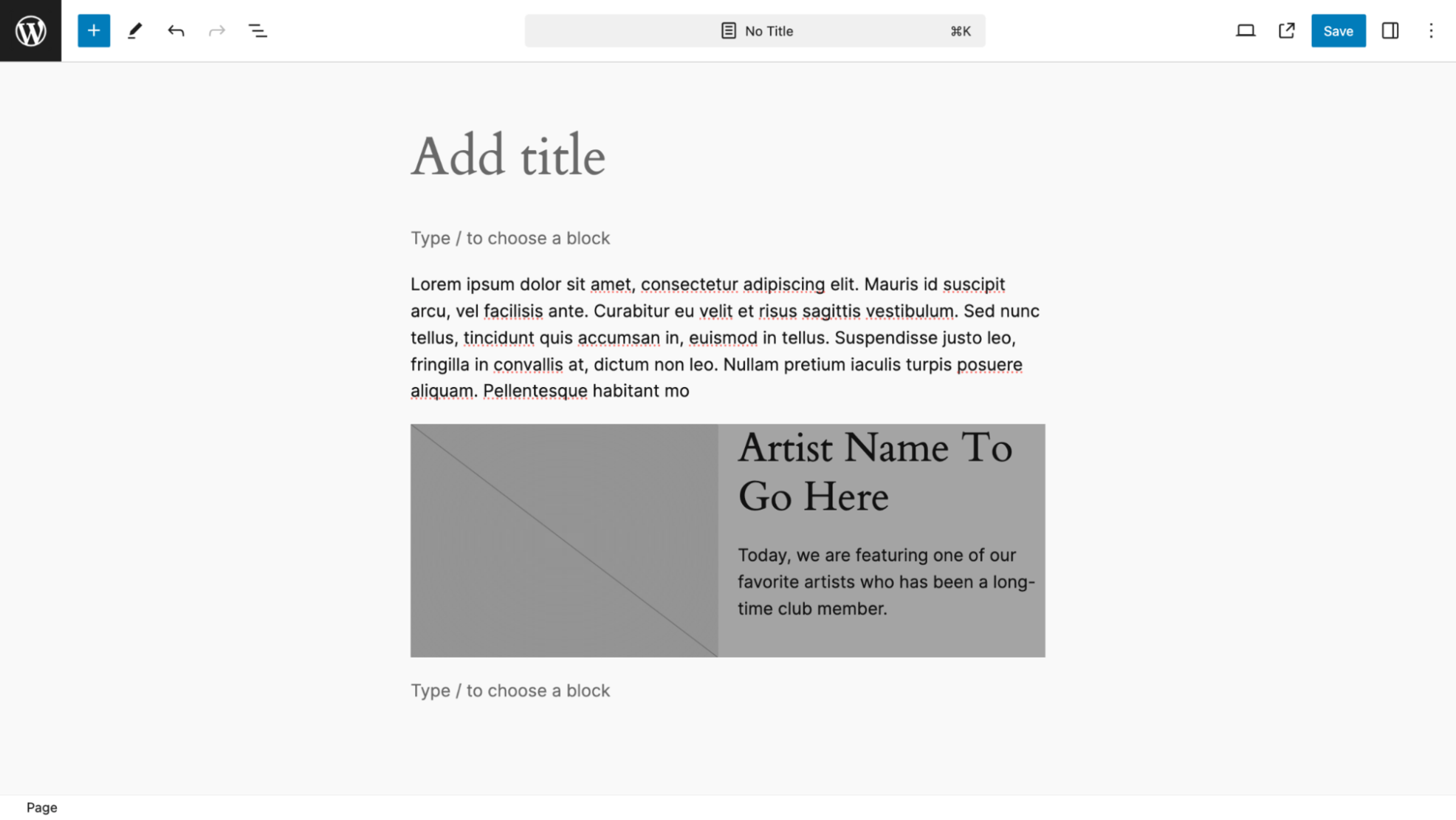
Below is just a regular group block with two columns. The left column holds an image placeholder block. The right column contains placeholder text for the name of the Artist and a paragraph that will not be changed as the pattern is used.
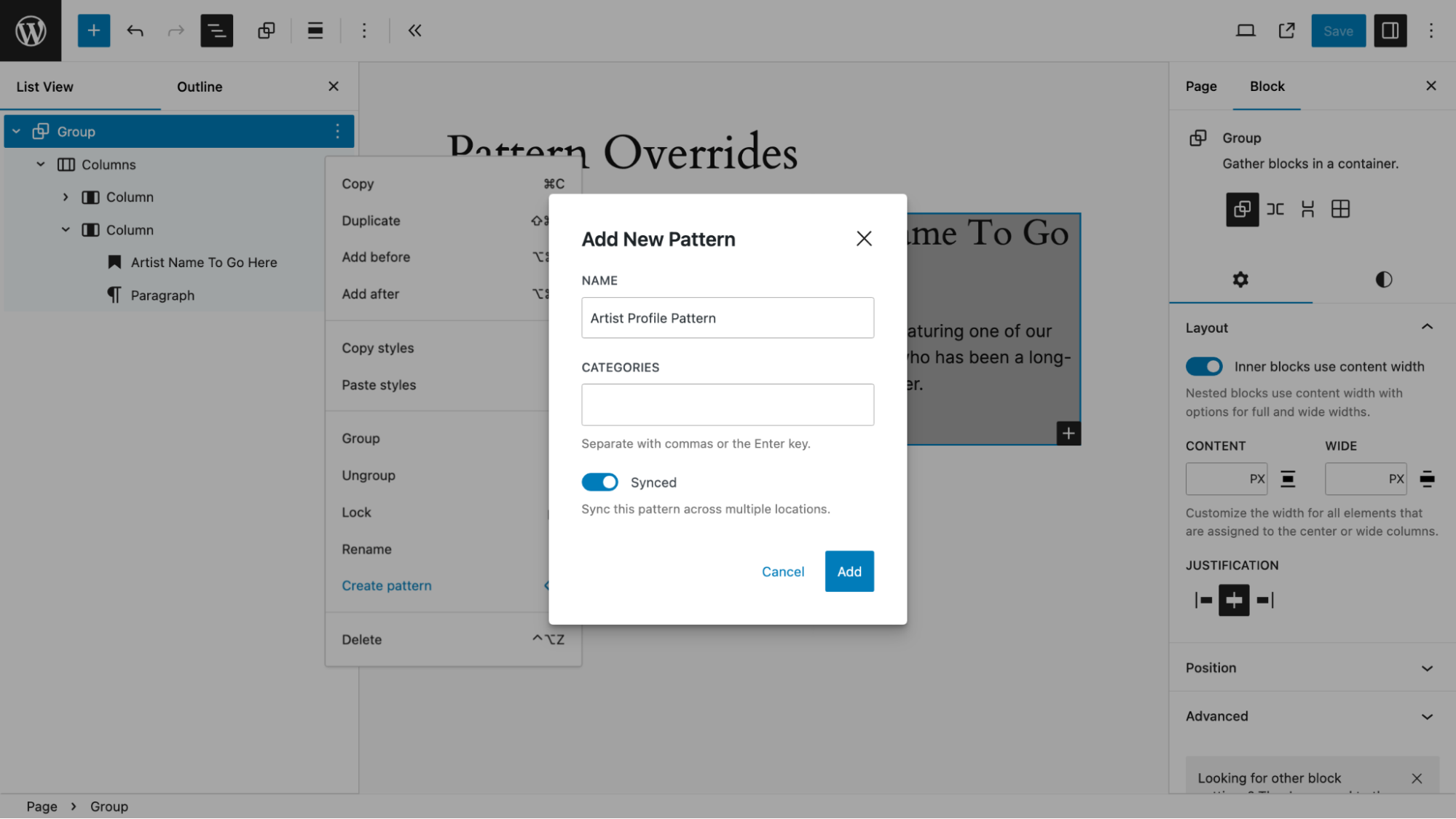
In the List View, I chose “Create Pattern” then completed the popup box. I gave the pattern a name (“Artist Profile Pattern” ), skipped assigning a category, then left the synced toggle switched on which is most important.
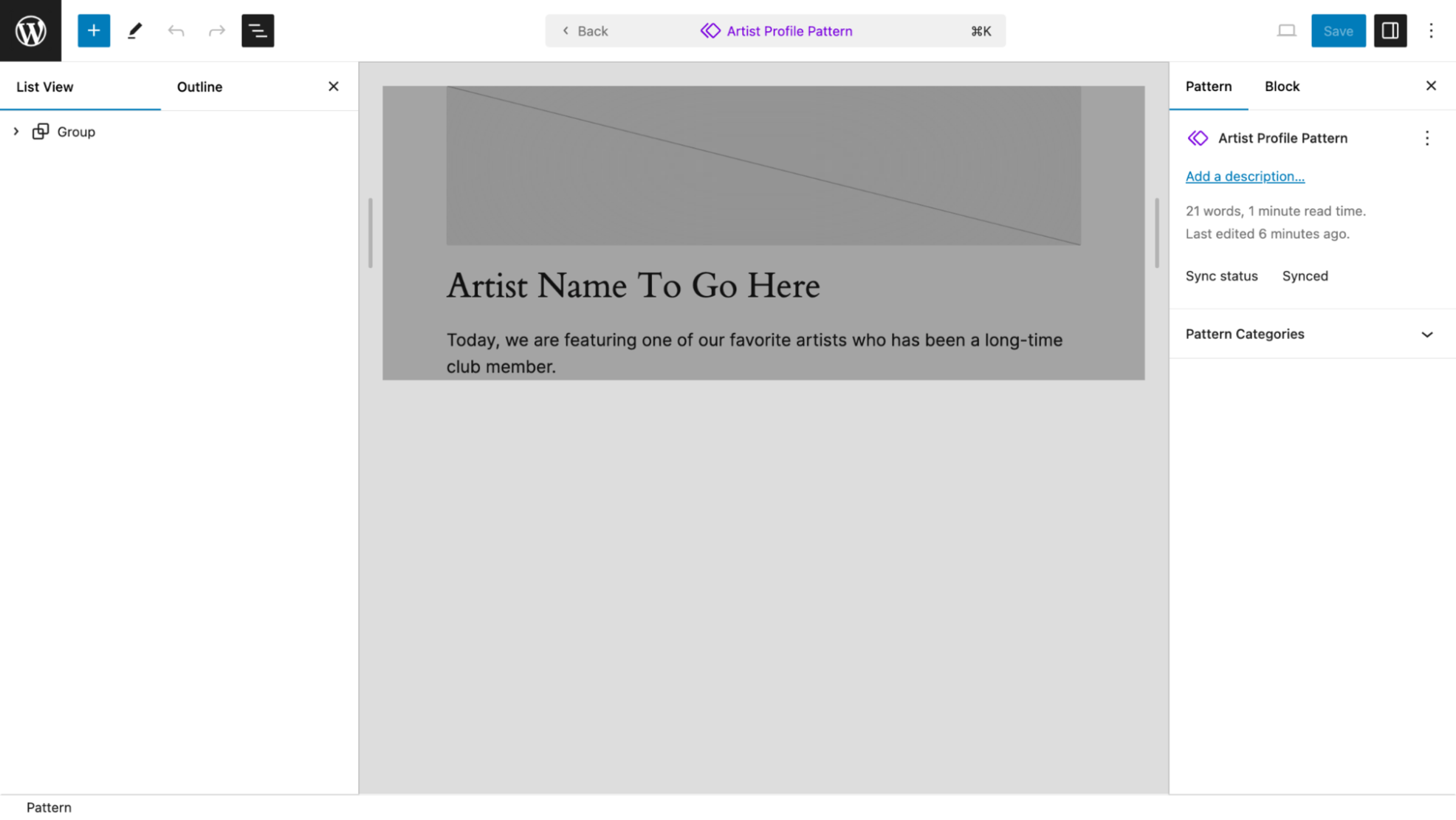
Then I designated the image and heading text to be overridden as the pattern is used.
I selected the Edit Original option in the Group Block toolbar.
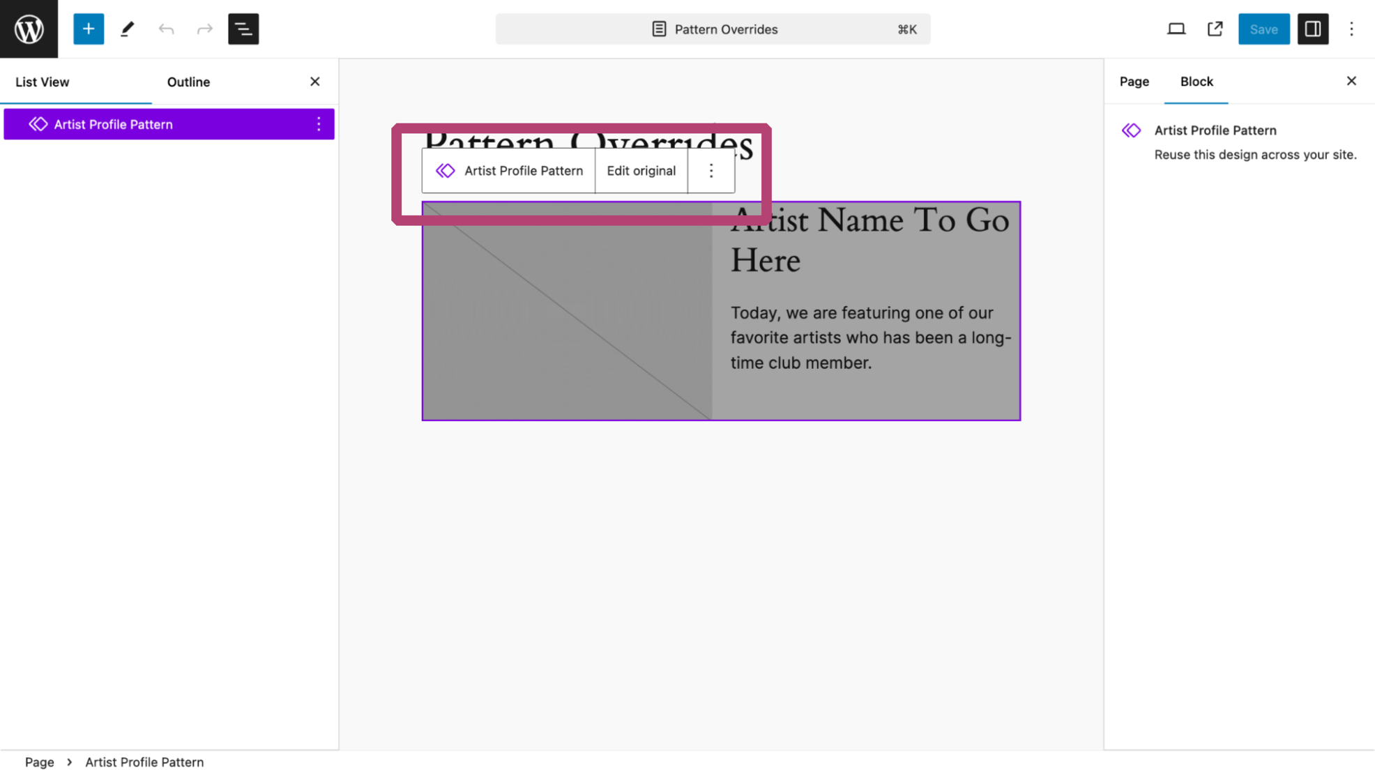
This is the result.
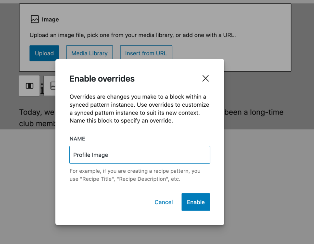
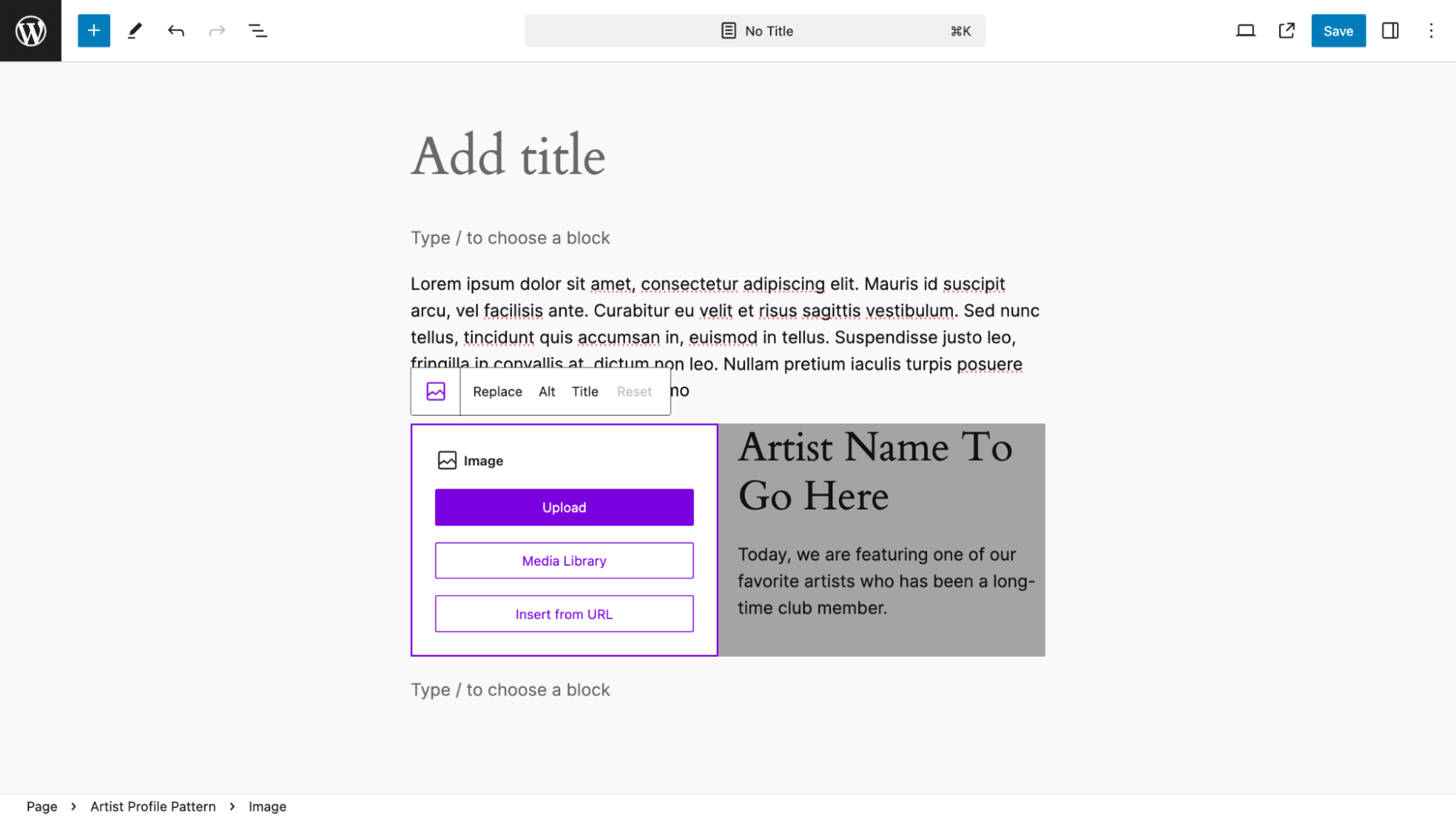
Next, I selected the image placeholder. In the right sidebar under the Advanced tab WordPress 6.6 has an Overrides button.
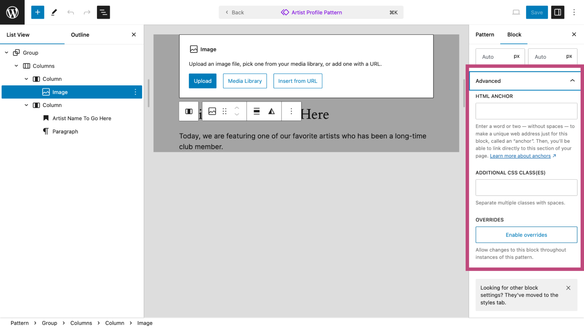
Selecting the Enable Overrides button displays this popup box. Here I give it a name, “Profile Image.”
For the heading, which will also change each time this pattern is used I do the same thing as I did for the image placeholder. In this case, after selecting the heading, in the right sidebar, I chose the Advanced tab and then once I select the Enable Overrides button I assign the name. “Artist Name.”
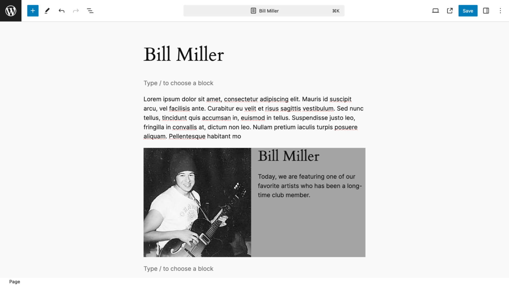
My pattern is all set for use. I will add an image and change the name of the artist for two different pages.
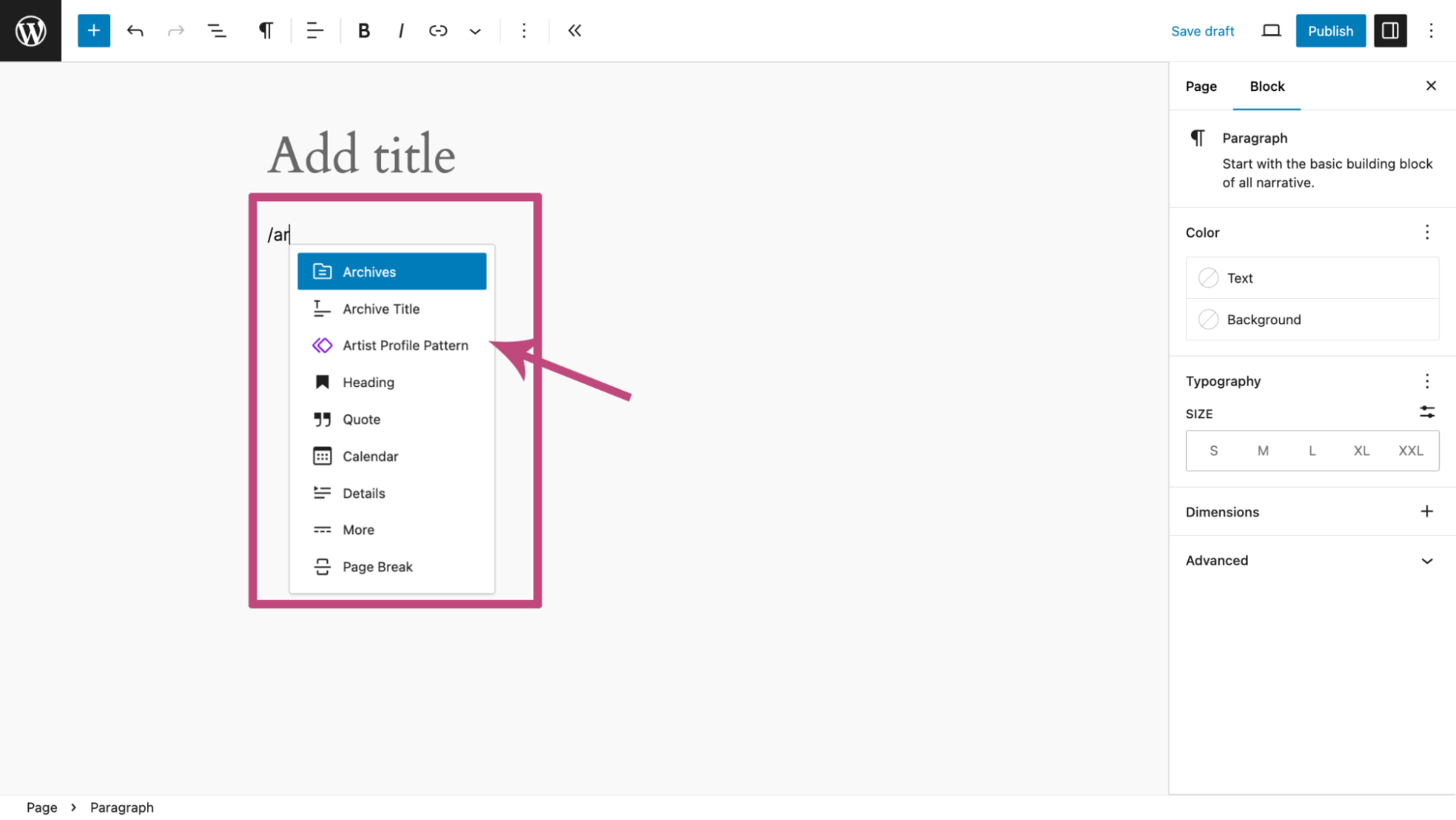
I insert the pattern, “Artist Profile Pattern”, into a page. There are two ways to do this.
Here I typed “/” where prompted. As I typed in “ar” a list of options to choose from appeared. I selected “Artist Profile Pattern.”
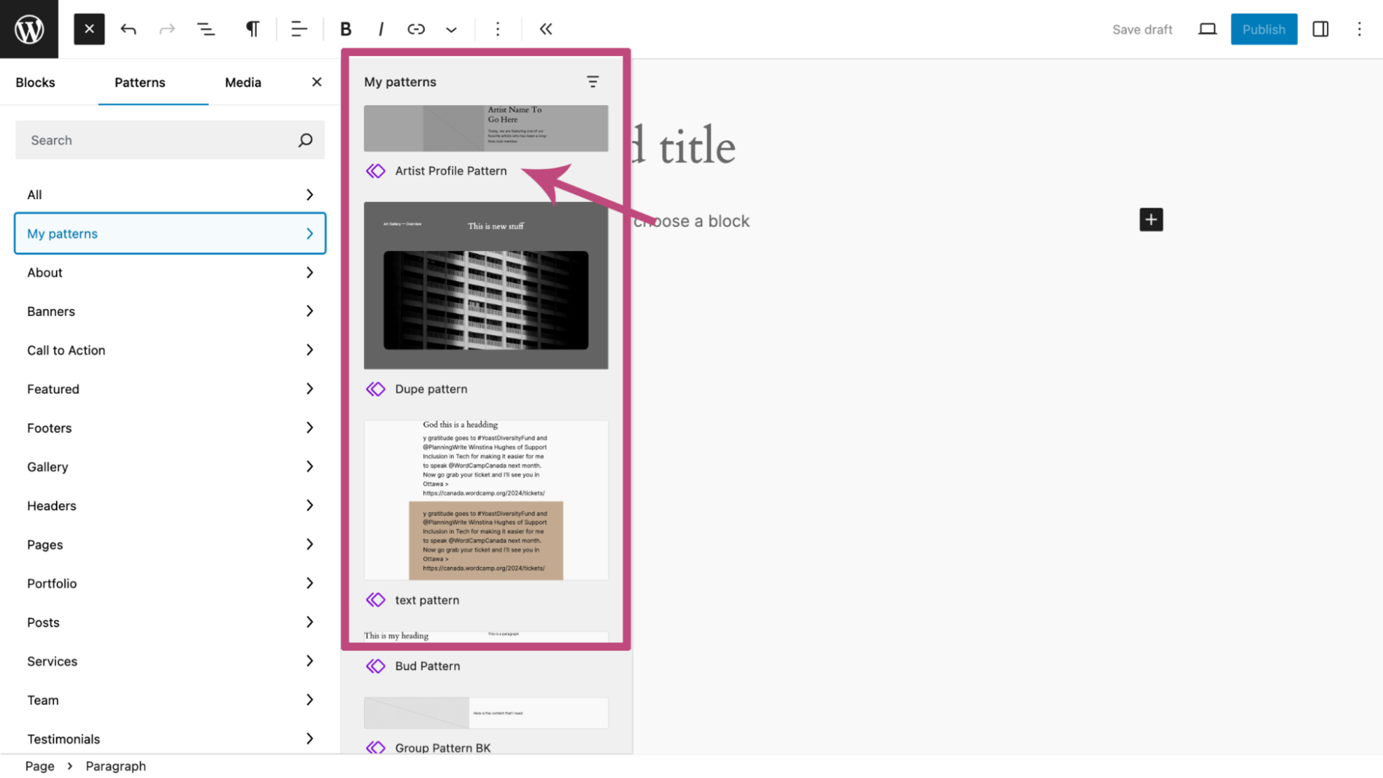
Alternatively, I could have used the Patterns tab within the Inserter and then chosen My Patterns to find the “Artist Profile Pattern” to insert into the page.
I also added some dummy text just above the pattern.
Then I select the image placeholder block and find an image in my media library.
I also added a title for the page, which is the same as the pattern heading.
Finally, on another page, I repeat the process to create another page for a different artist using the same pattern.
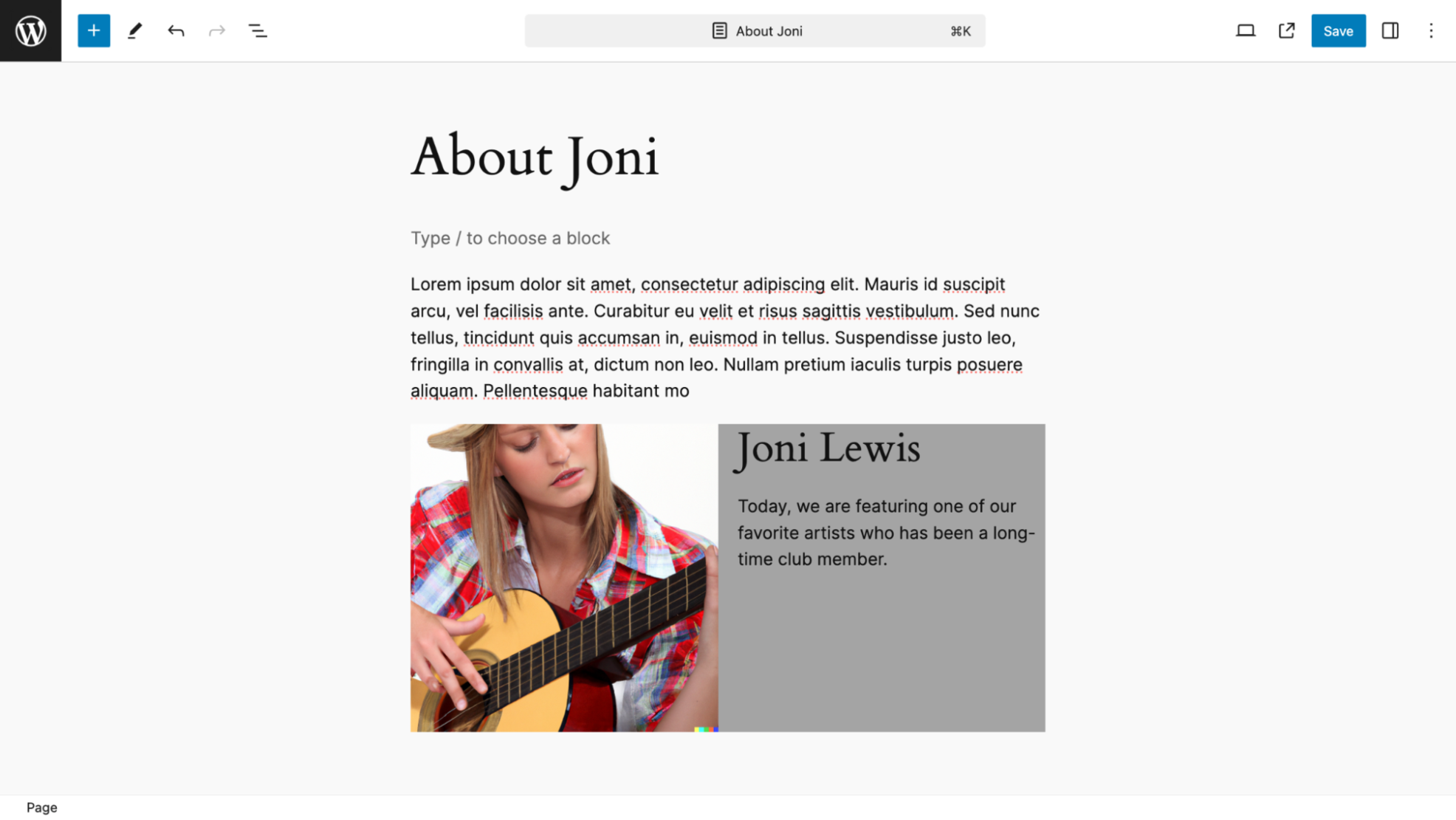
As expected, the paragraph following the heading is what remains unchanged each time I use the pattern.
In a way a pattern override may eventually be seen as a type of block locking where only some high level users (an Admin or Editor) will be able to use this feature. For example, people working on a team may wish to have low end users (such as Contributors and Writers) only have permission to change parts of a pattern. This will ensure that repeating and important content for the site will not accidentally get over ridden.
Also, in the future, using this same process of pattern overrides, it may be possible to block certain areas of a template so that these can not be disturbed accidently by site workers.
Grid Block
A powerful new way to layout page content lies with the ability to span rows and columns that work flawlessly in any screen size.
Because a Grid block removes a lot of unnecessary HTML, your pages will load just a little faster.
If you go back to the early days of web design when HTML tables, column and row spanning were used for design, this will look familiar. (Don’t worry. Tables for layout are not coming back.)
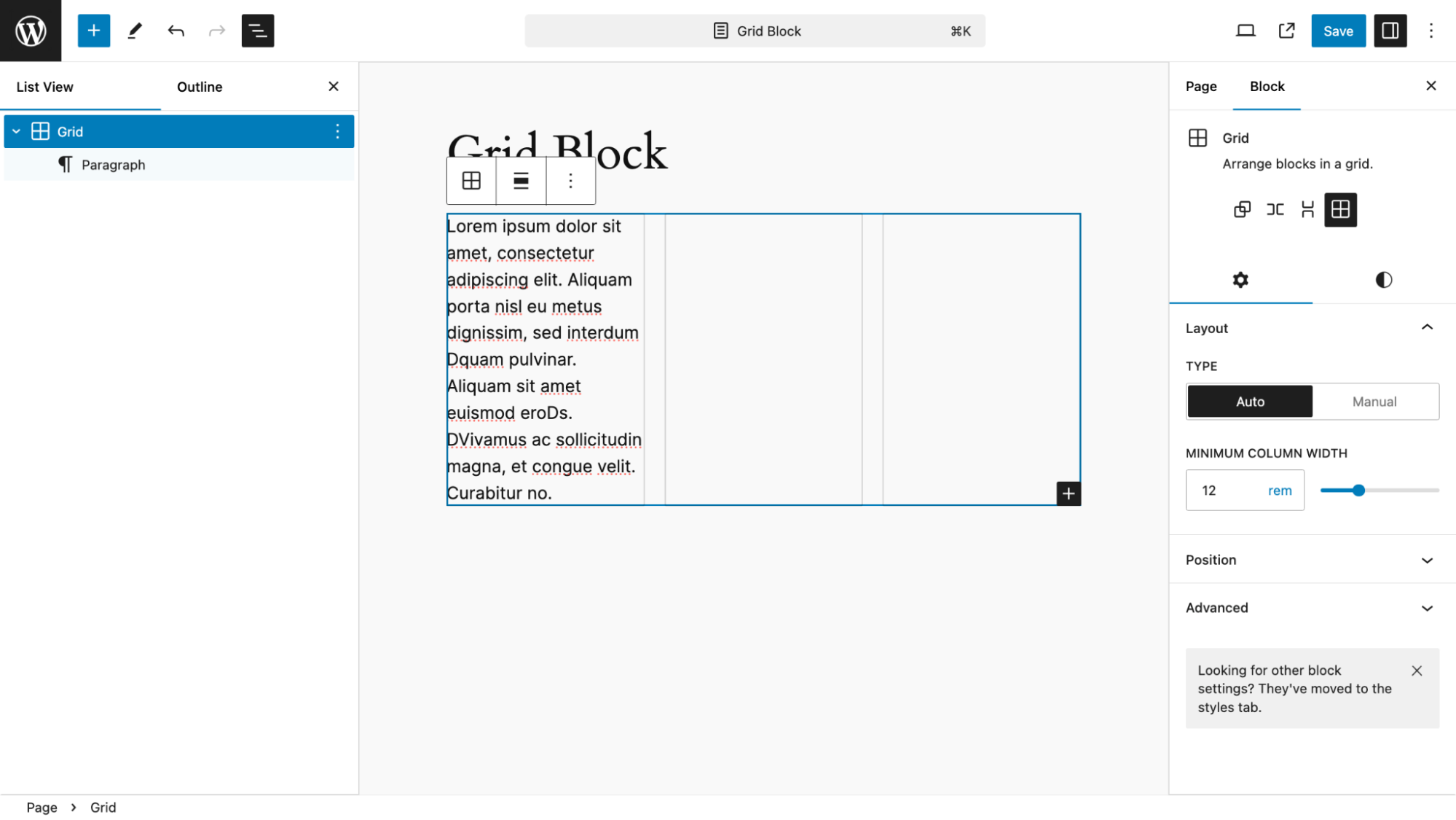
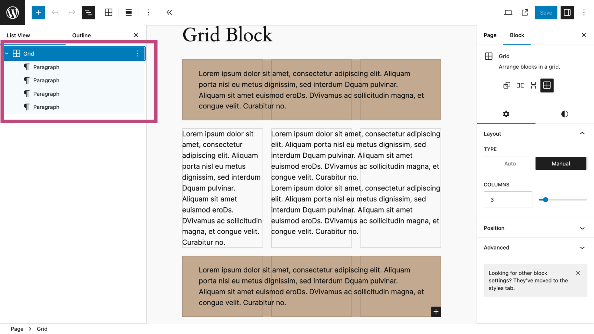
You can start a Grid block by transforming a Group or Column block into a Grid Block. But here I inserted the Grid block into my page to set up a three-row layout where the first and last rows will span the middle row containing two columns. Within the Grid block I added a paragraph which will be my first column.
The Grid Block has these notable features:
- In the toolbar, you can set width to wide and full. I kept the setting to normal, the default.
- Within the right sidebar you have the all important layout setting. The options of “Auto” and “Manual” mean the the following:
“Auto” sets the grid rows and columns automatically using a minimum width for each item. The default minimum width of each item is 12rem which can be adjusted.
“Manual” allows for the exact number of columns, which I use in the later step.
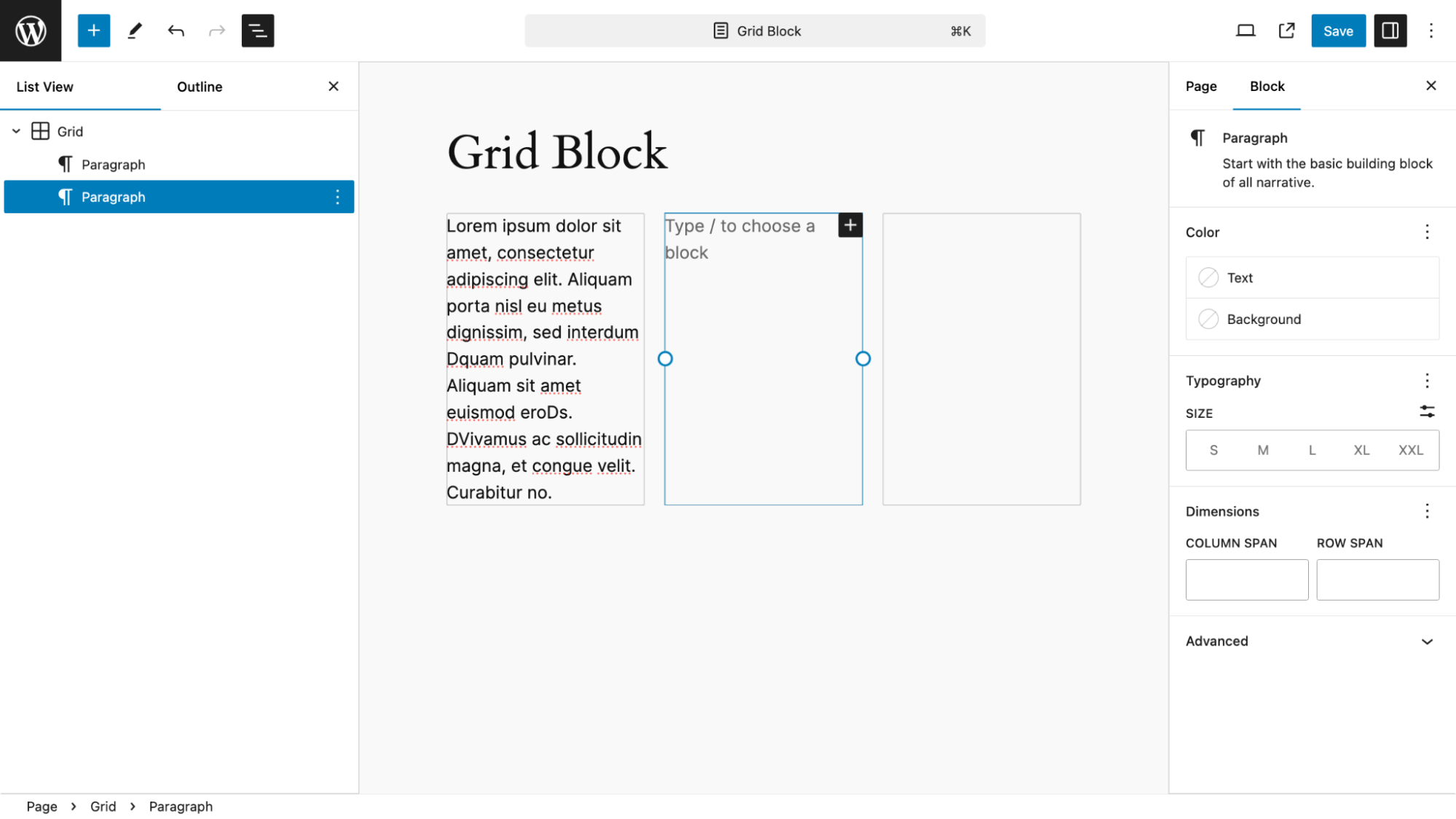
Next, I get ready to add my second column, which will be another paragraph.
I see a box outline with two circles, indicating that I can resize the column width by simply dragging and dropping the outline.
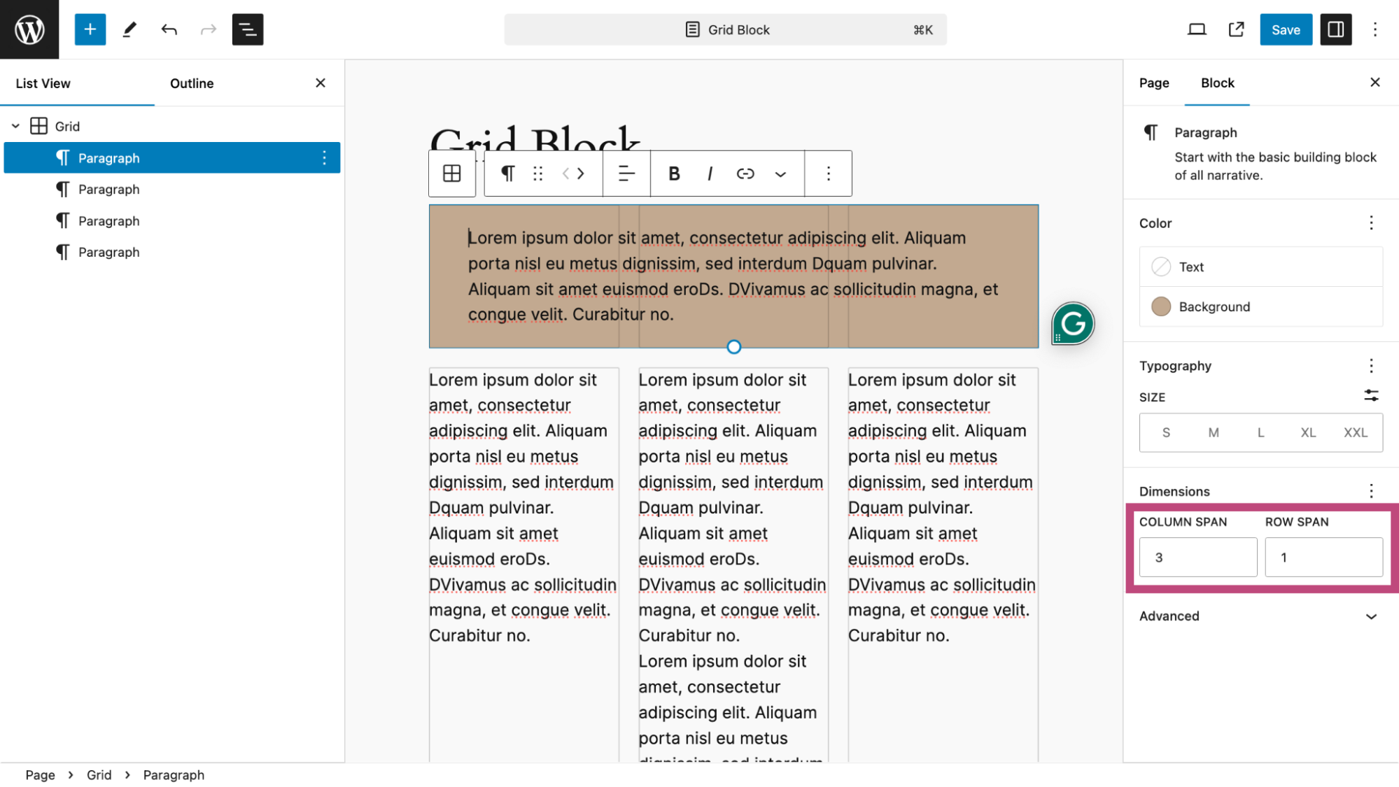
I now have all four paragraphs in place. I have changed the Grid block to Manual and set the number of columns to 3.
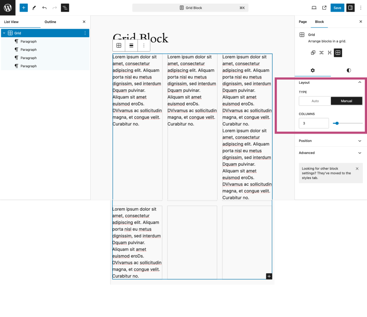
I added a background color to the first paragraph.
Now, I have two options to get the first paragraph to span across three columns.
I can pull on the drag line of the right side of the first paragraph. Here it is almost across the third column. Another option was to set the column and row span values (3 and 1, respectively) as shown below:
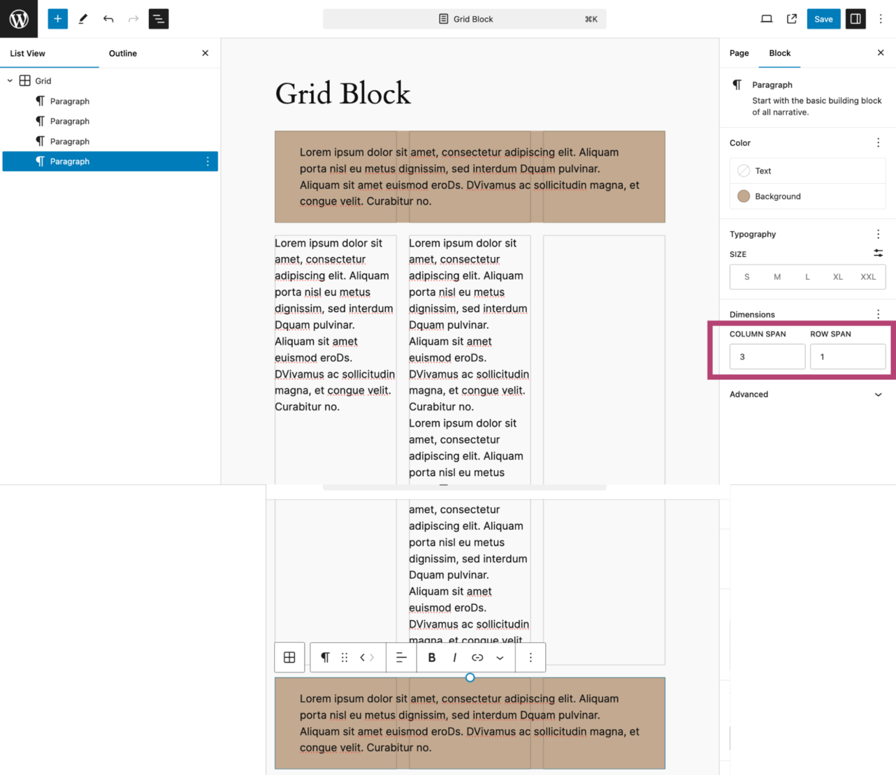
For the fourth paragraph, which is the third row, I set my spanning just like I did for the first paragraph above.
I also added a background color matching the first column.
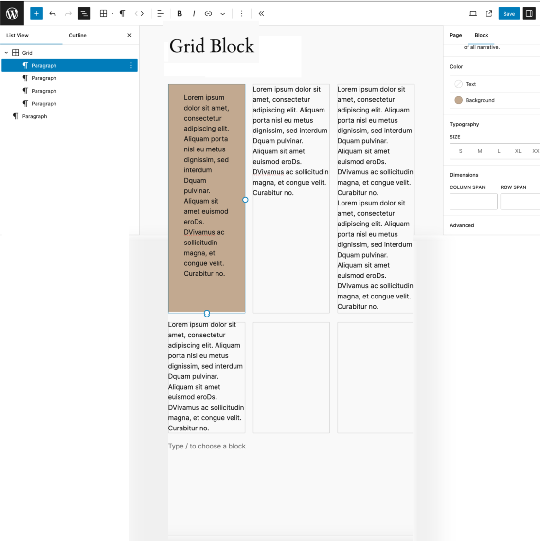
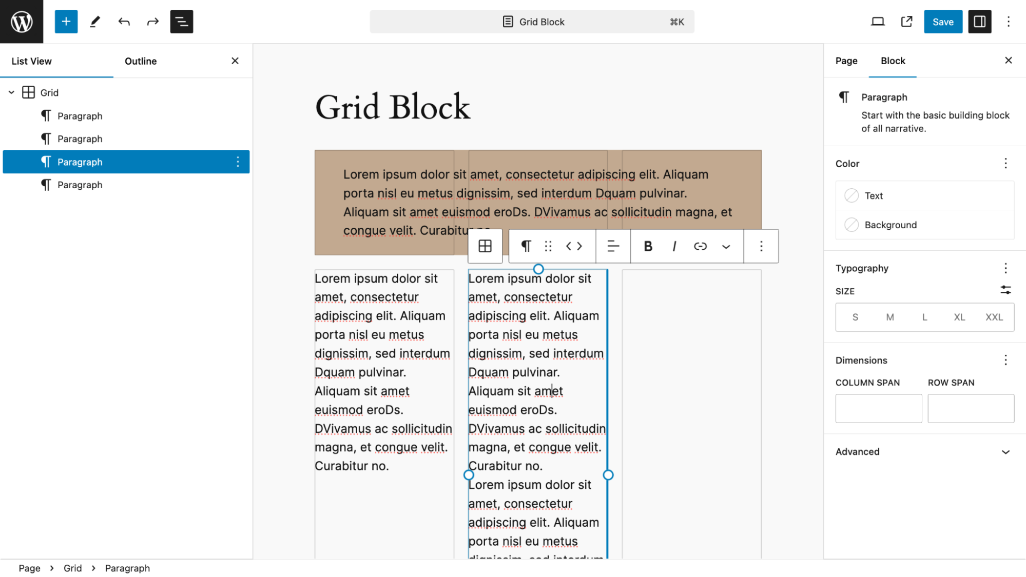
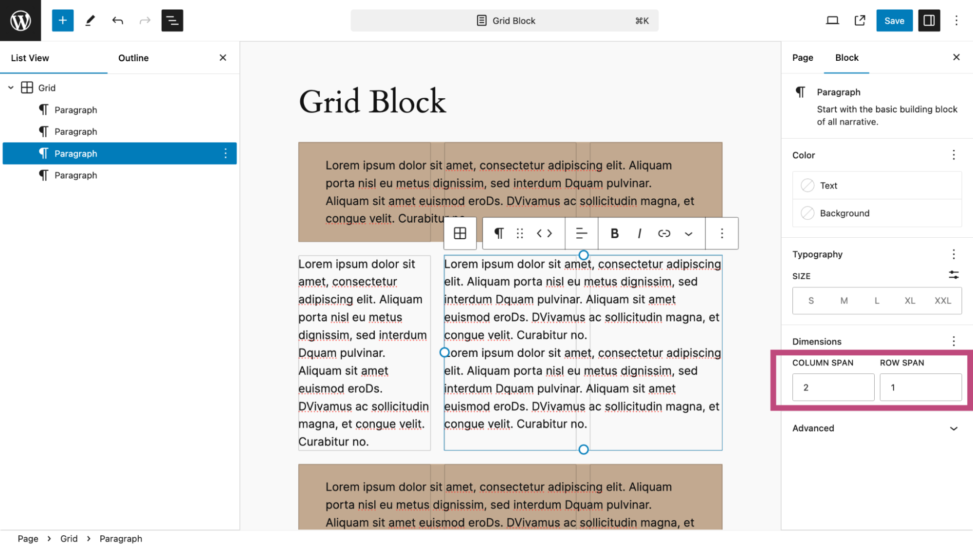
For the middle row, I select the second paragraph and get ready to drag the right side of the fox till it fills the Grid block.
This is the result. Again, I could have set the column and row spanning in the right sidebar, but dragging and dropping was easier.
The design is complete. Notice that the grid contains only four paragraph blocks. That is the most efficient way to layout a page.
One Click Styles
For block themes, the Style area within the Site Editor has two new features, making it easier to preview the chosen colors and typeface for your site.
First, there is a color palette. In the Twenty Twenty-Four theme, there are eight preset palettes. Selecting any one of these will instantly change the page background color, text color, link color, and button background color, as you see here.
The second new feature is the ability to easily change the typeface. There are six pre-set options.
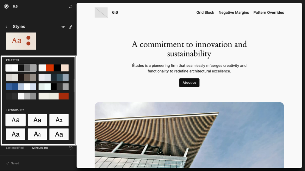
You can easily mix and match any of these presets. When you are satisfied, select the Save button to use your choices. As always, you can refine any of your styles at any time within the Style section of the Site Editor.
Better Views In The Site Editor
As WordPress evolves and enters a phase where the entire WP Admin will adapt to, among other things, collaborating on web projects possible. WordPress 6.6 makes it easier to manage all pages, templates, and template parts, which is an essential feature for people working together.
All of this takes place in the Site Editor, which is also a laboratory for developers working on the new WP Admin.
For example, here is how you will see all of your pages in WordPress 6.6.
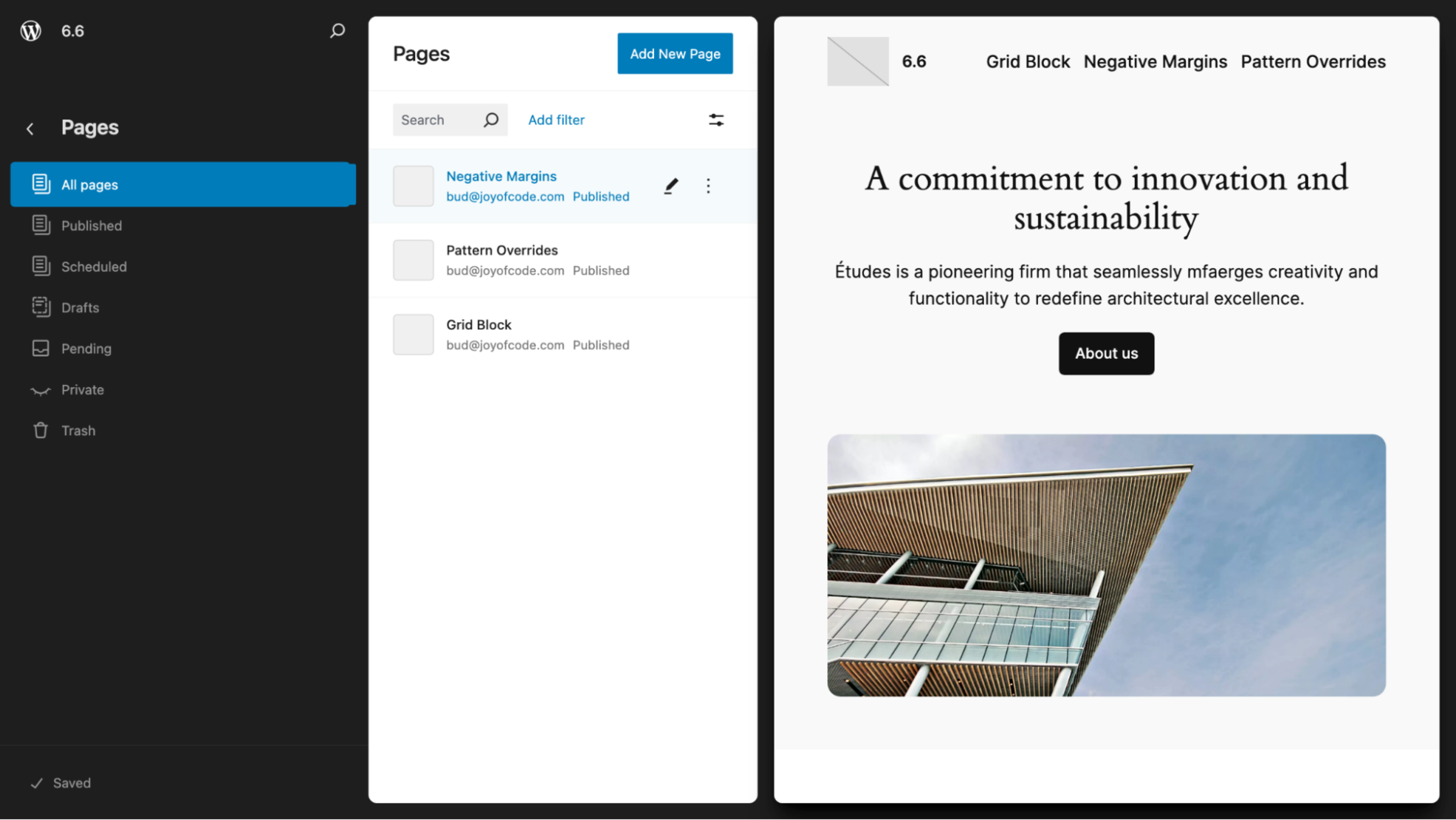
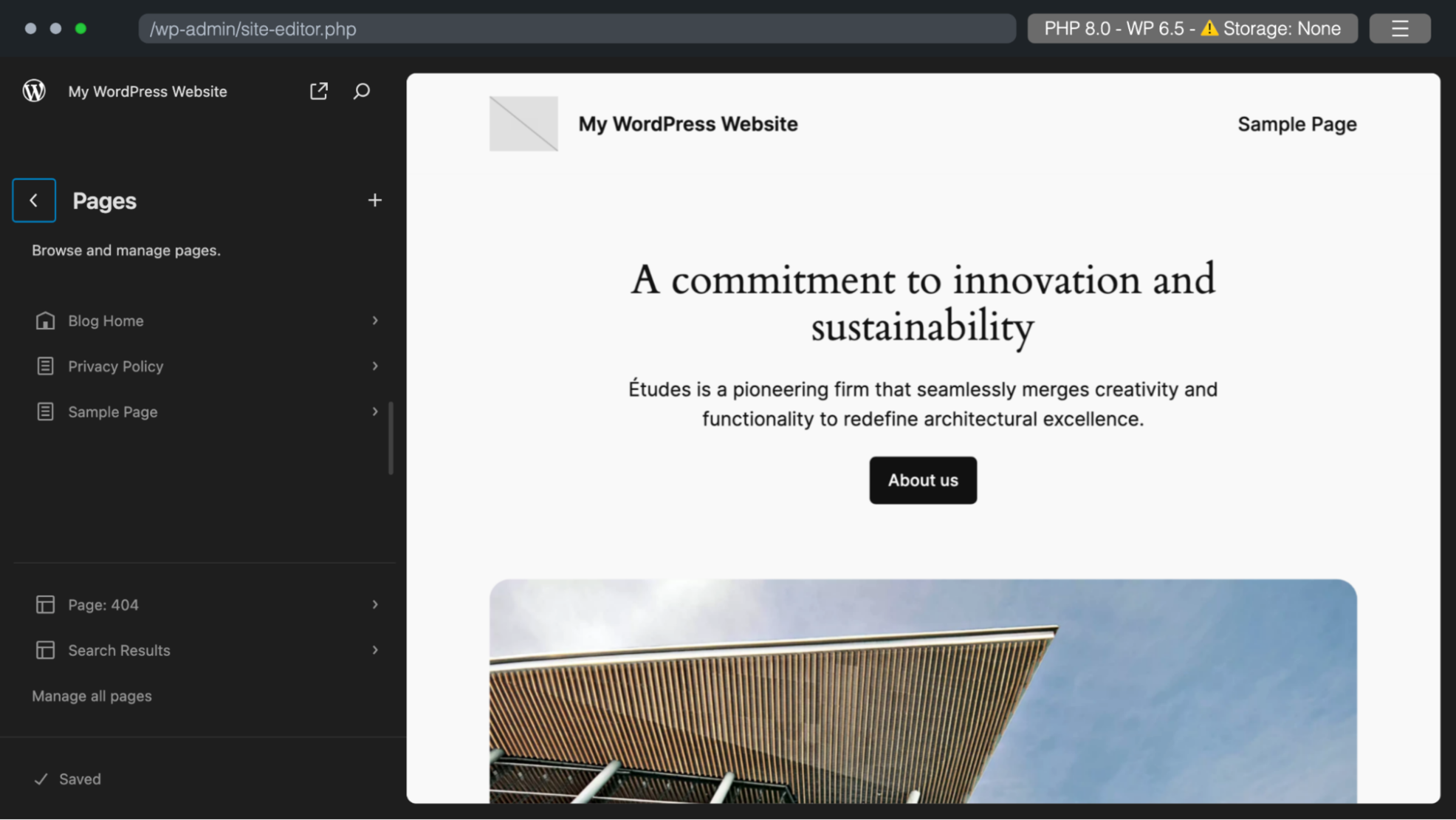
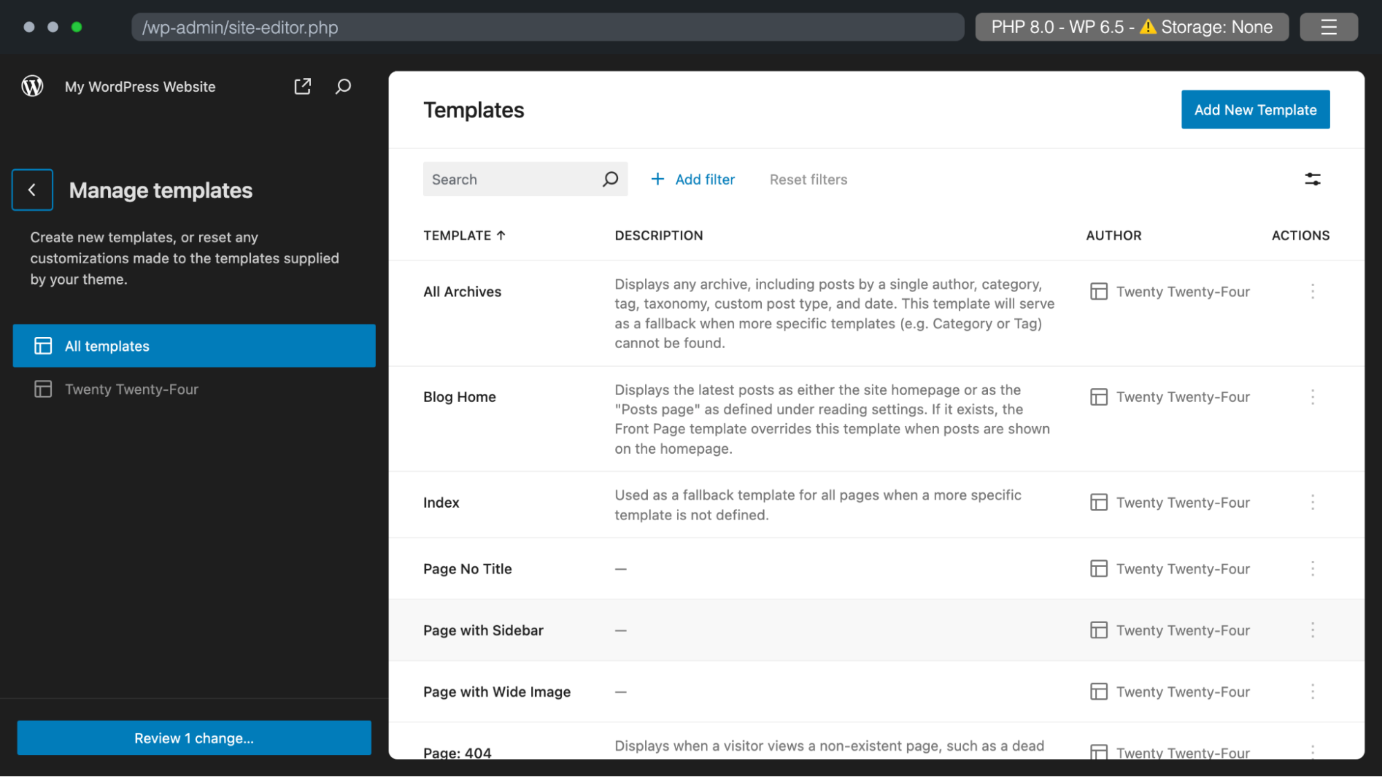
Compare that to what you see in WordPress 6.5.
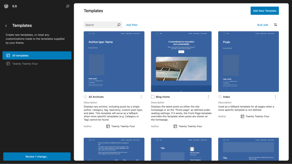
And here is what you will see when you manage all of your templates in WordPress 6.6. You can see the previews of the templates, descriptions, authors, and the theme they’re associated with.
Compare that to what you see in WordPress 6.5.
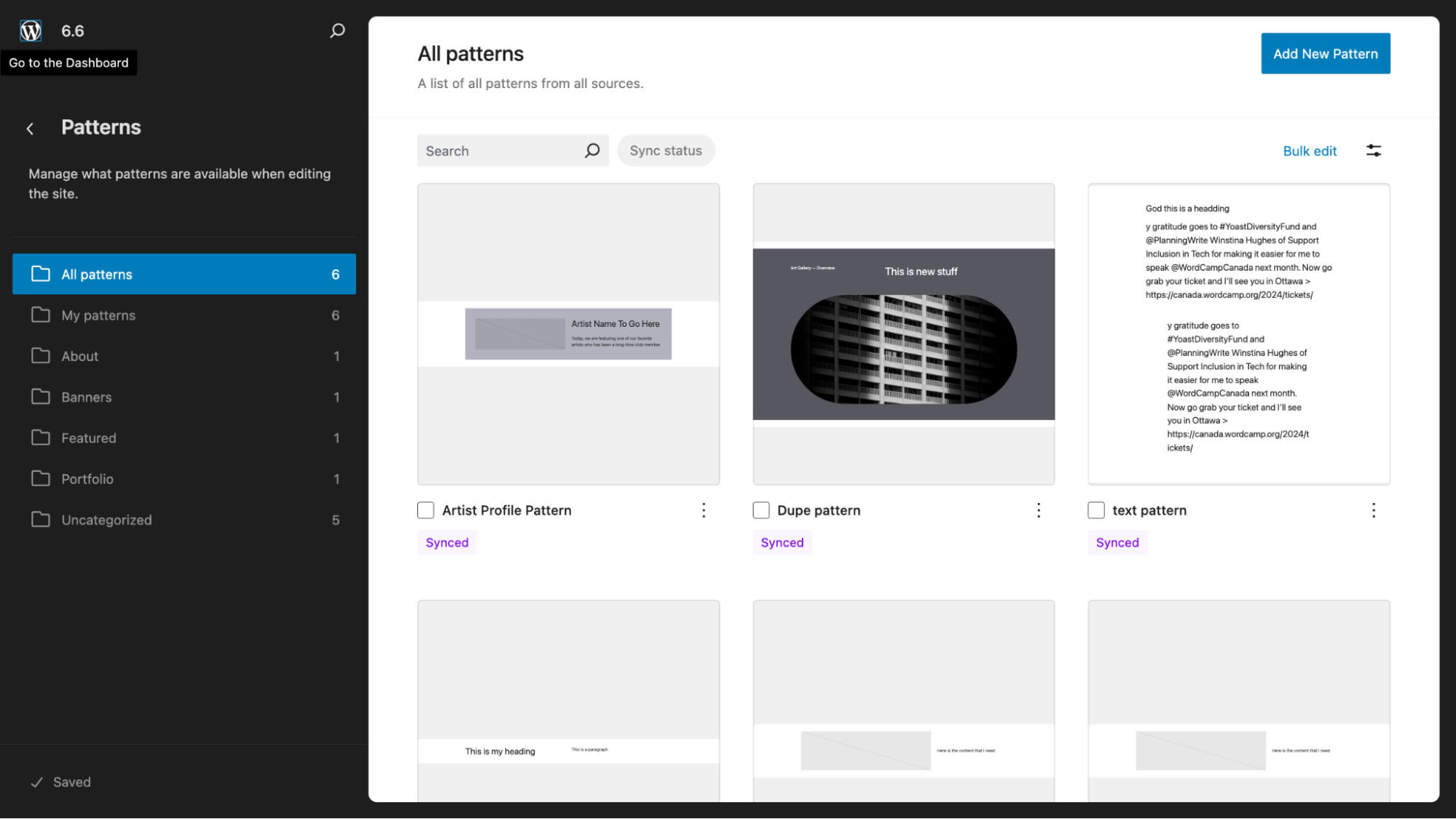
In addition, patterns are now easier to see and choose from whether you are working on a Page, Post or within the Patterns section of the Site Editor.
Enhanced Pattern Views With Classic Themes
WordPress 6.5 made it possible for Classic theme users to easily access patterns within the Appearance section. WordPress 6.6 takes this development one step further.
The above should look very familiar to anyone using a Block theme, as it is literally a page right out of the Site Editor.
Negative Margins
In the spirit of WordPress 6.6, which adds new design tools to the designer’s palette, you
will have the ability to create interesting designs using negative margins.
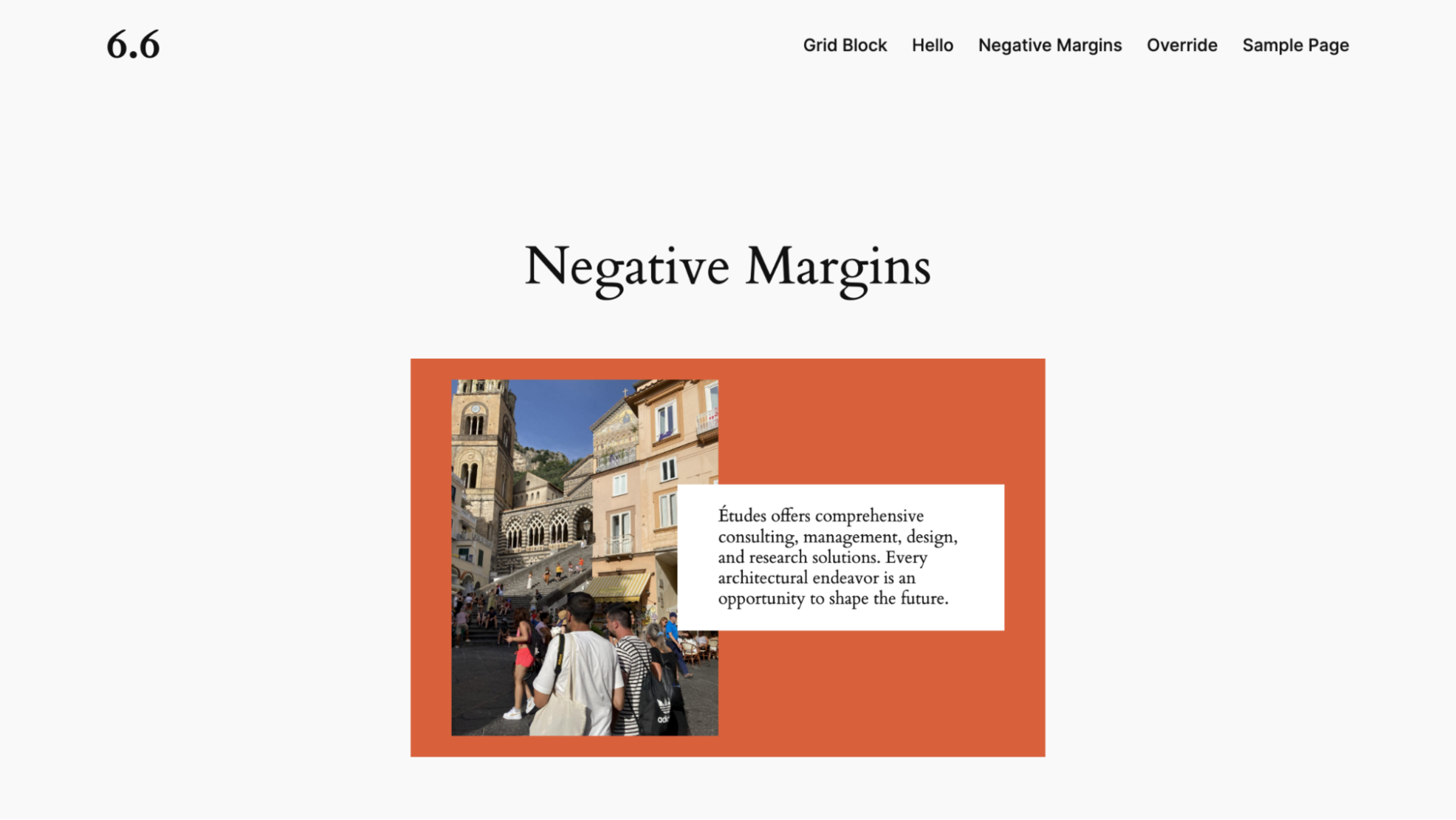
Here’s a typical two-column layout with an image and a paragraph.
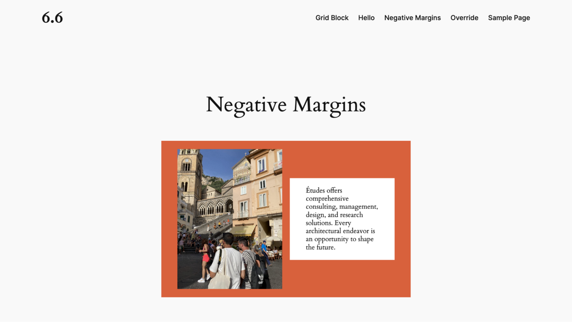
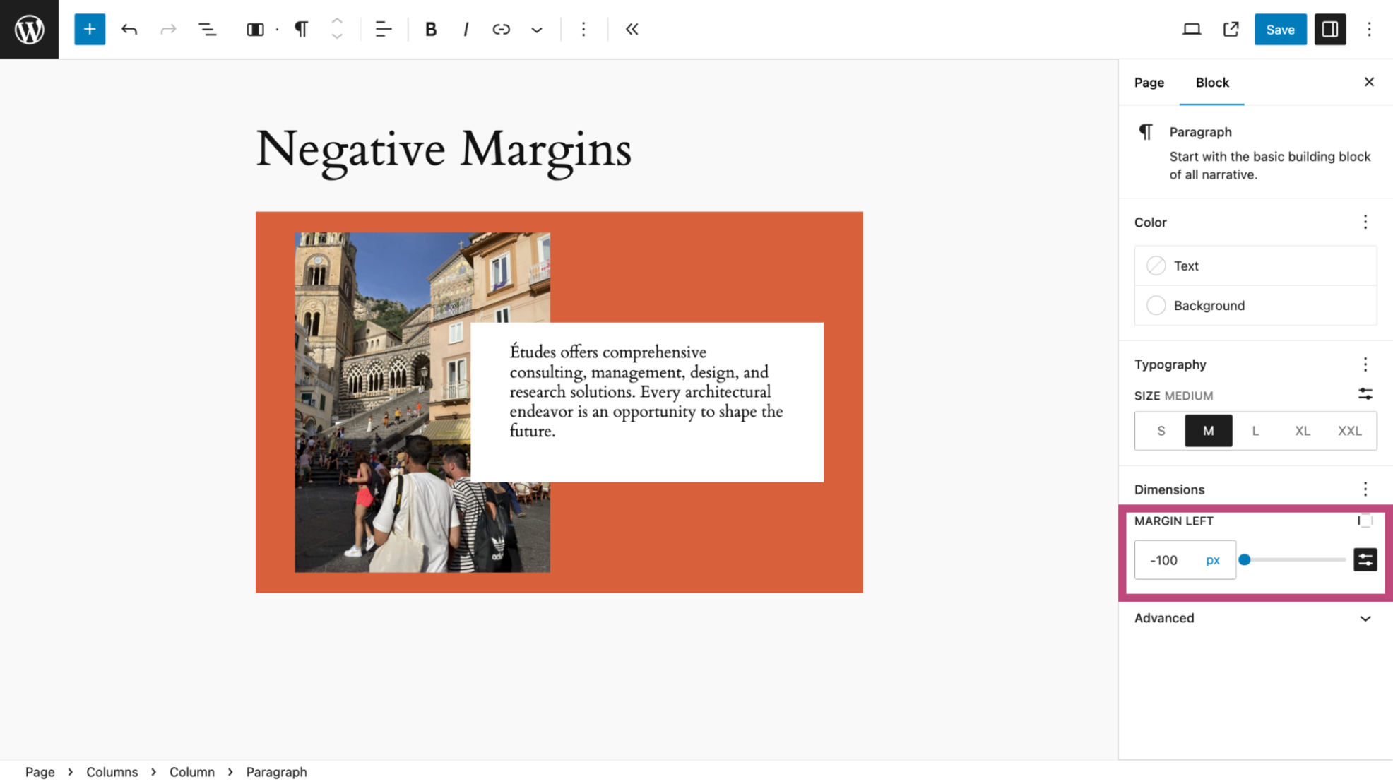
And now, in the Dimension settings of the paragraph I set a negative margin of 50 pixels on the left side. If you are not familiar with Dimensions on the block editor, each block has four sides – top, bottom, left and right. You can add space to these margins. Or, in this case, remove it.
Here you can see where I used -50px, an arbitrary value, on the left side of the paragraph. This has the effect of pulling the paragraph to the left. Note: while a slider is available to change margin sizes you can only use negative margins by adding a value in the text box as seen here.
The result is a pleasing design that should look fine on any screen size.
Testing WordPress 6.6
You don’t have to wait until July 16 to test all the new features and enhancements coming to WordPress 6.6. Testing is mandatory if you are a plugin or theme developer. And if you want to see how your site will perform or are just curious about what is coming, there’s no reason why you can’t have a look.
Want to assist WordPress developers to make 6.6 better? Here is how to help test WordPress 6.6.
Fortunately, WordPress makes it very easy to test the next version by using the WordPress Beta plugin. Only use this plugin on an evaluation or staging site, never on a live site.
Summary
Changes coming in WordPress 6.6 are geared toward making content creation and styling your site faster and more coherent. As always, your ability to use any of these features depends upon your needs and willingness to learn what you can now do with WordPress as it continues its journey toward becoming a full-featured web design system.

Bud Kraus has been working with WordPress as an in-class and online instructor, site developer, and content creator for over 14 years. He’s a completely reformed web designer who no longer building WP sites and has shifted his focus on creating WordPress content for WordPress Businesses. To him, it’s just another way to teach and have fun working with clients he loves and admires. No matter the project, Bud works with clients the way they want to work and not the other way around. Working as a content creator Bud creates WordPress materials as educational articles or instructional videos for WordPress companies. Follow him on LinkedIn


Comments
July 10 2024
WordPress 6.6 is my choice,and I will go for it because it is worth getting. Thanks for the information Ate-Agba
July 17 2024
Awesome!